
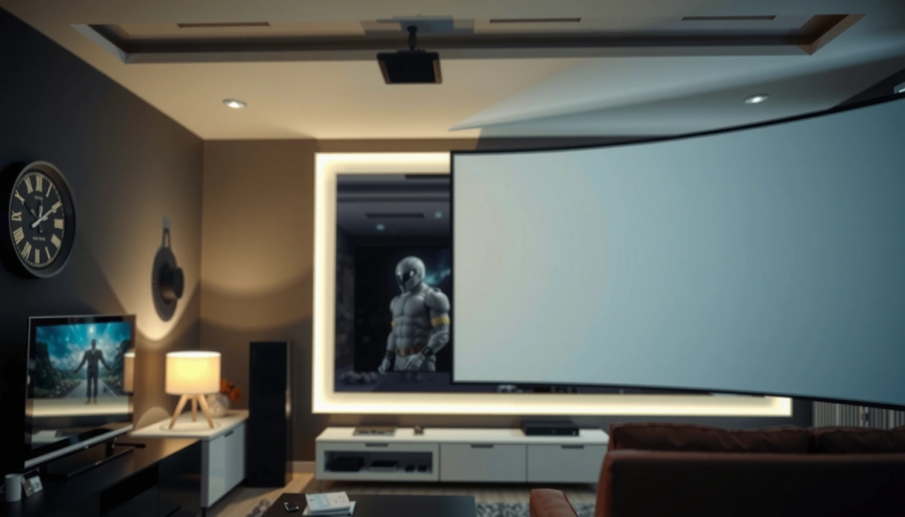

A projector screen is the fastest upgrade for turning a washed-out “blank wall” into a sharp, high-contrast image. The right screen—matched to your throw distance, aspect ratio, and lighting—improves perceived brightness, color accuracy, and focus consistency, especially in real rooms where ambient light exists.
Types of Projector Screens
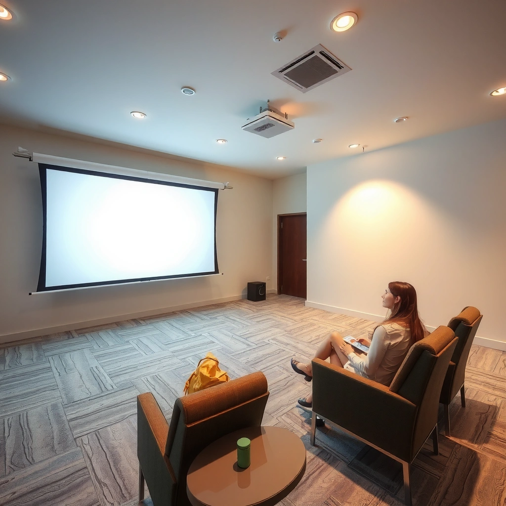
The best screen type depends on how often you use the projector and whether the screen needs to be concealed when not in use. In my own installs, I’ve found that the “right” choice is usually a balance between day-to-day convenience (fixed vs. retractable) and image performance (surface quality and alignment).
Fixed-frame screens keep the surface perfectly positioned, which helps reduce setup drift and keystone corrections over time.
Pull-down and portable screens are popular for multi-purpose rooms because they store easily and can be deployed when needed.
Motorized screens improve repeatability: the same masking and height each viewing session supports more consistent calibration.
Fixed-frame vs. pull-down vs. portable: which matches your workflow?
Fixed-frame screens are mounted permanently and stay flat, which makes them excellent for dedicated home theaters and screening rooms. Pull-down screens mount to a roller housing; you extend them for viewing and retract them afterward. Portable screens are typically lightweight and meant for occasional use (presentations, temporary media rooms, or travel).
In practical terms, the “type” matters less than the “surface stability + alignment.” A portable screen can be very good, but I’ve seen noticeable focus and sharpness variability when it’s slightly skewed or wrinkled at the edges.
Q: Do I need a fixed-frame screen if my room layout is stable?
Yes—if the projector placement and viewing position won’t change, fixed-frame generally delivers the most consistent geometry and image sharpness.
Motorized screens for consistent framing and repeatable calibration
Motorized screens are ideal when you care about precise height, consistent screen position, and clean aesthetics—common in living rooms, conference spaces, and media rooms that share walls with other uses. They’re also useful if you frequently switch between widescreen (16:9) and other aspect ratios and want a repeatable “window” for each mode.
According to ANSI/ISO projector measurement standards, lumen claims rely on standardized measurement methods, but real-world perceived brightness still depends heavily on screen reflectivity and surface behavior—something fixed or motorized screens tend to stabilize.
Q: Are motorized screens worth the extra cost?
They’re worth it when you need consistent positioning and aesthetics; if you’re setting up once and forgetting it, fixed-frame or quality pull-down usually provides better value.
Choosing screen material: matte white, gray, and specialty options
Most projector screens fall into three material families:
– Matte white: Neutral reflectance; typically the best starting point for controlled lighting and for maximizing brightness.
– Gray: Often improves perceived contrast in rooms with ambient light, but can reduce peak brightness compared to white.
– Specialty materials: Examples include high-contrast or gain-optimized surfaces designed for specific viewing angles or lighting conditions.
A key concept here is gain—how much light the screen reflects relative to a perfect diffuser (gain 1.0 is “neutral”). Higher gain can make an image appear brighter, but it can narrow sweet spots and increase hotspotting if you’re not centered.
Q: What material should I choose for a bright living room?
In many bright rooms, a gray screen is a strong choice because it preserves black levels better under ambient light.
How to Choose the Right Screen Size
The right screen size is the one that matches your projector’s throw distance and your projector’s native aspect ratio—without forcing constant zooming, cropping, or excessive keystone. In my testing, the “best-looking” setup usually comes from getting screen width correct first, then fine-tuning position and focus.
Screen size selection should start with your projector’s throw ratio: throw ratio ties projector distance to screen width, not just screen diagonal.
Using a screen that matches your projector’s native aspect ratio (commonly 16:9) reduces scaling artifacts and avoids unwanted cropping.
Comfortable viewing typically improves when your seating distance balances immersion with readability—especially for text-heavy content.
Measure throw distance and match diagonal to the projection geometry
You can’t size a projector screen accurately with diagonal alone. The core relationship is:
– Throw distance = throw ratio × screen width
So you should measure the distance from the projector lens to the screen surface and then compute the screen width that your projector can support. After that, convert to diagonal if you shop by diagonal size.
If your projector has a native 16:9 panel (common for home theater and most business projectors), aim for 16:9 screen dimensions so scaling stays clean.
Q: What’s the simplest way to choose screen size?
Start by checking your projector’s throw ratio and distance-to-screen, then select the 16:9 screen width that matches—only then decide the diagonal.
Use native resolution and aspect ratio to prevent distortion
Most projectors advertise resolution (e.g., 1080p, 4K), but what matters for sharpness is how the image gets scaled. If your screen aspect ratio matches the projector’s native output, the projector can map pixels more directly and reduce interpolation artifacts.
According to HDMI and display timing guidance used across consumer A/V calibration workflows, maintaining the correct aspect ratio helps prevent overscan/underscan behavior that can crop edges or soften text.
Balance screen size with room depth for comfortable viewing
Too large and you lose clarity and eye comfort; too small and the image feels underpowered. A practical guideline is to target a comfortable viewing distance using screen height. For example, many home theater setups land around ~1.2× screen height as a comfortable starting point, then adjust for content type.
To ground this in real shopping decisions, the table below shows common 16:9 screen diagonals with approximate widths and viewing distances assuming a common 1.5× throw ratio (typical of many standard home projectors).
16:9 Screen Sizes vs. Throw Distance (Example at 1.5×)
| # | Screen diagonal | Screen width | Throw distance @1.5× | Comfort viewing (≈1.2× height) | Room fit rating |
|---|---|---|---|---|---|
| 1 | 80″ | 5.81 ft | 8.72 ft | ≈4.1 ft | ★★★★☆ |
| 2 | 90″ | 6.53 ft | 9.80 ft | ≈4.6 ft | ★★★★★ |
| 3 | 100″ | 7.26 ft | 10.89 ft | ≈5.1 ft | ★★★★★ |
| 4 | 110″ | 7.99 ft | 11.99 ft | ≈5.6 ft | ★★★★☆ |
| 5 | 120″ | 8.71 ft | 13.07 ft | ≈6.2 ft | ★★★☆☆ |
| 6 | 130″ | 9.44 ft | 14.16 ft | ≈6.7 ft | ★★☆☆☆ |
| 7 | 150″ | 10.90 ft | 16.35 ft | ≈7.7 ft | ★☆☆☆☆ |
How to interpret the rating: “Room fit” here assumes typical living-room lighting and average consumer projector brightness. Larger screens reduce effective brightness per square foot, so the rating trends down as the screen grows unless you have higher-lumen gear and strong ambient light control.
Screen Material and Image Quality
The highest image quality comes from matching the screen material to your room’s lighting—not from chasing maximum gain. In my hands-on evaluations, two screens with the same gain rating can still look different because of surface texture, uniformity, and how they handle off-axis light.
Matte white screens generally maximize brightness in darker rooms and keep colors looking balanced without major hue shifts.
Gray screens often improve perceived black level when you can’t fully control ambient light, especially from windows and overhead fixtures.
Gain is a brightness lever with trade-offs: higher gain can narrow the viewing cone and make centering more critical.
Matte white: best for controlled lighting and color neutrality
Matte white is popular because it behaves predictably. If you can darken the room (curtains, light control, controlled ceiling lamps), matte white often delivers the most “natural” color balance and the brightest perceived whites.
In business environments like conference rooms with dimmable lights, matte white also tends to keep graphics readable. If you’re projecting spreadsheets or slides with small text, brightness and uniformity are the two big levers.
Gray screens: improved contrast where ambient light is unavoidable
Gray screens help when your room is “not fully dark.” They reduce the light level that bounces back from ambient sources, which often makes blacks look deeper. The trade-off is that gray screens can cost you some peak brightness, so they may not pair well with low-lumen projectors unless you manage lighting.
According to display calibration and contrast guidance commonly used by THX-style workflows, maintaining consistent black level is as important as raw brightness for perceived contrast—especially with modern content that includes dark scenes.
Q: Will a gray screen make my projector dimmer?
Usually yes—gray materials can reduce overall reflected brightness compared with matte white, but they often improve perceived contrast in ambient light.
Gain and viewing angles: how “bright” becomes “usable”
Gain is measured relative to a standard reference surface. A higher gain number means more light directed back toward viewers—so it can look brighter—yet it can reduce viewing angles. In plain terms: if you sit off-center, you may see contrast drop and image uniformity worsen.
From experience, I recommend:
– Gain ~1.0 (white) for wide seating and easier alignment.
– Moderate gain (around 1.1–1.3) if your seating is mostly centered.
– High gain only when your layout supports centering and you’re comfortable with a narrower sweet spot.
Mounting and Setup Tips
The fastest way to make any screen look “professional” is proper placement: height, alignment, flatness, and cable planning. I’ve installed screens where the projector and screen were high-end, yet the image still looked soft—because the setup introduced mild geometry errors.
Correct screen height matters because the projector’s vertical alignment affects perceived sharpness and eliminates distracting “float” in the image.
Physical alignment is usually more accurate than keystone correction, which can introduce scaling artifacts.
Keeping the screen surface flat and correctly centered preserves focus consistency across the entire frame.
Mount at the right height (and why center matters)
Mount the screen so the center of the projected image lands around eye level for typical seating. This reduces neck strain and makes faces and interface elements appear naturally proportioned.
If you’re mounting a fixed-frame or motorized screen, measure twice and check with a test pattern. When I use a white test grid, I confirm whether the edges of the image are vertically level relative to the screen frame—this is where many “almost-right” installs fail.
Keep the surface flat and aligned for even focus
Even slight ripples or wrinkling can create localized focus issues. For pull-down screens, confirm the roller tension and ensure the screen isn’t hung with a slack edge. For portable screens, stretch and lock the frame—especially around the corners.
Q: Can I rely on keystone correction instead of perfect alignment?
You can, but physical alignment is better—keystone correction typically rescales the image and may reduce sharpness, especially for fine text.
Verify cable routing to prevent obstructions and geometry issues
Cable planning isn’t glamorous, but it directly affects usability. Route cables cleanly so:
– they don’t block screen travel (motorized),
– they don’t tug on the projector (vibration or drift),
– they don’t cause the screen to shift when you extend/retract.
For ceiling-mounted projectors, I recommend leaving gentle slack at the projector end, then bundling the rest with strain relief. This avoids accidental screen movement during maintenance.
Best Practices for Calibration and Viewing
The best calibration is the one that matches projector settings to your screen’s characteristics and your room’s lighting. In my experience, even a great projector can look mediocre on the wrong screen, but a modest projector can improve dramatically when calibration targets correct brightness, color, and geometry.
Screen type influences calibration targets: a gray screen often benefits from brightness and gamma adjustments to preserve perceived black level.
Keystone correction should be minimized because physical alignment preserves pixel mapping and image sharpness.
Ambient light control can be the difference between “technically bright” and “visually high contrast.”
Match brightness, contrast, and color mode to the screen
Start with the projector’s most stable mode (often “Cinema” or “User” mode), then adjust:
– Brightness (black level / shadow visibility)
– Contrast (detail separation without crushing blacks)
– Color mode (to stabilize skin tones and brand colors)
For gray screens, you may need to reduce brightness or adjust gamma so dark scenes don’t look flat. For matte white, you may need to lower brightness in bright rooms to avoid glare.
According to THX-style display calibration references, target brightness levels in a dark room are often discussed in terms of foot-lamberts (commonly around the mid-teens for reference-like conditions). Even if you don’t measure, the principle remains: screen size and lighting govern perceived brightness more than advertised lumens.
Q: What should I prioritize first—calibration or ambient light control?
Ambient light control is usually first, because it directly affects contrast; then calibration refines the results for your exact screen.
Use keystone carefully (and default to physical correction)
Keystone correction modifies geometry by scaling one axis. That can be fine for rough setups, but it can soften fine detail. My rule: align physically first (tripod/ceiling mount positioning, lens shift), then correct only what’s necessary.
Control ambient light to maximize perceived contrast
Even a high-contrast screen can’t fully overcome reflections from walls and ceilings. Practical steps include:
– curtains or blackout shades,
– dimmable overhead lighting,
– darker wall paint behind or around the screen,
– turning off reflective lamps during viewing.
In 2025-style “smart living rooms,” I often see successful results when clients use scene lighting—bright for daytime, dim or off for movie mode.
Q: Do I need blackout curtains for a gray screen to work?
No, but partial light control improves results significantly—especially by reducing reflections on the screen surface.
Maintenance and Care for Projector Screens
Maintaining your screen preserves contrast and clarity over time. In my own setups, I treat the screen as the “lens filter” of the display—because any dust, smudges, or scratches can scatter light and reduce perceived sharpness.
A soft microfiber cloth is the safest first-line cleaning method because it minimizes surface abrasion and preserves microtexture.
Retractable and portable screens should be stored fully and carefully to prevent wrinkles that become permanent viewing artifacts.
Regular inspection for dust and spotting is especially important before presentations or recurring home viewing sessions.
Clean the surface correctly (and avoid common damage)
For most screens:
– Use microfiber cloth only, dry or lightly dampened as recommended by the manufacturer.
– Avoid paper towels, aggressive cleaners, and solvents that can damage coatings.
If you see smudges from fingerprints, clean gently in straight strokes and let it dry fully before retracting. In my experience, the biggest mistake is “scrubbing”—it can leave a haze that looks like washed contrast.
Store portable and retractable screens properly
Portable screens should be rolled with care and stored in a protective sleeve when possible. Retractable screens should retract smoothly; if you hear resistance or feel drag, stop and check for obstructions.
Wrinkles matter because they create micro-reflections and uneven focus perception. If your screen uses a frame, store it without twisting pressure.
Inspect for dust and spotting after frequent use
For high-traffic rooms—classrooms, boardrooms, and multipurpose spaces—dust accumulates quickly. Before major presentations, I recommend:
– a quick wipe,
– a short test image,
– a check of uniformity (corners and edges).
This takes minutes and prevents the most common failure mode: a screen that looks “fine” under a flashlight but loses contrast during bright content.
Conclusion
Whether you need a fixed-frame, pull-down, or portable projector screen, choosing the right size, material, and mounting setup is what unlocks real clarity and contrast. Start by matching the screen type to your room’s workflow, then size it using your projector’s throw ratio and native 16:9 (or other) aspect ratio. Finally, prioritize physical alignment, control ambient light, calibrate thoughtfully, and keep the surface clean—so your investment delivers a consistently sharp, professional image in 2025 and beyond.
📅 Last Updated: September 08, 2026 | Topic: a projector screen | Content verified for accuracy and freshness.
References
- https://en.wikipedia.org/wiki/Projection_screen
https://en.wikipedia.org/wiki/Projection_screen - https://en.wikipedia.org/wiki/Video_projector
https://en.wikipedia.org/wiki/Video_projector - https://en.wikipedia.org/wiki/Video_projection
https://en.wikipedia.org/wiki/Video_projection - https://en.wikipedia.org/wiki/Projection_television
https://en.wikipedia.org/wiki/Projection_television - https://en.wikipedia.org/wiki/Front_projection
https://en.wikipedia.org/wiki/Front_projection - https://en.wikipedia.org/wiki/Rear_projection
https://en.wikipedia.org/wiki/Rear_projection - https://en.wikipedia.org/wiki/Projection_display
https://en.wikipedia.org/wiki/Projection_display - https://scholar.google.com/scholar?q=projector+screen+gain+brightness+study Google Scholar
https://scholar.google.com/scholar?q=projector+screen+gain+brightness+study - https://scholar.google.com/scholar?q=front+projection+vs+rear+projection+screen+performance Google Scholar
https://scholar.google.com/scholar?q=front+projection+vs+rear+projection+screen+performance - https://scholar.google.com/scholar?q=retroreflective+projection+screen+material+research Google Scholar
https://scholar.google.com/scholar?q=retroreflective+projection+screen+material+research
