To color grade videos like a pro, you need to master color theory and tools. Start by organizing your footage and establishing a color grading workflow. Use software like DaVinci Resolve or Adobe Premiere Pro, focusing on color wheels and curves for precision. Pay attention to mood by employing harmonious color palettes, and guarantee your corrections enhance the visual narrative. Properly exporting your final video with the right settings can elevate your project further. There’s much more to explore!
Understanding the Basics of Color Theory
Color theory forms the foundation of effective color grading, acting as a roadmap for your creative decisions. Understanding color temperature is essential; it influences the mood and tone of your footage. Warmer colors evoke warmth and comfort, while cooler tones can create a sense of calm or detachment. Achieving color harmony is equally important; it involves balancing colors to create a cohesive visual experience. You can experiment with complementary, analogous, or triadic color schemes to find the perfect blend for your project. By mastering these principles, you empower yourself to make informed choices that resonate with your audience. Embrace the freedom that comes with color theory, allowing your artistic vision to shine through every frame.
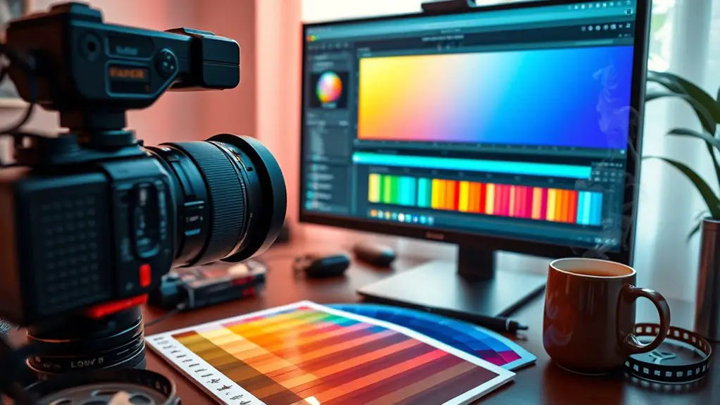
Essential Color Grading Tools and Software
When diving into the domain of color grading, having the right tools can make all the difference in achieving your desired aesthetic. Start with industry-standard color grading software like DaVinci Resolve or Adobe Premiere Pro, which offer advanced features for precise adjustments. Vital tools include color wheels, sliders, and LUTs (Lookup Tables), enabling you to manipulate shadows, midtones, and highlights effortlessly. Don’t overlook scopes like waveforms and histograms; they’re essential for evaluating your color balance and exposure. Additionally, consider using color grading panels for tactile control, enhancing your workflow’s efficiency. With these vital tools at your disposal, you’ll access the creative freedom to transform your footage into a visually stunning masterpiece.
Establishing a Color Grading Workflow
Having the right tools is only the beginning; establishing a color grading workflow is key to maximizing their potential. Start by organizing your footage into bins—this simple step streamlines your process and enhances your focus. Next, develop a consistent color grading technique, such as starting with a primary grade before diving into secondary adjustments. This helps you maintain a coherent vision throughout your project. Utilize color grading software’s batch processing features for workflow optimization, saving time on repetitive tasks. Don’t forget to create a checklist for each grading session, ensuring you address all elements methodically. Remember, experimenting with various techniques can lead to unique results, so embrace that creative freedom while keeping your workflow efficient and effective.
Creating a Mood With Color Palettes
To effectively create a mood in your videos, you need to understand color psychology and how different hues evoke specific emotions. By choosing complementary colors, you can enhance visual appeal while maintaining coherence in your narrative. Additionally, establishing a consistent color scheme throughout your project will reinforce the mood and elevate the overall impact of your work.
Understanding Color Psychology
Color can evoke powerful emotions and set the tone for your video, often without viewers even realizing it. Understanding color psychology is essential for creating a compelling narrative. Each hue carries specific color associations; for instance, blue can evoke calmness, while red sparks passion. By strategically selecting your color palette, you tap into these color emotions to enhance storytelling. Consider warm colors for inviting scenes and cool shades for introspective moments. Experiment with saturation and brightness to deepen the emotional impact. Remember, the right color choices can transform a simple scene into a memorable experience, allowing you to express creativity and connect with your audience on a profound level. Embrace color’s potential to elevate your video projects considerably.
Choosing Complementary Colors
When you choose complementary colors, you’re not just adding visual interest; you’re actively shaping the mood and emotional resonance of your video. Utilizing color harmony techniques, you can create a striking balance that draws the viewer in. For example, pairing warm tones with cool shades can evoke feelings of tension or harmony, depending on how you apply them. Experiment with color pairing strategies like the 60-30-10 rule, which guides you in proportioning dominant, secondary, and accent colors. By thoughtfully selecting complementary hues, you can enhance narrative elements and amplify emotional responses. Don’t shy away from bold choices; your creative freedom allows you to push boundaries, ensuring your video not only stands out but also resonates deeply with your audience.
Creating Consistent Color Schemes
Building on the foundation of complementary colors, creating consistent color schemes can greatly enhance the mood and cohesion of your video. Begin with a clear palette selection that aligns with your intended narrative—consider the emotions you wish to evoke. Aim for color harmony by limiting your palette to three to five colors that work together seamlessly. Use shades and tints of these colors to maintain visual interest while preserving consistency. Don’t shy away from experimenting; however, make certain that every choice serves the story. This thoughtful approach fosters an immersive experience, allowing your audience to engage more deeply. By mastering these principles, you’re not just editing; you’re crafting a visual journey that resonates with viewers on a profound level.
Using Color Wheels and Curves for Precision
Though you might be familiar with basic color correction techniques, utilizing color wheels and curves can elevate your video’s visual storytelling to new heights. Color wheel techniques allow you to manipulate shadows, midtones, and highlights independently, giving you precise control over your color palette. By adjusting these elements, you can create a mood that resonates with your audience.
Curve adjustments, on the other hand, enable you to refine tonal ranges, enhancing contrast and saturation with surgical accuracy. By dragging points on the curve, you can selectively brighten or darken areas, allowing for dynamic shifts that draw viewers in. Together, these tools empower you to craft a visually compelling narrative, ensuring your story shines with vibrancy and emotional depth.
The Importance of Color Correction
Color correction is essential for elevating your video’s visual appeal, guaranteeing that every frame captivates your audience. It also plays an important role in maintaining a consistent tone throughout your project, guiding viewers through an immersive experience. Additionally, addressing color imbalances not only enhances realism but also assures that your narrative unfolds with clarity and impact.
Enhancing Visual Appeal
Achieving a visually stunning video often hinges on one essential element: color correction. This process isn’t just about fixing issues; it’s a powerful tool for enhancing visual appeal and elevating your visual storytelling. You’ll need to master various color grading techniques to evoke emotions and create a cohesive narrative. By adjusting hues, saturation, and contrast, you can draw viewers into your narrative, guiding their eyes where you want them to focus. Experiment with palettes that resonate with your story’s themes—warm tones for intimacy or cooler shades for tension. Remember, the right colors can transform mundane footage into enchanting art, allowing your creativity to shine and giving your audience the freedom to experience your vision fully.
Ensuring Consistent Tone
While you might focus on individual shots to create striking visuals, ensuring a consistent tone throughout your video is equally essential. Color consistency helps you maintain a cohesive aesthetic, enhancing the viewer’s experience. When color grading, consider these key points for effective tone matching:
- Establish a reference shot for uniformity
- Utilize scopes to monitor color balance
- Match key colors across different clips
- Adjust saturation and contrast for harmony
- Create a color palette that reflects your theme
Correcting Color Imbalances
When you immerse yourself in the world of video editing, correcting color imbalances becomes essential for achieving a polished final product. Color grading isn’t just about enhancing aesthetics; it’s about establishing the right color balance to convey your narrative effectively. Start by analyzing your footage for any dominant hues that disrupt the visual harmony. Use tools like the RGB parade or vectorscope to identify shifts in color. Adjust the shadows, midtones, and highlights to neutralize unwanted tints and guarantee a cohesive look across all scenes. Remember, subtlety is key; over-correction can lead to unnatural results. By mastering color correction, you’ll not only elevate your projects but also free the creative freedom to express your artistic vision more vividly.
Exporting Your Final Color-graded Video
After you’ve meticulously color graded your video, the next step is to export it in a format that preserves your hard work while guaranteeing compatibility with your intended viewing platforms. Choosing the right export settings is vital for achieving the best results. Here’s what to take into account:
After color grading, export your video with the right settings to ensure compatibility and preserve quality.
- Resolution: Match it to your target platform’s requirements.
- Bitrate: Balance quality and file size for ideal performance.
- Final Formats: Select from options like MP4, MOV, or AVI.
- Frame Rate: Confirm it aligns with your original footage for smooth playback.
- Audio Settings: Don’t overlook the importance of clear, high-quality sound.
Frequently Asked Questions
How Long Does Color Grading Typically Take for a Project?
Color grading can take anywhere from a few hours to several days, depending on project size. On average, professionals spend about 10% of their editing time on grading speed, balancing creativity with efficiency to achieve stunning results.
Can I Color Grade on a Laptop or Do I Need a Desktop?
You can definitely color grade on a laptop, but make certain it has sufficient performance for your chosen color grading software. A powerful laptop offers flexibility, allowing you to work creatively without being tethered to a desktop.
What Is the Difference Between Color Grading and Color Correction?
Color grading techniques enhance mood and style, while color correction processes fix exposure and balance. Understanding these differences lets you creatively manipulate visuals, ensuring your footage resonates with your audience’s emotions and artistic vision.
How Do I Know if My Colors Are Accurate on Screen?
To guarantee your colors are accurate on screen, you’ll need color calibration and monitor profiling. Regularly calibrating your display helps maintain fidelity, giving you the freedom to trust your creative choices without second-guessing your colors.
Are There Any Free Color Grading Tools Available?
You’ll find plenty of free software for color grading out there, like DaVinci Resolve and HitFilm Express. They offer robust features without costing a dime, giving you the freedom to express your creative vision effortlessly.
