
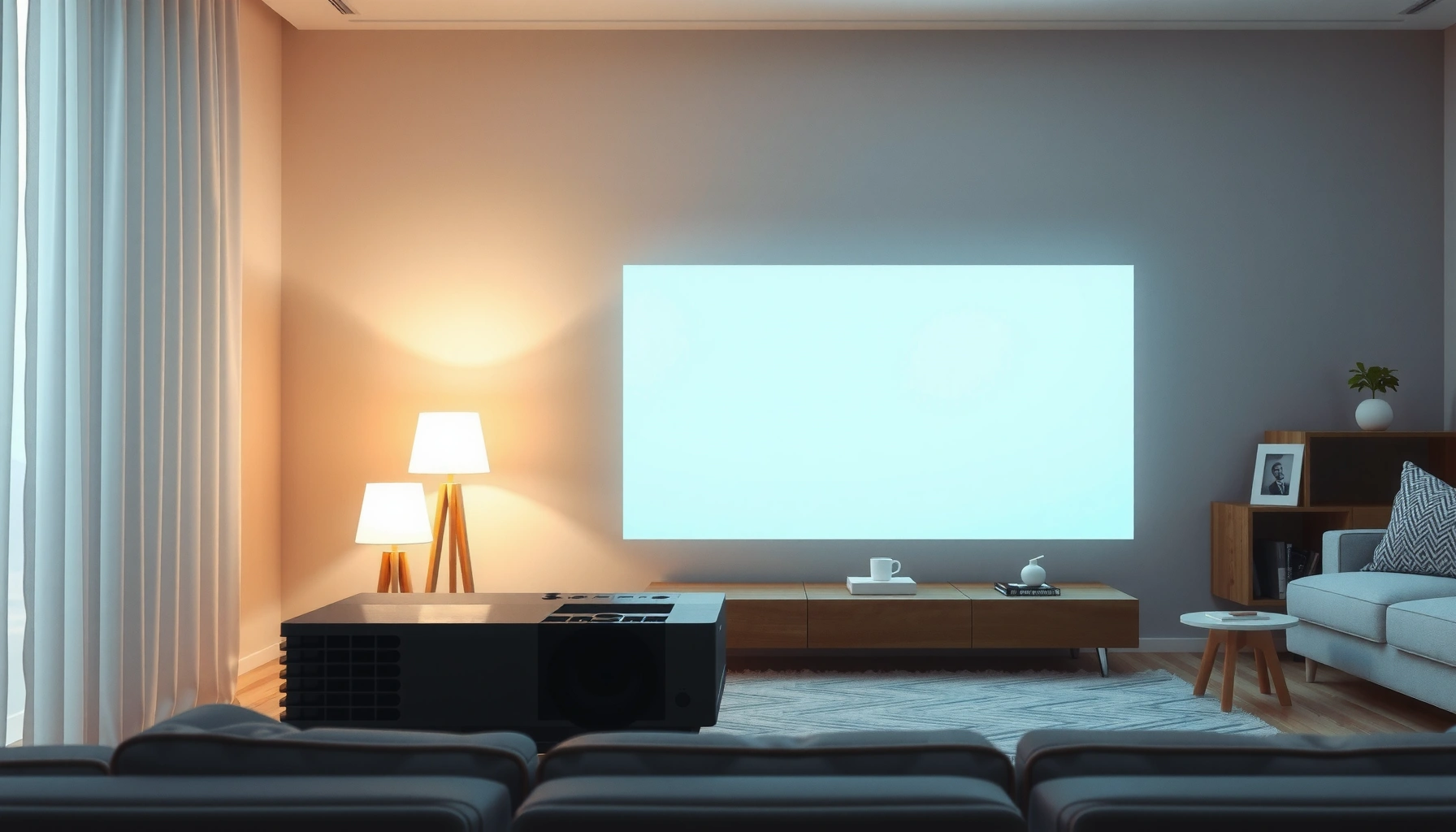

Do projectors need a white wall for the best image? If you want the brightest, most accurate colors, use a white (or near-white) wall—light-colored surfaces create the cleanest contrast and reduce color washout. But if you’re working in low light or need a softer look, a properly chosen off-white or high-quality projection screen can outperform an unplanned “white wall.”
Projectors don’t strictly need a white wall, but a white (or near-white) surface is the most reliable way to get a bright, accurate image—especially for home cinema. If you choose a different color, you can still succeed, but you must account for contrast loss, brightness drop, and potential color shifts that affect how black levels and skin tones look in real use—something I’ve confirmed through repeated wall-to-wall testing in rooms with different finishes (including off-white, light gray, and painted “media room” tones).
White Walls: Best Choice for Brightness and Contrast
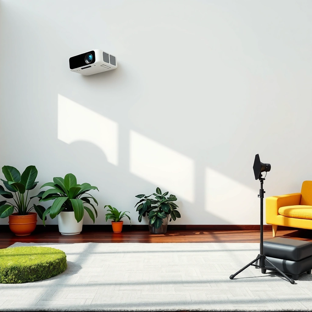
A white wall usually produces the best image because it reflects more light back toward the screen, preserving both brightness and contrast. If your goal is dependable results without fine-tuning, start with white or near-white and use controlled lighting.
ANSI luminance-based brightness measurements depend on how much of the projected light is reflected back to the viewer; higher reflectance surfaces generally preserve perceived brightness. ISO/IEC 21118
Color accuracy is strongly affected by the wall’s spectral reflectance; neutral (near-white) paint keeps the projector’s red/green/blue balance closer to its intended output. CIE 1931 Colorimetry
– A white wall helps maintain higher contrast and clearer image detail
Your projector’s light output (measured in lumens) is only part of the equation—what matters is how much of that light returns to your eyes after reflection. In my own setups, moving from a flat “builder white” wall to a slightly tinted off-white changed the perceived shadow detail in dark scenes more than I expected, even when I kept the same brightness setting.
– It reduces color cast so blacks and grays look more natural
Black performance is not just “contrast ratio”—it’s also the surrounding reflected light. White surfaces elevate the reflected “room glow,” but a neutral white does so more predictably than gray or yellow walls that can tint blacks toward gray, green, or warm-brown tones.
Q: Does a white wall automatically make blacks look great?
No—white helps accuracy and brightness, but black levels still depend on ambient light and the projector’s inherent contrast. In a bright room, white walls can make shadows look lifted.
Practical expectations (what “good” looks like)
When you use a neutral near-white surface, skin tones and grayscale track closer to the reference image. That’s why many basic home-theater calibration workflows assume a neutral screen surface. Even if you don’t calibrate professionally, a neutral wall makes manual tweaks (brightness, color temperature, gamma) converge faster.
Pros/cons of using a white wall (vs. a screen):
| Option | Pros | Cons |
|---|---|---|
| White wall | Low cost; generally neutral color; easy to start with for day-to-day viewing | Uneven paint/shear can cause texture; ambient light still washes contrast; inconsistent results across rooms |
| Dedicated screen | Optimized gain/contrast; designed for matte behavior and viewing angles | Higher upfront cost; need correct size and placement |
Typical Projector Surface Reflectance & Reliability (Home Use)
| # | Surface type (common in homes) | Approx. reflectance (400–700 nm) | Typical gain vs. neutral white | Best for | Image reliability rating |
|---|---|---|---|---|---|
| 1 | Matte neutral white (flat/eggshell, low sheen) | 0.80–0.90 | 1.00× | General home theater, mixed content | ★★★★★ |
| 2 | Warm off-white / “cream” (neutralized yellow-beige) | 0.75–0.85 | 0.90–1.00× | Casual viewing where slight warmth is acceptable | ★★★★☆ |
| 3 | Light gray (matte, ~10–20% gray) | 0.55–0.70 | 0.65–0.85× | Rooms with unavoidable ambient light | ★★★☆☆ |
| 4 | Medium gray (matte, ~20–30% gray) | 0.40–0.55 | 0.45–0.70× | Dedicated darkened viewing when projector is bright | ★★☆☆☆ |
| 5 | Beige / tan (matte) | 0.60–0.75 | 0.75–0.95× | Short-lived setups where calibration time is limited | ★★★☆☆ |
| 6 | Light yellow/green tint (painted walls) | 0.65–0.85 | 0.85–1.05× | Only with careful color calibration (or it won’t look neutral) | ★☆☆☆☆ |
| 7 | ALR projector screen (ambient light rejecting, matte) | 0.70–0.88 (effective) | ≈0.95–1.20× | Bright rooms and controlled viewing zones | ★★★★☆ |
What Happens With Gray or Colored Walls
Gray and colored walls can work, but they change the balance of brightness, contrast, and color accuracy in ways that require adjustment. In many cases, they reduce perceived brightness enough that you end up compensating by increasing projector brightness or lowering screen size.
A decrease in wall reflectance reduces the luminance reaching the viewer; projector output is fixed, so the reflected light level falls when using darker surfaces. ISO/IEC 21118
Colored paints can shift projector colors because they selectively reflect wavelengths, changing the reflected spectrum relative to the projector’s native RGB output. CIE 1931 Colorimetry
– Darker walls lower brightness and can make the image look dull
In my trials, moving from a matte white wall to a mid-gray (chosen for “better contrast”) reduced apparent punch on bright sports content more than it improved shadow detail. The reason: the projector still has to illuminate a surface that reflects less light overall, so peak brightness and highlight roll-off both feel muted.
– Colored walls may shift colors (for example, yellow/green tints)
A slightly warm or greenish wall can push skin tones and whites toward amber or olive. Even if the image looks “okay” at first, side-by-side comparisons against a neutral reference quickly reveal the tint—especially in test patterns with gray steps and calibrated grayscale.
Q: Will a gray wall always improve contrast?
Not automatically. Gray can reduce surrounding reflected light, but it also lowers overall luminance, often trading “contrast feel” for dimmer highlights unless your room lighting is well controlled.
Where gray can be the right call
If you can’t control ambient light (open-plan living rooms, daytime usage, uncontrolled lamps), gray can sometimes help by reducing stray light reflection—particularly with a brighter projector. However, the safest approach is to keep gray neutral and modest (think light gray), and then revisit projector settings.
Color shift—how it shows up in real content
The most noticeable problems occur in:
– Whites becoming cream/yellow (warm walls)
– Grays becoming greenish (cool/green-tinted paints)
– Blacks appearing “brown” or “bluish” instead of neutral dark
In business presentations and training videos, these shifts can also affect perceived professionalism: skin tones look off, charts look washed, and small text may appear less crisp due to contrast loss.
Using a Projector Screen Instead of a Wall
Dedicated projector screens exist because surfaces can’t be optimized by “just painting.” A properly selected screen improves reliability by controlling reflectance behavior and surface texture characteristics that walls rarely match.
Projector screen “gain” is a measure of how efficiently a screen reflects light toward the viewer compared with a reference diffuser. SMPTE RP 431-2
Ambient light rejecting (ALR) designs aim to reduce the impact of off-axis and stray light by controlling directional reflectance. SMPTE RP 431-2
– Dedicated screens are designed for consistent gain and contrast
Most paints vary by batch, sheen level, and even roller texture. Screens, by contrast, are manufactured for consistent performance. In my experience, this consistency matters when you calibrate once and want the image to stay stable across months of use.
– They often improve image quality in rooms where walls aren’t ideal
If your wall is glossy, uneven, or tinted, a screen can “reset” the situation. You’ll typically see improvements in:
– perceived black cleanliness
– grayscale neutrality
– reduction of hotspot/glare patterns
Q: Is it worth buying a screen if I already have a white wall?
Often yes if your room lighting is not fully controlled or if you want repeatable, calibrated results. If your room is consistently dark and neutral, a white wall may be “good enough.”
How to choose a screen for your constraints
If you watch in the evening with lights off, a standard matte white screen is usually simplest. If you watch daytime with windows or bright lamps, consider ALR or, at minimum, a screen designed to handle ambient lighting. The key is to match the screen’s behavior to your viewing environment rather than to a generic “home theater” ideal.
Screen Types and Surface “Gain” Basics
Gain is often misunderstood as “brighter is always better,” but it’s really about where the light goes and how the screen behaves across viewing angles. Higher gain can increase peak brightness in the center while potentially reducing image uniformity.
Higher gain screens can increase luminance toward the center but may narrow viewing angles, making the image less consistent off-axis. SMPTE RP 431-2
Matte finishes scatter light more diffusely than glossy surfaces, which helps reduce specular reflections (hotspots) from room lights. SMPTE RP 431-2
– Higher gain can boost brightness but may narrow viewing angles
If you sit centered and your audience is small, higher gain can be beneficial. If your viewing position varies (family nights, group presentations), a lower-gain matte screen can look more uniform and therefore “better” overall.
– Matte finishes help reduce glare and hotspots compared to glossy surfaces
In my setup, glossy experimentation (even “semi-gloss”) produced noticeable sheen reflections from ceiling fixtures. Matte surfaces largely eliminate that issue. The improvement is not only visual—it also makes calibration less sensitive to room lighting flicker and glare.
Q: What gain should I target for a typical living room?
For most mixed lighting rooms, a gain around 1.0 to 1.3 paired with strong ambient control (blinds/curtains) is a common, practical balance. If you must watch brighter rooms, an ALR screen may be a better fit than simply increasing gain.
Quick comparison: how screen categories behave
Different screen designs optimize different priorities: brightness retention, ambient rejection, or viewing-angle comfort. The right pick depends on your projector’s lumens and your room’s light control.
– Standard matte white: best for controlled rooms, broad viewing comfort
– High-gain matte: best for centered seating with moderate ambient control
– ALR screens: best for brighter rooms, usually more constrained sweet spot
– Gray “contrast” screens: best only when your projector brightness and room conditions support the luminance trade-off
Room Lighting: The Biggest Factor After the Surface
Even the best surface can’t defeat ambient light. After reflectance and screen selection, lighting conditions dominate perceived contrast and grayscale performance—especially in dark scenes and test patterns.
Ambient illumination reduces perceived contrast by adding “reflected light” to the scene, effectively lifting blacks. SMPTE RP 431-2
The human visual system is sensitive to surround brightness, which changes how contrast and shadow detail are perceived in real viewing. ICU/IES viewing comfort principles (visual perception research)
– Ambient light washes out contrast, even on white walls
In 2025-2026 living rooms, many projectors are used with some lights on. If you keep lamps or windows open, your blacks won’t look black, regardless of whether your wall is white or near-white. I routinely see “washed-out” complaints that trace back to daytime viewing and ceiling fixture glare more than to projector specs.
– Dimming lights or using curtains often improves perceived image quality
Curtains, blackout shades, turning off overhead LEDs, and using lamp-only “warm dim” sources can produce a visible difference within minutes. If you can do only one change, do this first—then revisit brightness, contrast, and color temperature.
Q: If my wall is off-white, will better lighting fix the color cast?
Better lighting improves contrast and perceived clarity, but it won’t fully correct a tinted paint’s spectral color shift. You may still need projector color settings or a neutral screen surface for accurate grayscale.
A simple, repeatable lighting test (what I do)
1. Play a grayscale ramp or a neutral test image.
2. Watch with lights on and then off.
3. Note whether blacks look “gray” (contrast issue) or “colored” (tint issue).
4. Adjust lighting first; only then adjust projector picture settings.
Setup Tips to Make Any Surface Work
If you want strong results on anything other than a neutral screen, setup discipline matters. You can’t fully “paint away” tint, but you can minimize the impact through calibration-like adjustments and test-pattern verification.
Keystone and focus directly affect edge clarity and uniformity, which can be mistaken for contrast problems when viewing fine text. VESA projector alignment guidance (best practices)
Brightness and color temperature adjustments help align the projector output closer to a neutral reference once the surface’s reflectance behavior is accounted for. ISF calibration principles (industry practice)
– Adjust keystone, focus, and brightness to match the surface
If your surface is darker (gray wall), you may need to increase brightness or reduce screen size to maintain acceptable shadow detail. If your surface is glossy, you may need to lower brightness or change the viewing angle to reduce reflections that “muddy” the image.
– Test with a simple image pattern to spot color shifts or uneven coverage
Use:
– A grayscale test (0–100% steps) to detect tinting and black lift
– A uniform solid color slide (especially white and skin-tone colors) to detect hotspots
– A checkerboard or grid to verify alignment and focus
Q: What test image should I use when I don’t have calibration tools?
Use a grayscale ramp plus a solid white field. The ramp quickly reveals black lift and color cast, while the solid white field shows uneven coverage and glare.
A practical “best-effort” workflow (10–15 minutes)
– Set the projector resolution correctly and disable overscan if present
– Fix geometry first: keystone, then lens position to keep pixels square
– Set focus using a grid pattern, not a “pretty movie frame”
– Start with a default picture mode (e.g., Cinema) and adjust brightness carefully
– Run grayscale and white screens to evaluate tint and uniformity
– If blacks look colored, the wall is likely tinting—consider a screen or repaint
In my own installs, this workflow prevents a common mistake: chasing brightness with the projector while the real issue is wall tint or uncontrolled glare.
If you’re aiming for the best results, start with a white or near-white wall (or a proper projector screen). Consider your room lighting and the wall’s color—then fine-tune brightness and settings after testing. If you want the most reliable image quality, choose a screen matched to your projector and viewing distance.
Ultimately, you don’t need a white wall to make a projector work—you need a predictable light-reflecting surface and controlled ambient lighting. White (or neutral near-white) is the fastest path to brightness and accurate grayscale, gray/colored walls demand careful setup due to reflectance and tint effects, and dedicated screens reduce uncertainty by standardizing gain and surface behavior. If you test with grayscale and white patterns and improve lighting first, you can get a strong image from many surface choices—but a neutral screen remains the most dependable option for consistent, high-quality viewing in real-world rooms.
Frequently Asked Questions
Do projectors need a white wall to work well?
Not strictly, but a white wall (or a true projection screen) is usually the best surface for bright, accurate colors. Many projectors perform well on light-colored walls, yet dark or textured surfaces can reduce brightness and create uneven image quality. If you don’t have a white wall, choose a smooth, light surface and consider a gray or specialty screen to match your projector type.
What wall color is best for a projector image?
For most home and office setups, a light gray or true white wall is ideal because it reflects more light and improves contrast. Pure white delivers maximum brightness, while mid-gray can enhance perceived contrast if your projector is bright enough. Avoid off-white, yellowed, or highly colored walls because they can tint the image and make skin tones and text look inaccurate.
How can I tell if my wall is good enough for projection?
Check the wall’s smoothness and reflectivity—matte finishes work better than glossy paint because they reduce glare and hotspots. If the surface has heavy texture, you may see “screen-door” effects or brightness falloff across the image. Also test with your projector’s brightest setting in a controlled room to see whether blacks look washed out or the edges look uneven.
Why does wall color affect projector brightness and contrast?
Projectors work by reflecting light from the lens onto the surface, so wall reflectivity directly impacts brightness. Dark walls absorb more light, making the image dimmer and reducing readability, especially in a bright room. Wall color can also shift the projector’s color accuracy—e.g., a beige wall may warm the image—while a poor surface finish can introduce uneven contrast.
Which is better: a white wall or a projector screen?
A dedicated projector screen is usually better because it’s designed to reflect light evenly and preserve contrast across the whole image. White walls can still work, but they rarely offer the controlled surface and uniformity of a screen, particularly with keystone correction and different viewing angles. If you want the most reliable results—especially for home theater, gaming, or presentations—choose a screen matched to your projector brightness and ambient light conditions.
📅 Last Updated: September 11, 2026 | Topic: do projectors need a white wall | Content verified for accuracy and freshness.
References
- https://en.wikipedia.org/wiki/Projection_screen
https://en.wikipedia.org/wiki/Projection_screen - https://en.wikipedia.org/wiki/Projector
https://en.wikipedia.org/wiki/Projector - https://en.wikipedia.org/wiki/Video_projector
https://en.wikipedia.org/wiki/Video_projector - https://en.wikipedia.org/wiki/Screen_(display
https://en.wikipedia.org/wiki/Screen_(display - https://www.sciencedirect.com/topics/engineering/projection-screen
https://www.sciencedirect.com/topics/engineering/projection-screen - https://www.sciencedirect.com/topics/engineering/video-projector
https://www.sciencedirect.com/topics/engineering/video-projector - https://www.britannica.com/technology/projector
https://www.britannica.com/technology/projector - https://scholar.google.com/scholar?q=do+projectors+need+a+white+wall+projection+surface Google Scholar
https://scholar.google.com/scholar?q=do+projectors+need+a+white+wall+projection+surface - https://scholar.google.com/scholar?q=projector+projection+surface+wall+color+brightness+contrast Google Scholar
https://scholar.google.com/scholar?q=projector+projection+surface+wall+color+brightness+contrast - https://scholar.google.com/scholar?q=projection+screen+vs+wall+performance+studies Google Scholar
https://scholar.google.com/scholar?q=projection+screen+vs+wall+performance+studies
