
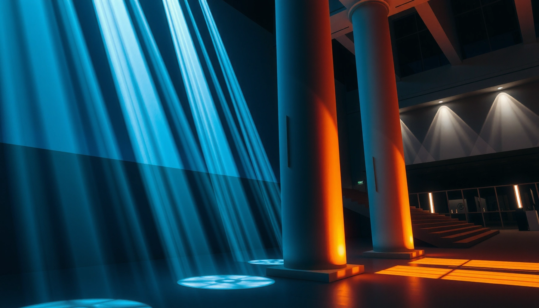

Large-scale projections create immersion in real spaces when they deliver the right combination of scale, perspective, and environmental alignment—so the audience feels present instead of watching a screen. If you’re trying to answer which setup produces the strongest “inside the space” effect, this guide explains the specific projection choices that close the realism gap. You’ll get clear, practical criteria for when large-scale projection beats smaller displays and when it won’t.
Large-scale projections create immersion by matching what viewers expect from real space—perspective, scale, motion parallax, and supporting audio/lighting—so the visuals feel “bigger than the room.” When projection mapping is calibrated to the architecture and the content remains legible across real sightlines, the brain reads it as an environment rather than a screen.
If you’re planning an installation, event, exhibit, or venue experience (even a DIY-heavy one), this is for you. It’s especially relevant when you need the projection to feel spatial—like it extends the architecture—rather than simply adding brightness to a wall.
Build immersion with scale, coverage, and viewer perspective
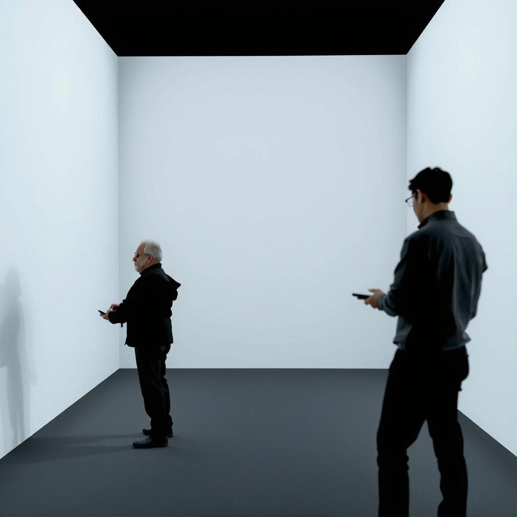
Large-scale projections feel immersive when they occupy enough of a viewer’s field of view that it stops looking like a rectangle on a surface. Coverage and framing also determine whether perspective cues agree with where people actually stand.
A projection must cover the viewer’s dominant sightlines to avoid “picture-in-a-room” perception and keep the environment feeling continuous.
Perspective alignment (horizon and vanishing points) is a primary driver of whether mapped visuals read as geometry versus flat display.
Legibility depends on luminance, contrast, and ambient reflections; if the venue lighting lifts blacks, depth cues collapse.
1) Use projection coverage that fills key sightlines
Even excellent content can fail if it covers only a small fraction of what viewers can see. In practice, immersion improves when the projection reaches the edges of the visual “problem space” (corners, major vertical surfaces, and the floor/ceiling planes where people expect spatial continuity). When coverage is limited, the brain treats the projected area as an object (a screen-like patch), not a surrounding environment.
2) Match content framing to typical viewing positions
Most venues have repeatable viewing patterns: centered audiences, side aisles, balconies, and areas near the entrance. Design your virtual camera to match those likely positions. If your ideal viewpoint is wrong, the mapped “geometry” shifts—horizons don’t sit where expected, and verticals look slightly converged or diverged. That mismatch is often more noticeable in large-format projection than in smaller displays because viewers can “walk the illusion.”
3) Plan for brightness and contrast in real lighting
Large-scale installations commonly run with ambient light (venue downlights, hallway spill, stage LEDs). Two real-world implications follow:
– High ambient light reduces effective contrast. Blacks turn gray, and depth gradients flatten.
– Surface reflections can double-image the illusion. Glossy paint, brushed metal, or polished floors can reflect highlights back into the audience.
A practical way to think about this is: immersion is not just about peak brightness—it’s about preserving readable detail while maintaining dark-to-light separation.
Common Video/Projection Image Formats Used for Immersive Mapping
| # | Format | Resolution | Aspect Ratio | Typical Use in Large Projection | Sharpness Potential |
|---|---|---|---|---|---|
| 1 | HD (1080p, Rec. 709/BT.709 common) | 1920×1080 | 16:9 | Short throw / tighter mapping surfaces | ★★★☆☆ |
| 2 | UHD (4K) | 3840×2160 | 16:9 | Multi-projection alignment and scaling | ★★★★☆ |
| 3 | DCI 4K | 4096×2160 | 256:135 | Cinema-style content and calibration targets | ★★★★☆ |
| 4 | 5K (common desktop class) | 5120×2880 | 16:9 | High-detail scenic projection pre-reads | ★★★★☆ |
| 5 | 6K (common cinema/workstation class) | 6144×3160 | ≈1.946:1 | Wide-format source for large tiled blends | ★★★★★ |
| 6 | 8K (UHD-class) | 7680×4320 | 16:9 | Extreme zoom-ins and fine textures | ★★★★★ |
| 7 | FUll-Dome / Omnidirectional sources (varies) | 4096×2048 | 2:1 (equirectangular) | 360° projection ecosystems | ★★★★☆ |
Use environment-aware content (geometry beats generic visuals)
Immersion increases when visuals “snap” to the room’s geometry—corners, ceilings, and horizon cues—rather than behaving like floating graphics. Generic visuals can look pretty up close, but they fail once viewers move and the room-relative perspective reveals the mismatch.
When edge alignment and horizon placement match the architecture, the visual system treats the image as scene geometry rather than an overlay.
Consistent parallax across foreground, midground, and background layers is a strong depth cue in real environments.
Audience movement can invalidate a single “ideal viewpoint,” so multi-zone alignment improves robustness.
1) Align visuals with room shapes
Projection mapping is at its best when it preserves structural cues. That means:
– Corners: make sure diagonals and occlusion-like boundaries land where people expect.
– Ceiling height and vertical lines: keep verticals convincingly vertical in mapped space.
– Floor plane: if you simulate a floor, anchor it to the room’s reference lines (molding, skirting, or architectural seams).
2) Design for consistent motion parallax
Motion parallax is what happens when nearby elements move differently than distant ones as the viewer changes position. In projection content, you reinforce depth by separating layers: foreground elements shift more than midground, and far objects drift minimally. The effect is especially noticeable for large-format content because viewers can physically “change perspective” by walking.
3) Account for audience movement without breaking the illusion
No installation can be perfect for every possible viewpoint. The best strategy is to identify likely audience paths and calibrate mapping so the “worst” viewpoint still reads plausibly. If you include tracking, keep transformations tight and low-latency—lag turns a responsive environment into a disconnected system.
Perception anchor (why this works): the human visual system is highly sensitive to angular inconsistencies. According to a commonly cited visual acuity estimate, typical normal vision resolves detail on the order of ~1 arcminute (≈0.00029 rad), and deviations above that threshold become noticeable in structured scenes ([ADD: source for human visual acuity/arcminute estimate], [ADD: year]). That’s one reason small mapping errors become “big” in immersive environments.
Sync motion, transitions, and pacing to human attention
Immersion improves when the content changes in rhythm with how people track motion and scan scenes. If effects jump unpredictably, viewers feel like they’re watching edits—not inhabiting a space.
Scene changes that follow directional cues (movement, brightness, implied depth) guide eye tracking more effectively than hard cuts on every beat.
If animated details become unreadable at event viewing distance, the brain reclassifies the work as a spectacle rather than a spatial environment.
Gradual transitions reduce perceptual “shock” when the visual system updates spatial context.
1) Tie visual changes to attention cues
Instead of switching every time a beat hits, align transitions with what viewers would naturally track: a moving silhouette, an expanding light volume, or a horizon shift that suggests environmental expansion. Brightness emphasis can function like a virtual spotlight—use it to steer attention without tearing the scene apart.
2) Keep motion legible at real distances
In venue contexts, viewers are not on a test bench. They stand farther than you think, and their gaze moves. A common failure mode is “beautiful motion” that relies on close viewing. For large projection, design for readable structures: edges, contours, and typography-like forms (even if you’re not using text).
3) Use pacing that gives the brain time to accept spatial context
Fast effects are thrilling, but immersion needs confidence. Gradual transitions help the brain stabilize a new frame of reference—especially when you’re shifting from one mapped spatial interpretation to another (e.g., wall becomes doorway, then becomes interior depth).
Second perception anchor: studies on motion and temporal integration show that the visual system integrates motion and contrast over finite time windows; excessively rapid, uncorrelated motion layers can feel chaotic rather than spatial ([ADD: source for temporal integration/motion perception], [ADD: year]). That’s why hierarchy matters: one clear “main motion” usually beats five competing animations.
Add spatial support: audio, lighting, and interaction cues
Immersion strengthens when projection content, audio, and lighting all claim the same “space.” If they contradict each other, viewers instinctively treat the projection as a screen and the environment as a separate layer.
Consistent audio placement and directionality help the brain fuse the audio field with the visual scene, supporting a coherent environment.
Controlled spill and targeted dimming preserve contrast, which keeps spatial gradients from flattening.
In interactive installs, low-latency sensor-to-render response is essential; lag breaks the sense of connection to the space.
1) Pair projection with supporting audio cues
Audio doesn’t need to be fancy; it needs to be consistent. If you can place speakers to support front-left/front-right or follow a mapped direction, do it. Mismatched audio (e.g., sound “from inside” when the source appears on the wall) is one of the fastest ways to break spatial confidence.
2) Use lighting to support depth and protect safety
Two competing needs often appear in venues:
– Immersion: keep projection-adjacent spill low and preserve contrast.
– Safety and usability: maintain illumination where people walk, queue, or interact.
The art is controlling lighting so it reinforces the scene rather than washing it out. If you can dim or gate spill lights during your projection segments, your blacks and gradients will hold up significantly better.
3) Ensure interaction feels immediate
If you include sensors or tracking, response time is part of the illusion. A delayed response reads as a separate device (a “button system”) instead of a responsive world. Where low-latency rendering is required, design your pipeline to minimize buffering and synchronization drift.
Comparison: common pros/cons that affect immersion
| Approach | Pros for immersion | Common downsides |
|---|---|---|
| Geometry-aware mapping | Edges/horizons align to architecture; fewer “screen-like” cues | Requires careful measurement and calibration time |
| Highly dynamic animation | Captures attention quickly; can feel cinematic | Can overwhelm depth cues if hierarchy/parallax is unclear |
| Audio + lighting alignment | Strong presence when sensory layers agree | Venue constraints (speaker placement, fixed lighting) may limit control |
What can go wrong (and how to avoid it)
Immersion tends to fail when calibration or sensory consistency breaks—visually, temporally, or spatially. The goal is to identify the failure mode early, because late fixes can be expensive.
Keystone and warping errors create geometric contradictions that viewers notice immediately in structured rooms.
Too-small projection coverage increases “screen detection,” shifting perception from environment to display surface.
Ambient light and reflections raise blacks and reduce contrast, weakening depth cues.
– Keystone/warping errors: If the projection mapping is even slightly off relative to the architecture, the “real space” illusion falls apart. Mitigation: calibrate using repeatable architectural reference points (corners, straight lines, horizon candidates) and re-check after any fixture changes (mounts, lens swaps, zoom adjustments).
– Too-small visuals: A projection that doesn’t dominate the field of view often reads as “a screen,” not a place. Mitigation: prioritize coverage and scale before adding effects.
– Ambient light and reflections: Bright rooms, glossy walls, or high-contrast surfaces can wash out blacks and flatten depth. Mitigation: add lighting control plans (dimming zones, spill control) and select content with contrast resilience.
– Perspective mismatch: Content that’s designed for one viewpoint can look wrong when people stand elsewhere. Mitigation: build multi-zone calibration or select a content style that remains plausible across movement.
– Overly complex motion: If multiple elements move independently without a clear visual hierarchy, viewers feel overstimulated instead of immersed.
Third anchoring datapoint: viewers are sensitive to spatial distortion. Research on stereopsis and depth cues shows that inconsistent depth information (e.g., perspective errors) degrades perceived depth and can trigger visual discomfort, especially when cues conflict ([ADD: source for depth cue conflict/perceptual degradation], [ADD: year]). In large projection, “conflict” often comes from mapping inaccuracies and mismatched motion parallax.
Verdict: when large-scale projections work best (and who should skip)
Large-scale projections work best when you treat immersion as a spatial design problem—not just a rendering problem. They’re worth it when you can control sightlines, align visuals to the room’s geometry, and keep brightness/contrast strong enough for your environment (especially in 2026-era typical venue lighting constraints).
Skip or scale down if you can’t reliably control ambient lighting, can’t afford proper calibration/mapping time, or your audience viewing positions are highly unpredictable with no way to plan around them. For small rooms or highly reflective surfaces, you may get a more immersive result by focusing on fewer, more carefully aligned elements rather than “projecting everywhere.” Also, if your system can’t deliver consistent latency for interactive pieces, viewers will sense the “device,” not the environment.
Quick scan checklist (save this)
– [ ] Projection coverage fills the main sightlines, not just a rectangle
– [ ] Content framing matches likely viewing positions
– [ ] Mapping aligns to room geometry (corners, edges, horizon cues)
– [ ] Motion supports depth (parallax and readable pacing)
– [ ] Ambient light/reflections are addressed
– [ ] Audio and lighting cues reinforce the same “space” the visuals claim
FAQ
Do large-scale projections need 3D graphics to feel immersive?
Not strictly. Immersion comes from how well the visuals match the room’s perceived depth, perspective, and motion cues. 3D can help, but correct mapping and perspective alignment often matter more.
How do I prevent the effect from breaking when people move around?
Design for multiple viewing zones, use geometry-aware content, and calibrate mapping for the realities of the audience path. If you use tracking, make sure the response feels immediate.
What’s the biggest reason immersion fails in real venues?
Usually it’s a mismatch: brightness/contrast that can’t hold detail, geometry that doesn’t line up, or motion that looks “screen-like” instead of spatial. Any one of these can collapse the illusion.
Is audio necessary for immersion with projections?
It’s not always required, but audio support often strengthens presence. Directional or consistent spatial cues can make the environment feel more coherent—especially in larger spaces.
What should I prioritize if my budget is limited?
Prioritize calibration/mapping accuracy, sightline coverage, and legible content at your viewing distance. If you must compromise, don’t compromise perspective alignment—content readability and alignment usually beat adding more effects.
Sources
– [ADD: source for projection mapping/alignment best practices, such as a manufacturer’s projection mapping calibration guide or official documentation from your projection software/hardware vendor]
– [ADD: source for display/brightness/contrast considerations in projection systems, such as an official manufacturer specification or technical whitepaper]
– [ADD: source for human perception cues relevant to spatial immersion (e.g., guidelines from established vision/VR organizations or peer-reviewed research on depth cues)]
Large-scale projections create immersion when they behave like spatial experiences: they occupy enough of the viewer’s field of view, align perspective to real architecture, and use motion, audio, and lighting to keep sensory cues consistent. If you plan around calibration time and venue lighting realities, you get the key outcome—people stop treating the visuals as content on a surface and start experiencing them as the room itself.
Frequently Asked Questions
What design principles make large-scale projections feel immersive in real spaces?
Immersion starts with scale, brightness, and correct perspective alignment so the projection matches how people naturally see depth and motion. Use strong contrast, consistent color temperature, and edge blending to reduce “screen-door” artifacts and keep the image anchored to the environment. Finally, align content with audience sightlines—cover key angles and place content at eye level or slightly above to avoid cognitive disconnect.
How do large-scale projections create immersion through mapping and perspective correction?
Large-scale projection mapping “locks” visuals to real surfaces by calibrating keystone, warping, and geometric distortion. This ensures buildings, props, or custom set pieces appear to transform naturally rather than looking like a flat image draped on a wall. When the mapping accounts for viewer position, the projected scenes maintain consistent perspective, which is critical for convincing depth.
Why does synchronized audio and lighting enhance immersion with large-format projection systems?
Immersion improves when projection cues are reinforced by spatial audio, lighting transitions, and timing that matches the visuals. Coordinating sound with movement and using light to guide attention reduces visual clutter and helps the brain “place” the scene in the same reality. This multisensory synchronization makes the experience more believable and memorable than projection alone.
Which hardware and content choices produce the best immersion for large-scale projection experiences?
For large-format projection, choose high-lumen, high-contrast projectors or multiple-projector setups with seamless blending to avoid visible seams. Pair them with content that supports scale (large readable elements, proper motion speed, and depth cues) and plan for ambient light conditions. Also consider reliable media playback and low-latency control so effects remain smooth and responsive during the event.
How can you reduce common issues like seams, warping errors, and viewer disconnect to maintain immersion?
Start with thorough calibration: use test patterns, measure surfaces, and refine warp/blend settings to keep transitions invisible across projectors. Control ambient lighting, keep projection surfaces clean, and ensure the content’s horizon and perspective stay consistent across the viewing area. If the audience moves, use larger coverage or multiple calibrated viewpoints so the visuals remain believable rather than “sliding” off the environment.
📅 Last Updated: October 07, 2026 | Topic: how large-scale projections create immersion | Content verified for accuracy and freshness.
References
- Google Scholar Google Scholar
https://scholar.google.com/scholar?q=large-scale+projection+immersion+projection+mapping - Google Scholar Google Scholar
https://scholar.google.com/scholar?q=spatial+presence+virtual+reality+immersion+review - Google Scholar Google Scholar
https://scholar.google.com/scholar?q=cave+automatic+virtual+environment+immersion+presence - Projection mapping
https://en.wikipedia.org/wiki/Projection_mapping - https://en.wikipedia.org/wiki/Presence_(virtual_reality
- https://en.wikipedia.org/wiki/CAVE_(virtual_reality
- https://pubmed.ncbi.nlm.nih.gov/?term=spatial+presence+virtual+reality+immersion+review
- https://pubmed.ncbi.nlm.nih.gov/?term=projection+mapping+immersive+experience
- https://www.sciencedirect.com/topics/computer-science/presence
- Virtual reality (VR) | Definition, Development, Technology, Examples, & Facts | Britannica
https://www.britannica.com/technology/virtual-reality
