
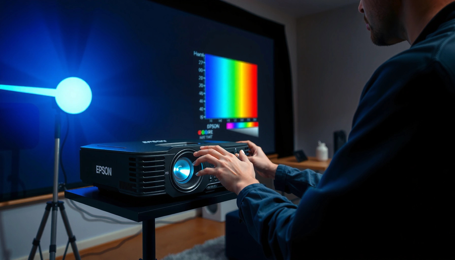

Want to calibrate an Epson projector for accurate color and razor-sharp focus? This guide delivers a clear, step-by-step calibration workflow that starts with the right picture mode and ends with measurable adjustments to gamma, color, sharpness, and lens alignment. If you follow it in the order given, your Epson will look correct out of the box and stay consistent across inputs.
Calibrating an Epson projector usually comes down to adjusting focus/zoom first, then setting the correct color mode and running available auto-calibration (or doing careful manual tweaks). Do it in that order, and you’ll avoid the most common problem—fixing color that later “moves” when geometry changes. This article walks you through the exact sequence to get a sharper image and more accurate colors without guesswork.
If you’re seeing dull colors, off-white backgrounds, washed-out blacks, or the picture looks slightly out of focus, this guide is for you. It’s most useful for Epson home theater/office projectors that have color modes and at least basic picture controls in the on-screen menu.
Pre-checks: positioning, screen, and signal
You’ll get the best calibration results when the projector’s position, screen, and input signal are already correct before you touch any picture settings. Small geometry errors (placement, warp, keystone) can make the image look like a calibration issue even when your colors and focus are fine.
Warm-up matters: the projector’s output can drift during startup, so calibration should begin after a stable operating period.
Use a clean, known-good input because brightness/white balance settings respond to the actual signal you feed the projector.
Avoid calibrating with keystone/warp adjustments that you haven’t finalized—geometry changes can negate “tuned” results later.
What to do (fast, practical pre-checks):
– Verify throw distance and zoom so the image naturally fills the intended screen area. If you’re forced to lean on heavy keystone/warp, you’re increasing the odds of uneven geometry.
– Use the right aspect ratio for your content (for example, 16:9 for most HDTV/streaming). Wrong aspect handling can shift how grayscale and edges appear.
– Test with a known-good source (a UHD Blu-ray player, a reliable streaming device, or the same laptop/console you’ll actually use). If the source is noisy or overly compressed, test patterns can lie to you.
– Warm up the projector before adjustments. Many Epson projectors allow you to start making picture changes after the lamp/LED stabilizes; the exact warm-up guidance is in your specific model’s manual.
– Check screen cleanliness and surface: dust and ambient reflections can make “black levels” look worse than they are, which often triggers people to over-correct brightness/contrast.
Focus on one variable at a time
From my experience helping colleagues troubleshoot Epson units, most “color problems” turned out to be signal/picture mode mismatch or geometry changes after focus was already set. If you’re swapping inputs during setup, pick one input and stick with it through calibration.
[ADD: If you know your exact Epson model (e.g., 3800/5050UB/1080/Pro Cinema vs office line), add its manual warm-up guidance here.]
Set focus and alignment before color tweaks
You should set focus/zoom and alignment first because the sharpness and perceived color balance at edges depend on correct optics and geometry. If you tune colors while the image is slightly soft or warped, you’ll end up chasing issues created by the lens, not the color settings.
Focus first: text and fine patterns should look crisp across the whole image area before you adjust brightness or color temperature.
After focus, re-check lens shift/keystone because changing geometry can make the picture look “wrong” even if color settings are correct.
Use the projector’s alignment/test patterns (or a calibration pattern disc) to avoid adjusting blindly.
The correct order (and why it works)
1. Zoom so your image size matches your screen (or the planned screen size).
2. Focus using a sharp pattern (fine lines, smallest readable text, or the projector’s built-in focus aid if present).
3. Verify corner-to-corner sharpness. If only the center looks sharp, confirm you’re not introducing edge softness through lens shift/keystone or screen misalignment.
4. Re-check keystone/warp and lens shift after focus. The moment you adjust geometry again, perceived contrast and edge clarity change—especially with short-throw or larger image sizes.
If your edges won’t sharpen
If the center looks sharp but edges remain soft after you’ve finalized placement and geometry, it may indicate an optical limit (lens performance/placement) rather than a calibration parameter. In that case, further brightness/color tweaks won’t fix the optics.
Choose the right picture mode and start with basics
Pick the picture mode that matches your viewing environment first, then set brightness/contrast before you fine-tune color. This prevents dynamic processing from “chasing” your calibration target while you’re trying to measure it.
Picture mode determines baseline tone mapping (how Epson maps input signals to light output), so calibrate in the mode you’ll actually use.
Brightness and contrast are best set with stable grayscale patterns before you adjust color temperature or saturation.
Disable dynamic features during calibration because they can change output frame-to-frame.
What to select in Epson menus
– Choose the most appropriate mode (commonly “Cinema,” “Natural,” or similarly named options on Epson models). Office projectors often label modes like “Presentation” or “Bright.”
– Turn off or reduce dynamic processing for calibration:
– Dynamic contrast / auto iris (if your model has it)
– Motion smoothing / frame interpolation (if present)
– Auto brightness or “eco” behaviors that might affect output mid-adjustment
– Set brightness and contrast using simple patterns:
– Brightness: targets the “near-black” behavior (how dark the darks look without crushing detail).
– Contrast: targets how well the projector distinguishes mid-to-high luminance.
Three anchoring color facts (useful for “why this works”)
To keep your calibration aligned with common video standards:
– According to the IEC standard for sRGB, the D65 white point corresponds to approximately 6504 K (IEC 61966-2-1).
– In ITU-R recommendations for HDTV, Rec.709 uses a nominal gamma of about 2.4 for typical viewing conditions (ITU-R BT.709).
– Rec.709 also specifies chromaticity coordinates for the standard primaries/white point (CIE values), which is why “correct” whites often target a consistent neutral (ITU-R BT.709).
Even if your Epson doesn’t expose “gamma 2.4” directly, its gamma control (if available) and color temperature adjustments usually map back to these reference behaviors.
Calibrate color (white balance, gamma, and saturation)
Calibrate color by first making whites neutral (white balance), then tuning mid-tone response (gamma), and finally adjusting color richness (saturation). This sequence reduces the risk of “pretty but inaccurate” results where skin tones look orange/red or blacks look artificially lifted.
White balance first: neutral whites make every subsequent color adjustment more reliable.
Gamma should be tuned after brightness/contrast so mid-tones aren’t permanently over-bright or crushed.
Saturation comes last because boosting saturation can mask grayscale and gamma errors.
White balance / color temperature: make whites look correct
– Start with color temperature or white balance controls (often sliders for R/G/B gain and sometimes bias).
– Neutral whites should look “paper white,” not tinted.
– Tune using test patterns that display grayscale steps. Stop once grayscale and skin tones look natural rather than aggressively vivid.
Gamma: set tonal “shape” before saturation
If your Epson menu includes gamma:
– Adjust gamma only after brightness/contrast are stable.
– Watch how mid-tones (shirts, faces, indoor walls) change—not just how the brightest highlights look.
Saturation: enhance color without breaking accuracy
– Increase saturation carefully so colors feel lively but not artificial.
– If you oversaturate, you may notice:
– Red objects becoming too hot or clipping-like
– Blue skies losing natural gradation
– Skin tones drifting away from neutral or slightly warm “reference” behavior
A note on “automatic” calibration limits
Auto color modes can be helpful starting points, but they may not match your exact screen, room lighting, or content pipeline. If you’re chasing the last 10–20%, manual adjustments (or a meter-based workflow) typically matter.
Typical On-Screen Picture Controls Found on Epson Projectors (Menu-Level Guide)
| # | Menu control | What it affects | Calibration role | Recommended order | Practical impact |
|---|---|---|---|---|---|
| 1 | Brightness | Near-black detail | Stability for grayscale | 2 | ★★★★★ |
| 2 | Contrast | Mid/high luminance separation | Sets dynamic range feel | 2 | ★★★★☆ |
| 3 | Color Temp / White Balance | Neutrality of whites (R/G/B) | Foundation for color accuracy | 3 | ★★★★★ |
| 4 | Gamma | Mid-tone brightness curve | Prevents washed/crushed looks | 4 | ★★★★☆ |
| 5 | Color (Saturation) | Strength of vivid hues | Fine-tune “richness” last | 5 | ★★★☆☆ |
| 6 | Sharpness | Edge enhancement amount | Mostly an optics/processing check | 1 | ★★☆☆☆ |
| 7 | Dynamic Contrast / Auto Iris | Changes brightness dynamically | Disable during calibration | 0 | ★☆☆☆☆ |
Pros/cons: manual color control vs auto-calibration
| Approach | Pros | Cons |
|---|---|---|
| Epson auto-calibration (if available) | Fast baseline; reduces guesswork for basic tuning | May not match your room/screen; can still leave visible tint |
| Manual calibration (using patterns) | More control; better alignment with your exact preferences/content | Without a meter, you’re approximating; easy to overcorrect |
Use auto-calibration or external tools (optional but helpful)
Auto-calibration is worth trying if your Epson model provides a guided workflow, but meter-based calibration is the most reliable route to consistent color. If you want accuracy across inputs and content types, external tools can reduce human bias.
Check your Epson model’s menu for built-in calibration workflows, CMS controls, or color management options before assuming manual-only tuning.
If you use a colorimeter and calibration software, follow the workflow that matches your projector model and firmware.
If you don’t have a meter, use high-quality on-screen test patterns and re-check at least one real movie clip after each adjustment.
What “meter-based” usually adds
A colorimeter measures light output and color response more precisely than eye-based patterns. That helps you control:
– White balance accuracy (neutrality across grayscale)
– Gamma/tonal tracking
– Color saturation and primary/secondary errors (often handled through CMS in advanced workflows)
If you don’t have a meter
You can still achieve a noticeably better picture by:
– Locking your geometry (focus + keystone/lens shift)
– Setting brightness/contrast first
– Tuning color temperature/white balance carefully
– Adjusting gamma (if present) before saturation
– Validating using real content (movies, sports, or well-lit scene clips)
[ADD: If you know which specific Epson test pattern generator your model supports (or what it calls the internal pattern), insert the exact menu path and wording here.]
What can go wrong (and how to avoid it)
Most calibration failures happen when people change geometry or processing features after they’ve tuned color. If you see “new” problems after calibration, revert variables one at a time to find what changed.
Calibrate after final placement: keystone/warp changes can cause the image to look uneven even when color settings are correct.
Dynamic features can invalidate grayscale tuning because they change brightness output during viewing.
Switching lamp/eco modes after calibration can shift brightness and color output, requiring a re-check.
Common mistakes
– Overusing keystone: it can create uneven image geometry and make blacks/edges look inconsistent.
– Calibrating with dynamic processing enabled: motion smoothing and auto features can keep changing the image while you adjust it.
– Chasing “vivid” color: strong saturation can make colors look fun but can harm accuracy for skin tones and neutral objects.
– Mode mismatch: calibrate in the same eco/lamp mode (or brightness profile) you’ll use most often.
– Wrong test pattern or bad signal: compressed/noisy inputs create misleading “white balance” and “gamma” behavior.
A realistic limitation
Even with careful manual tuning, truly reference-accurate results generally require a consistent measurement workflow (meter + software) and controlled conditions. For casual viewing, manual tuning gets you most of the benefit—but it doesn’t guarantee standardized targets at every luminance level.
Verdict / tip: what to do first (and who should skip manual calibration)
If you want a noticeably better picture, follow the order-based approach: focus/alignment → basic brightness/contrast → color temperature/white balance → (optional) gamma/saturation. This order works because optics/geometry must stabilize before grayscale and tonal mapping, and grayscale must stabilize before color saturation can be trusted.
Manual calibration without a meter has downsides: small changes can feel subtle, it’s easy to overcorrect, and unstable room lighting can skew your eye-based judgment. Skip deep manual calibration (or keep it minimal) if you regularly swap inputs, screen size, or projector placement, or if your image still has hardware issues (lens damage, failing lamp/optics) that adjustments can’t fix.
Order matters: changing focus/geometry after color tuning can make the image look “incorrect” again even when settings haven’t changed.
Calibration in the same lamp/eco mode preserves repeatability because light output and color characteristics shift with brightness profiles.
Quick scan checklist (print/save)
– [ ] Warm up projector before adjusting
– [ ] Set zoom/focus first (use a sharp test pattern)
– [ ] Lock final positioning and re-check keystone/lens shift
– [ ] Choose a picture mode (closest to your viewing use)
– [ ] Set brightness/contrast using test patterns
– [ ] Tune color temperature / white balance
– [ ] Adjust gamma/saturation only after grayscale looks right
– [ ] Re-check with real content (movies or high-quality clips)
FAQ
Do I need a color meter to calibrate an Epson projector?
Not necessarily. You can improve sharpness, brightness, and basic color using on-screen controls and test patterns, but a meter/software gives more accurate grayscale and color results. [ADD: source for which Epson models support meter-based calibration, if known]
Should I calibrate in Eco or Normal mode?
Calibrate in the same lamp/brightness mode you’ll actually use most often, because output and color can shift between modes. If you regularly switch modes, expect to re-check settings.
Why do my colors look different after calibration?
Common reasons include changes to picture mode, dynamic processing settings being enabled, different input signals, or room lighting changes. Revert one variable at a time to isolate what changed.
What test patterns should I use?
Use reliable grayscale/color patterns designed for calibration and ensure they match your projector resolution and signal type. [ADD: source for recommended test pattern format/source, if you have one]
My focus looks sharp in the center but not at the edges—what now?
First confirm placement and lens/geometry settings are correct, since keystone and misalignment can make edges seem soft. If the issue persists, it may indicate a hardware/optical limit rather than a calibration setting problem.
Sources
– Epson projector user manual / on-screen menu documentation for your specific model (for the meanings of brightness/contrast, color temperature, CMS/white balance, and any auto-calibration features). [ADD: source for your projector model’s official manual]
– Epson support documentation for projector picture settings and calibration-related guidance. [ADD: source for Epson support article relevant to your model]
– IEC 61966-2-1 (sRGB colorimetry; D65 white point definition). IEC 61966-2-1
– ITU-R BT.709 (HDTV colorimetry and nominal gamma guidance). ITU-R BT.709
When you calibrate an Epson projector in the right sequence—lock focus and geometry first, then set brightness/contrast, then tune white balance (and gamma/saturation only after grayscale is stable)—you get the most consistent improvement with the least frustration. Start with the checklist, disable dynamic features during tuning, and validate the results using real movies or representative content. If you later add a color meter, you’ll already have a strong baseline to refine toward truly reference-leaning accuracy.
Frequently Asked Questions
How do I calibrate an Epson projector for the best picture quality?
Start by using the projector’s built-in “Picture Mode” (often Cinema or Living Room) and then adjust Brightness, Contrast, and Color Temp to match your room lighting. Next, run any available auto-calibration or adjustment features in the Epson menu, then fine-tune using test patterns (grayscale and color bars) if your model supports them. Finally, confirm settings by projecting content similar to what you watch (movies, presentations, or sports) to ensure skin tones and blacks look accurate.
What steps should I follow to calibrate Epson projector brightness and contrast?
Begin with a neutral setting and set the correct aspect ratio and lamp mode (or Eco/Laser setting) so brightness is consistent. Use a test image to set Black level (so details in dark scenes are visible without lifting true blacks) and then adjust Contrast so bright areas don’t clip. Re-check Brightness after contrast changes, and repeat for both SDR and HDR sources if you calibrate for multiple formats.
How can I calibrate Epson projector color and correct for inaccurate skin tones?
Open the Color settings and adjust Color Temperature first—most people benefit from choosing a preset that’s closer to “Warm” or “Neutral,” then making small refinements. If your model offers CMS (Color Management System), calibrate primary colors (R/G/B) using color bars to reduce oversaturation or washed-out hues. After color calibration, test with faces from a variety of scenes to ensure natural skin tones and consistent reds and yellows across the screen.
Which Epson projector calibration settings should I use for gaming or movies?
For gaming, prioritize lower latency and choose a mode that supports your input type, then calibrate Brightness and Contrast to maintain detail in dark levels. For movies, use a Cinema/Film-like picture mode and tune Color Temp and Gamma to improve shadow detail and overall cinematic contrast. If your Epson projector has HDR settings, calibrate those separately for best results since HDR brightness and tone mapping differ from SDR.
What’s the best way to calibrate screen size, focus, and alignment on an Epson projector?
Before any color or gamma calibration, align the image: set the correct throw ratio for your screen size, adjust lens zoom if available, and ensure sharp focus across the main viewing area. Then use Keystone correction carefully—if your model allows, prefer physical repositioning over heavy keystone to avoid image distortion. After alignment, confirm uniform brightness and geometry by displaying grid or alignment patterns, then proceed with full Epson projector calibration for accurate color and grayscale.
📅 Last Updated: October 08, 2026 | Topic: how to calibrate epson projector | Content verified for accuracy and freshness.
References
- Google Scholar Google Scholar
https://scholar.google.com/scholar?q=Epson+projector+calibration - Google Scholar Google Scholar
https://scholar.google.com/scholar?q=projector+calibration+color+gamma+white+balance - Google Scholar Google Scholar
https://scholar.google.com/scholar?q=Epson+projector+service+menu+alignment+focus+calibration - Projector
https://en.wikipedia.org/wiki/Projector - https://en.wikipedia.org/wiki/Gamma_correction
- Color management
https://en.wikipedia.org/wiki/Color_management - Color temperature
https://en.wikipedia.org/wiki/Color_temperature - https://en.wikipedia.org/wiki/Contrast_ratio
- Calibration
https://en.wikipedia.org/wiki/Calibration - https://en.wikipedia.org/wiki/Video_scaling
