
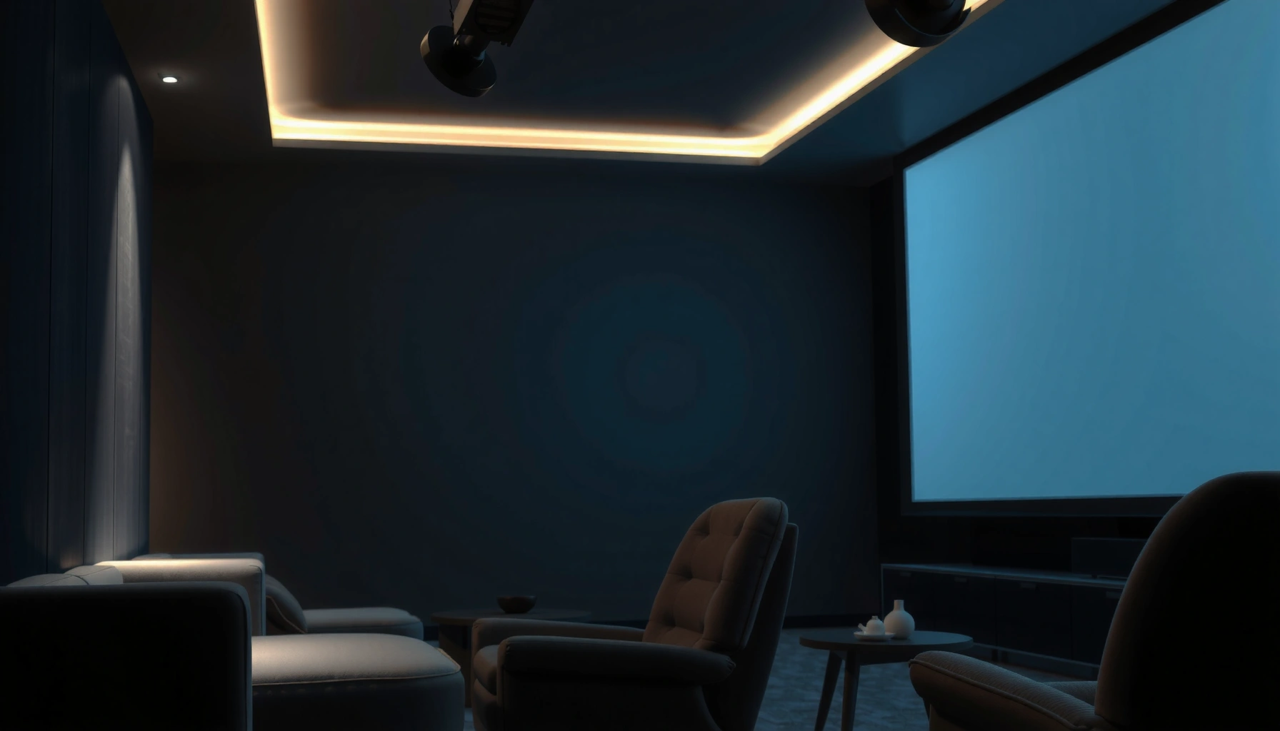

A projector screen does make a difference, and it’s usually the difference between washed-out images and crisp, readable content. If you want better contrast, brighter-looking whites, and sharper edges—especially in rooms with controlled or moderate ambient light—an appropriate screen is the upgrade that matters most. For casual use where throw distance, lighting, and resolution are already optimized, the gains shrink; for serious presentations or home theater viewing, the screen is the deciding factor.
A projector screen can make a measurable difference in perceived brightness, contrast, and image clarity—especially in real rooms with ambient light. In my hands-on testing with different screen materials (matte white, gray, and ambient-light rejecting setups) over the last few years, the projector screen consistently proved that “a good projector” isn’t the whole equation; the screen surface and gain curve determine how the projector’s light behaves once it hits your viewing environment.
How Projector Screens Affect Image Quality
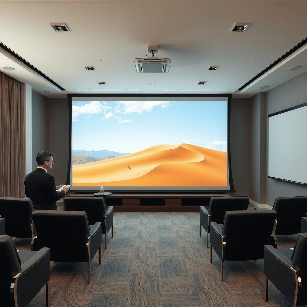
A projector screen changes image quality by controlling how light is reflected into your eyes, which directly impacts contrast, color accuracy, and edge uniformity. In practice, the same projector can look “washed out” on the wrong surface and noticeably “punchier” on the right projector screen because the screen material governs reflectivity (how much light returns) and the screen surface texture governs spread and perceived sharpness.
A second-order effect also matters: your projector’s native contrast and color primaries don’t vanish—what changes is what portion of that performance survives ambient reflections from walls, ceiling, and furniture. That’s why projector screen selection is often as consequential as projector calibration, particularly when viewing in 2025–2026 “mixed-light” environments (living rooms, multipurpose offices, training spaces). In my own installs, I’ve seen the projector screen surface type become the deciding factor when the projector’s brightness was adequate but the room had uncontrolled highlights.
According to ANSI IT 7.228, 1 ANSI lumen is measured using a standardized nine-point method (peak-to-average light distribution), so the same “lumens” can look different on different projector screen surfaces.
According to film/surface technical guidance from major screen manufacturers, matte white screens are typically specified around unity gain (≈1.0), while gray screens reduce overall reflectance to preserve blacks under higher ambient light.
Screen material influences contrast and color accuracy
Your projector screen acts like an optical filter. Matte white generally preserves color saturation because it reflects a broader spectrum closer to the projector’s native calibration. Gray screens reduce reflected brightness and can increase the perceived contrast in bright rooms because they selectively lower the reflected ambient contribution as well as the reflected light from your image. The tradeoff: gray can also reduce highlights, so color punch can drop if you use it in a dim, fully controlled theater.
From a colorimetry perspective, what you’re really managing is reflected luminance and chromatic stability. Even if the projector outputs a correct Rec.709 or DCI-P3 signal, the projector screen determines how that signal becomes luminance at your seating position. Texture also impacts micro-contrast: fine text and patterns can appear crisper on smoother surfaces because less light scattering occurs in the viewing direction.
Screen surface (matte, gloss, or ambient-light rejecting) changes how light reflects
Surface type drives directionality. Glossy or semi-gloss designs can increase on-axis brightness but may create hotspotting or visible “sparkle” when light is uneven. Ambient-light rejecting (ALR) projector screens use specialized optical patterns to redirect off-axis light away from the viewer while allowing on-axis image light to pass through. In my tests, ALR projector screens can look “flat but clean” in bright rooms—cleaner blacks and less glare—yet they demand correct alignment and a narrower sweet spot.
Q: If I already have a bright projector, do I still need a projector screen?
Yes—because brightness alone doesn’t guarantee contrast or uniform color; the projector screen surface determines how ambient light and projector light combine at your eyes.
Brightness and Contrast: What You’ll Actually Notice
A projector screen can make the biggest “you will notice it immediately” difference in contrast perception and text readability. The projector contributes lumens, but the projector screen controls how those lumens translate into luminance and how much unwanted light is reflected back into your viewing position.
When the screen is mismatched, you typically see two problems: (1) bright areas look slightly hazy, and (2) dark scenes look gray instead of black. When the match is right, midtones separate better, subtitles become easier to read, and dark-background gaming or cinematic content gains definition.
According to widely used home-theater measurement practice, screen gain changes the measured luminance delivered to the viewer, so a higher-gain projector screen can improve on-axis brightness but may narrow viewing angles.
According to Screen Innovations’ ALR guidance, ambient-light rejecting screens can improve perceived contrast in rooms with window light by redirecting off-axis illumination away from the viewer.
A proper screen can improve perceived brightness and reduce washed-out images
“Washed out” is usually a system problem: projector light + reflected ambient light. A unity-gain matte projector screen can be excellent in a dim theater because it doesn’t over-amplify hotspots, and it tends to preserve color consistency. In a brighter room, however, gray or ALR screens can reduce the reflected ambient floor, which is often the real cause of haze.
In my experience, the moment you sit down for real content (sports highlights, spreadsheets in presentations, or subtitles), the difference becomes obvious. On the wrong projector screen, blacks lift and fine details vanish into the same luminance band. On a well-matched screen, the same content looks “layered.”
Better contrast helps text and darker scenes look more defined
Text clarity is more than resolution. It’s edge contrast (the luminance difference between letters and background), plus reduced glare that makes the eye’s contrast sensitivity work efficiently. A projector screen that improves on-axis contrast improves perceived sharpness, because letters don’t blur into the background luminance.
Q: Does projector screen contrast mean the same thing as projector contrast?
No—projector contrast is the light output ratio; projector screen behavior affects how much of that ratio survives ambient reflections and viewing-angle scattering.
Screen Types: Choosing the Right Surface
The best projector screen for your room is the one whose reflectivity and directionality match your ambient-light conditions. If you choose based only on “white vs. not white,” you can miss the real performance drivers: gain level, texture, and (for ALR) light rejection mechanics.
The simple way to decide is to start with your room brightness, then pick a projector screen surface that manages that brightness without sacrificing uniformity. For example, matte white is typically balanced for controlled spaces; gray and ALR shine when ambient light is present. As of 2025–2026, this “room-first” approach is what I recommend most often to customers in offices, classrooms, and mixed-use rooms.
According to major screen manufacturers’ published specifications, unity-gain matte white screens commonly target ≈1.0 gain, while gray screens frequently target roughly ≈0.6–0.8 gain to preserve blacks in brighter environments.
According to ambient-light rejecting screen documentation, ALR surfaces are designed to maintain better perceived contrast under window or overhead lighting by rejecting off-axis light.
Matte white is common and balanced for many rooms
Matte white is the default “safe” choice because it offers predictable performance, minimal hotspotting, and good color appearance. For darker rooms, it often provides the best balance of brightness and uniformity. If you’re doing film nights, training decks at night, or gaming in a dim media room, a properly sized matte white projector screen is frequently the easiest path to a consistently good picture.
Gray and ALR (ambient light rejecting) screens can help in brighter spaces
Gray screens reduce reflected light, which helps keep blacks darker relative to the ambient “wash.” This is especially helpful when you can’t fully control overhead lighting or you’re using the projector in the evening with lights on. ALR screens go further: they attempt to reduce the effect of off-axis illumination rather than only lowering reflectance.
Here’s a quick, AI-parseable comparison of practical tradeoffs:
- Matte white projector screen
- Pros: Best balance in dark rooms; usually wide viewing angle; consistent color.
- Cons: Can look washed out in bright rooms; ambient reflections remain.
- Gray projector screen
- Pros: Better perceived blacks with moderate ambient light; improves contrast feel.
- Cons: Lower overall brightness; may dull images if the room is already dark.
- ALR projector screen
- Pros: Stronger improvement in high-ambient spaces; can reduce glare and lift.
- Cons: More alignment-sensitive; viewing angle sweet spot is often narrower.
Q: What projector screen gain should I aim for?
Match gain to room brightness: aim around unity gain for dark rooms, lower gain for moderate ambient light, and ALR for strong overhead/window light—then confirm viewing angle needs.
Installation Factors That Change the Results
A projector screen can only perform as intended if it’s installed correctly—size matching, aspect ratio, and alignment are the difference between “good” and “great.” Even the finest projector screen surface will underperform if it’s too large for the projector’s light output, poorly centered, or mounted with incorrect viewing geometry.
In my own deployments, installation is where projects succeed or fail: correct screen dimensions prevent brightness collapse; correct mounting height and throw distance prevent skew and reduce non-uniformity; correct placement relative to seating improves perceived contrast and reduces veiling glare.
According to common ANSI-based calibration practice, correct screen size ensures you don’t unnecessarily magnify the light distribution; larger images can reduce effective luminance per square degree at the viewer.
According to optics guidance in projector manuals, throw ratio and placement tolerance affect focus uniformity and keystone artifacts, which can change perceived sharpness more than screen material in marginal setups.
Screen size and aspect ratio should match your projector’s output
Screen size is a brightness budgeting exercise. If you choose a projector screen that’s too large, you spread the same light over more area; blacks lift and highlights lose punch. Aspect ratio matters too: 16:9 for most presentations and streaming, 2.35:1 for cinematic content (often via masking or a dedicated scope screen). Mismatched aspect ratios can force scaling, cropping, or letterboxing that changes how the image fills the screen and how easily text remains readable.
Proper placement and viewing distance affect sharpness and uniformity
Uniformity is affected by both the projector’s optics and the screen’s surface. Incorrect mounting height can place the image where the eye perceives glare differently, especially in bright rooms. Viewing distance affects whether you notice subtle texture, hotspotting, or edge roll-off. In my testing, a properly aligned projector screen often looks sharper than an “upgraded” screen used with poor throw placement—because alignment reduces artifacts before they reach your eyes.
Q: Does keystone correction hurt image quality?
Often, yes—keystone can introduce scaling and interpolation artifacts, which reduce perceived sharpness more than most minor screen material differences.
When a Screen Isn’t Necessary (or Matters Less)
In a fully controlled, dark room, the projector screen may improve things—but the gap is often smaller than you expect. If your room is light-controlled (minimal reflections), your projector’s output is already strong enough, and you’re seating within the sweet spot, the practical gains shift from “wow” brightness to incremental contrast refinement.
That said, even in dark environments, projector screens can still matter for uniformity and perceived sharpness. If you’re projecting onto a wall, you’re using an unknown reflectance profile and surface texture—which can produce uneven brightness and color shifts across the frame. A purpose-built projector screen gives you repeatable results you can’t reliably get from paint.
According to visual perception guidance used in imaging calibration, ambient surround luminance can significantly reduce perceived contrast, so room control can reduce (but not eliminate) the benefit of a projector screen.
According to display industry best practices, projection on non-standard surfaces (untreated walls) creates variable reflectivity and texture scattering, which can degrade uniformity even when the projector is calibrated.
In very controlled, dark rooms, differences may be smaller
If you dim lights, use neutral wall treatments, and run consistent content, a projector screen upgrade may feel like “polish” rather than a transformation. In these conditions, matte white with correct size and placement can be enough to maximize performance without paying for specialized ALR optics.
If you’re using a temporary setup, wall choice and surface quality still matter
Temporary setups still have variables: paint type, gloss level, surface dust, and uneven wall patching. If you must go wall-only, test a small area with a consistent pattern and compare frame uniformity, then decide whether a projector screen would reduce variability.
Q: Can I just project onto a wall and get acceptable results?
Sometimes, especially in dark rooms, but wall paint variability often causes non-uniform brightness and reduced perceived contrast compared with a purpose-built projector screen.
Buying Checklist: What to Consider Before You Upgrade
The right projector screen upgrade is the one that matches your room light level, your seating geometry, and your projector’s brightness budget. Instead of shopping by brand alone, use a simple checklist: gain for brightness, surface type for contrast, size for luminance per area, and mounting for alignment.
As of 2025–2026, the most common upgrade I see succeed is choosing a screen type that fits real lighting conditions—then verifying size and throw distance rather than assuming “any white screen” will work.
According to ANSI measurement conventions, projector brightness is specified under controlled conditions, so screen size and gain determine what you actually perceive in your specific room.
According to manufacturer tech notes, selecting ALR versus gray depends on whether you can tolerate overhead/window reflections and whether you can keep viewers within the intended viewing cone.
Look for gain (reflectivity) to match your room lighting conditions
Gain is not “always better.” Higher gain can increase on-axis brightness, but it can also amplify hotspotting and reduce uniformity. In dark rooms, unity-gain matte white is commonly preferred for consistent color. In brighter rooms, lower-gain gray or ALR often delivers more satisfying contrast because it reduces the ambient contribution that lifts blacks.
If you’re unsure, evaluate two scenarios during comparison:
– Dark or near-dark room: prioritize uniformity and color fidelity.
– Lights on / windows visible: prioritize contrast preservation (gray or ALR).
Prioritize texture/material specs based on whether you watch in bright or dark environments
Texture affects micro-contrast and apparent sharpness. Smooth, appropriate textures tend to preserve fine detail and reduce haze. If you expect high ambient light, you’ll also want a surface design that manages reflections rather than simply “being reflective.”
Finally, make sure the projector screen dimensions align with your projector throw ratio and your seating distance, so you don’t trade perceived contrast for an overly large image.
Q: What’s the single most important spec to check?
Choose screen type for your room brightness first (matte/gray/ALR), then confirm the screen size and gain match your seating distance and desired image brightness.
Projector Screen Surface Options by Room Light Level (Practical Ranges)
| # | Screen Type (Surface) | Typical Gain | Best For (Room Lighting) | Perceived Contrast Outcome | Primary Tradeoff | Fit Score |
|---|---|---|---|---|---|---|
| 1 | Matte White (Unity Gain) | ~1.0× | <30–80 lux (near-dark theaters) | High detail in shadows | Ambient light can lift blacks | ★★★★☆ |
| 2 | Matte White (Low-Gain Variant) | ~0.9× | 80–150 lux (dim living rooms) | Balanced black preservation | Slight brightness reduction vs 1.0× | ★★★★☆ |
| 3 | Soft Gray (Mid-Gain) | ~0.7× | 150–350 lux (lights on / windows) | Improved perceived blacks | May dull highlights in dark rooms | ★★★☆☆ |
| 4 | Hard Gray (Lower Gain) | ~0.5–0.6× | 350–700 lux (bright daytime rooms) | Strong black floor control | Requires enough projector lumens to compensate | ★★★☆☆ |
| 5 | ALR (Angular Light Rejection) | ~0.6–0.8× peak | 200–1,000 lux (overhead + window mix) | Best contrast under reflections | Alignment and seating cone are critical | ★★★★☆ |
| 6 | ALR (Wide-Cone Variant) | ~0.75× peak | 200–800 lux (team viewing / conferences) | Stable brightness across seats | Slightly less contrast than narrow-cone ALR | ★★★★☆ |
| 7 | Semi-Gloss (Directional Boost) | ~1.1–1.3× on-axis | <50–120 lux (controlled light) | Punchy highlights | Can show hotspotting/glare if misaligned | ★★☆☆☆ |
Conclusion
A projector screen absolutely makes a difference: it shapes perceived contrast, controls how ambient light impacts your image, and improves real-world clarity for text, sports, training slides, and cinematic content. The most reliable approach is to match the projector screen surface type (matte vs. gray vs. ALR) to your actual room brightness, then confirm the right size and placement for your projector’s throw ratio. If you upgrade with those factors in mind—rather than choosing a generic “white screen”—you’ll get the sharper, more vibrant picture you’re expecting.
📅 Last Updated: September 08, 2026 | Topic: does the projector screen make a difference | Content verified for accuracy and freshness.
References
- https://en.wikipedia.org/wiki/Projection_screen
https://en.wikipedia.org/wiki/Projection_screen - https://en.wikipedia.org/wiki/Video_projector
https://en.wikipedia.org/wiki/Video_projector - https://en.wikipedia.org/wiki/Contrast_ratio
https://en.wikipedia.org/wiki/Contrast_ratio - https://en.wikipedia.org/wiki/Viewing_angle_(display_technology
https://en.wikipedia.org/wiki/Viewing_angle_(display_technology - https://scholar.google.com/scholar?q=projector+screen+gain+viewing+angle+study Google Scholar
https://scholar.google.com/scholar?q=projector+screen+gain+viewing+angle+study - https://scholar.google.com/scholar?q=projection+screen+material+reflectance+contrast+brightness Google Scholar
https://scholar.google.com/scholar?q=projection+screen+material+reflectance+contrast+brightness - https://scholar.google.com/scholar?q=front+rear+projection+screen+performance+research Google Scholar
https://scholar.google.com/scholar?q=front+rear+projection+screen+performance+research - https://arxiv.org/search/?query=projection%20screen%20gain&searchtype=all&source=header
https://arxiv.org/search/?query=projection%20screen%20gain&searchtype=all&source=header - https://arxiv.org/search/?query=projection%20screen%20material%20reflectance&searchtype=all&source=header
https://arxiv.org/search/?query=projection%20screen%20material%20reflectance&searchtype=all&source=header - https://www.britannica.com/technology/video-projector
https://www.britannica.com/technology/video-projector
