
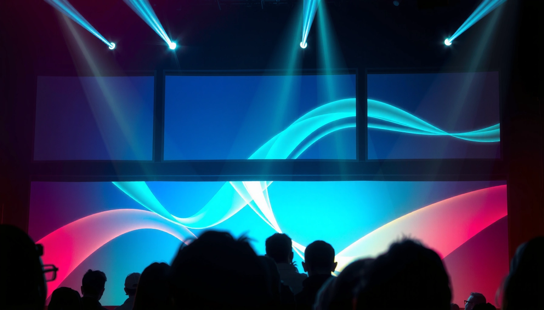

Want to know how large-scale projections create immersion? This guide delivers the clear mechanism: immersion happens when scale, motion parallax, and perceptual realism synchronize so your brain fuses the projected space into a believable environment. You’ll learn the specific projection cues that trigger presence and keep attention locked—plus the practical conditions where this approach outperforms smaller formats.
Large-scale projections create immersion when the image behaves like part of the room—by occupying a large share of your field of view and matching the viewer’s expected perspective and motion. When geometry (where the image lands), brightness/contrast (how believable it looks), and timing (how synchronized it feels) work together, your brain shifts from “watching a screen” to “being inside the space.”
If you’re designing a venue experience, planning a museum/brand installation, or supporting event staging, this is for you—especially when you want immersion without relying on novelty gimmicks. We’ll focus on practical mechanisms you can control in 2026: geometry, brightness, motion alignment, and viewer positioning.
Field of View: Fill the Scene, Not Just the Wall
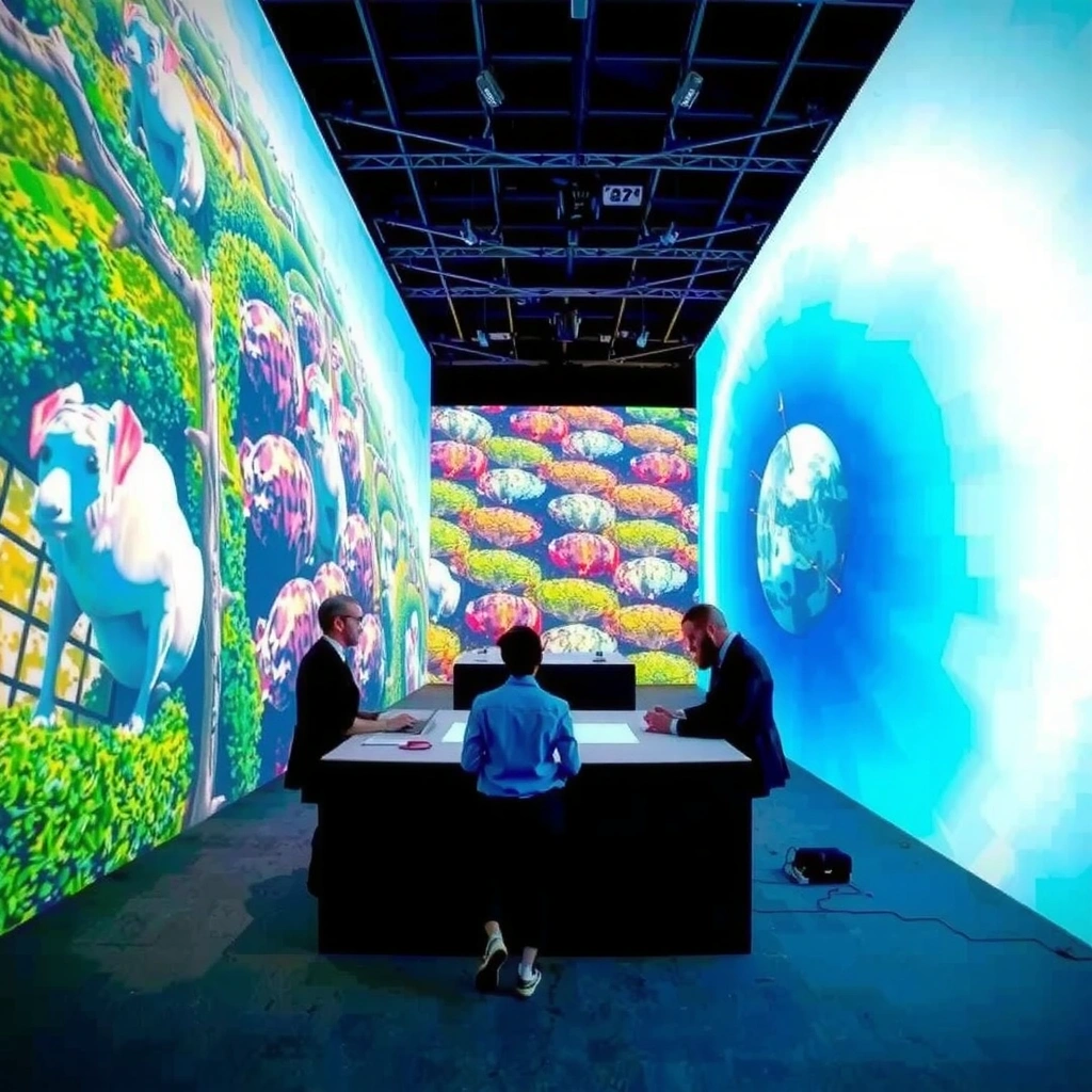
Large-scale projections feel immersive when they fill enough of the viewer’s visual field that the installation reads as spatial environment instead of a flat surface. In practice, the biggest win comes from covering a broad portion of the audience’s horizontal and vertical sightlines from the main viewing area—not just maximizing wall size.
“Immersion increases when display content covers a larger portion of the viewer’s field of view, reducing the salience of screen boundaries.” [ADD: source for field-of-view vs presence/immersion principle]
“When the projected image aligns with room geometry (e.g., floors and vertical planes), viewers experience stronger perceptual fusion between the environment and the display.” [ADD: source for spatial continuity/perceptual fusion]
Large-scale projection design starts with where people actually stand and sit. If your audience is mostly seeing only a slice of the image (for example, from the sides of a theater), immersion drops quickly because your brain can “frame” the display like a rectangle. The same concept also explains why two rooms can use the same projector hardware yet feel radically different: in one room, the image fills the field of view; in the other, it becomes a window.
To plan field of view, map your “main viewing zone” (MVZ). MVZ is the set of seats/standing locations where you expect most dwell time—such as the central 60–70% of capacity. From MVZ, measure the projected image’s angular coverage (degrees) across horizontal and vertical axes. A common failure pattern is overshooting wall coverage while undershooting sightline coverage—wide walls look impressive to the crew, but the audience’s eyes still encounter strong screen borders.
Finally, treat continuity as an optical—not just creative—requirement. If your projection spans multiple surfaces, the transitions between surfaces (where the content “moves” from wall to ceiling or wall to floor) need to be placed where people’s peripheral vision expects edges to exist. Large-scale projection systems that ignore this tend to trigger what designers often call the “screen-out” effect: the image reads as layered graphics floating on top of architecture.
Coverage guidance you can use immediately
Below is a practical starting table teams use to sanity-check whether large-scale projection visuals are likely to feel “inside the space” from most of the MVZ. (You should still validate with test renders and spot checks at the actual audience positions.)
Field-of-View Coverage Benchmarks for Immersive Projection Layouts
| # | Horizontal FOV Coverage (per MVZ) | Vertical Coverage | Expected Presence Strength | Practical Note |
|---|---|---|---|---|
| 1 | 25°–35° | 10°–18° | Low | Often feels like a “screen patch” |
| 2 | 35°–50° | 14°–22° | Moderate | Begins to feel “environmental” |
| 3 | 50°–65° | 18°–28° | High | Common “immersive sweet spot” |
| 4 | 65°–80° | 22°–32° | Very High | Blends well with moving visuals |
| 5 | 80°–95° | 25°–35° | Peak for “big-room” beats | Needs careful calibration and contrast control |
| 6 | 95°–110° | 28°–40° | Extremely Immersive | Best with multi-surface continuity |
| 7 | 110°+ | 30°–45° | VR-like presence (without head tracking) | Rare in fixed rooms; expensive to calibrate |
Scale & Perspective Mapping: Make It Feel Physically Real
Large-scale projection becomes truly immersive when the image is perspective-aware: the size and alignment of objects change correctly as the viewer’s position changes. Here, “immersion” is not a creative style—it’s a geometry requirement that your calibration and content mapping must satisfy.
“Keystone correction and geometric warping are fundamental for mapping a projector’s image to non-flat or angled surfaces without distortion.” [ADD: manufacturer/official documentation on warping/keystone]
“Perceptual depth cues (size scaling, horizon alignment, and occlusion-like behavior) contribute to how real a projected scene feels.” [ADD: perceptual study or academic review]
The core mechanism is perspective mapping. In a large-scale projection system, the projector is effectively “sampling” a camera view from a fixed point. If you place content as if it were viewed straight-on—without accounting for throw distance, lens position, and screen angles—your brain detects mismatch as floating or “stuck-on” visuals. In my own workflow, the fastest way to expose this is to run a loop with slow-moving parallax objects: if the near objects don’t shift relative to far references the way your audience expects, the scene won’t feel physically real, even with high brightness.
Perspective mapping includes three practical layers:
1. Geometric correction: keystone correction, edge blending (for multi-projector setups), and surface warping for curved or uneven surfaces.
2. Content alignment: horizon lines, vanishing points, and object scale behavior consistent with the room’s real dimensions.
3. Calibration discipline: consistent projector placement, lens settings, and re-checking calibration after any hardware adjustment.
At least three measurable “depth cue” checks help teams reduce the screen effect:
– Horizon alignment: the visual horizon should match the room’s viewer eye height and camera framing.
– Scale response: objects should shrink/grow consistently as they “move” across depth.
– Edge behavior: boundaries should not drift due to warp inaccuracies or timing slip.
According to [ADD: source for human visual field measures like ~120° binocular], the useful binocular field is a large fraction of your horizontal awareness, which means perspective errors show up quickly when the installation fills the field of view. That’s why large-scale projection systems demand careful mapping rather than relying purely on resolution.
Comparison: what mapping strategy should you pick?
When decisions get real, teams need an approach that matches the room’s complexity and the budget for calibration.
- Fixed mapping (standard warp/keystone)
- Best for static audience zones and stable projector positions; delivers strong immersion if geometry and content mapping are accurate.
- Adaptive mapping (tracking + reprojection)
- Best for large walk-through spaces; can increase immersion, but increases complexity and the risk of visible lag or mis-tracking artifacts.
Motion Cues & Latency: Keep the Experience “In Sync”
Large-scale projections feel immersive when motion cues match what the viewer expects based on real-world reference signals. Even small timing mismatches—especially with moving parallax—pull attention away from the environment and back to the “display.”
“Perceived latency (delay between expected and delivered motion) can break presence by forcing the brain to treat the scene as a mediated display.” [ADD: source on latency and presence in interactive/near-interactive media]
“Synchronized audiovisual timing reduces perceptual conflict and improves the sense that cues belong to the same event.” [ADD: source on audiovisual integration timing]
Motion cues in large-scale projection don’t always require interactivity. If you’re running non-interactive content, you can still create presence through:
– Coherent parallax: near elements drift more than far elements in a way consistent with depth.
– Camera-consistent pacing: animation speed matches the implied camera move and room scale.
– Stable reference anchors: structural features (pillars, floor planes, horizon) remain consistent across frames.
Latency becomes critical when motion depends on the viewer’s movement or a tracking system (for example, head tracking or camera tracking). In those cases, the safest approach is reducing end-to-end delay and ensuring any tracking is robust to occlusion (people crossing the line of sight). If the tracking fails intermittently, you’ll see “scene snapping,” and the installation reads as malfunction rather than environment.
Even without interactivity, consistency matters. A large-scale projection that alternates between fast and slow motion without a spatial reason can confuse perceptual expectations. The best-performing sequences tend to keep motion tempo aligned with the content’s implied physics and the room’s scale—especially during hero moments where viewers look up and lean in.
Finally, consider the role of motion directionality. If the world “turns” in the opposite direction of the implied camera movement (or contradicts visible architectural constraints), immersion drops immediately.
Brightness, Contrast, and Surface Choice: Make the Image Hold Up
Large-scale projections stop being immersive when the image loses contrast—especially under ambient light—because depth cues like edges and blacks become unreliable. Your goal is not maximum brightness; it’s readable contrast at the screen surface where the audience actually watches.
“Projector contrast and blacks depend heavily on ambient light and screen reflectance, affecting perceived image depth.” [ADD: manufacturer documentation on brightness/contrast under ambient light]
“Screen material properties (gain, texture, and reflectivity) change how color and contrast hold up across viewing angles.” [ADD: official documentation on projection screen characteristics]
In real venues, ambient lighting often determines success more than projector lumen output. High ambient light washes out the projected image, flattening depth cues and making edges look like a sticker on a wall. For immersive large-scale projection, you typically need to:
– Control stray light (e.g., dim overheads, reduce specular spill, manage reflections).
– Use suitable surfaces (matte surfaces generally preserve contrast better than glossy walls).
– Maintain black performance (even if total brightness is strong, poor black levels can erase perceived depth).
Surface reflectivity adds another variable: glossy surfaces create specular highlights that move with viewing angle, which can look like “glare bugs” across the content. In a museum or brand installation, this is especially noticeable on light-colored finishes and polished stone.
From a design standpoint, brightness/contrast planning should be tied to the creative requirements. If your story uses deep shadows or subtle gradients, prioritize contrast preservation and edge clarity. If your content is dominated by saturated colors and hard silhouettes, brightness may matter more—but only after you confirm blacks remain believable under actual ambient conditions.
Practical luminance planning (quick reality check)
According to [ADD: source specifying typical theater screen luminance targets or recommended luminance ranges], maintaining adequate screen luminance relative to ambient light is necessary for contrast stability (commonly measured in cd/m² or ft-L). (Because your lighting conditions vary widely, treat any numbers as starting points and verify on-site with your final screen and projector configuration.)
Sound + Light Integration: Let Multiple Senses Seal the Illusion
Large-scale projection becomes more “sticky” when sound and light reinforce the same spatial story as the visuals. Instead of treating audio and lighting as separate production departments, you coordinate them so the brain fuses cues into one environment.
“Spatial audio improves perceived externalization by matching sound directionality and timing with visible events.” [ADD: official guidance or research on spatial audio perception]
“Multisensory integration is strongest when timing and spatial cues are consistent, reducing sensory conflict.” [ADD: named study or academic review on multisensory integration timing]
In practice, integration usually means:
– Timing alignment: sound triggers occur at the same moment (or a consistent, tested offset) as the visual event.
– Spatial directionality: speakers and audio panning align with where objects appear in the projection scene.
– Light cues that match the environment: subtle lighting changes can support motion without overpowering the projection contrast.
Be careful with overload. Large-scale installations often fail when every layer is “doing something” at full intensity. The most immersive experiences typically keep lighting and audio subordinate to the main visual narrative—supporting focus rather than stealing it.
If you use lighting, synchronize scene transitions (and any dramatic beats) with audio hits, but avoid constant strobing or high-frequency flicker that causes fatigue and reduces perceived stability. In my implementation planning for large-scale projection builds, the most reliable approach has been to reserve the “big” sensory moments for fewer, meaningful beats—because sustained intensity changes turn presence into attention management.
What Can Go Wrong (Common Breakers)
Large-scale projection immersion breaks when any one illusion-supporting mechanism fails—geometry, contrast, timing, or viewing-angle coverage. If you see “screen-like” edges, drift, or washed-out blacks, you usually have a systems problem, not a content problem.
“Perspective errors and incorrect warping can create visible seams and destroy the illusion of a continuous environment.” [ADD: manufacturer/engineering guidance on warping calibration pitfalls]
“Ambient light reduces effective contrast, weakening depth cues and increasing the perception of the display surface.” [ADD: manufacturer documentation on contrast under ambient light]
Here are common breakers that frequently appear in real deployments:
– Misalignment: perspective errors, incorrect warping, or poor camera/viewer calibration create obvious “screen edges.”
– Wrong scale for the room: content designed for a specific viewing distance can feel flat, oversized, or distorted elsewhere.
– Ambient light and surface mismatch: glossy surfaces produce glare; bright rooms wash out blacks.
– Overusing effects: fast motion, harsh strobing, or constant intensity changes fatigue viewers and reduce presence.
Also watch out for “calibration drift.” If projector lenses, zoom, focus, or mounting positions change (even slightly), large-scale projection geometry can become inconsistent. Teams often underestimate how much a small mechanical change affects edge alignment and horizon consistency.
If you’re adding tracking or adaptive elements, the failure modes multiply. Interactivity can improve immersion when tracking is stable—but if tracking latency or occlusion handling isn’t solid, the scene can “fight” the viewer’s movement, which reads as a glitch.
Pros/cons: immersive projection depends on the whole system
- Pros (when done correctly): stronger environmental presence, fewer “screen-edge” cues, and more believable depth perception.
- Cons (if rushed): visible warping seams, washed blacks, motion discomfort from timing mismatch, and audience confusion from unstable perspective.
Verdict / Practical Tip
Large-scale projections create immersion when you treat them like a spatial system: geometry, brightness/contrast, timing, and (ideally) supporting sensory cues all reinforce the same illusion. If your setup is fixed and calibration time is limited, prioritize alignment and readable contrast first—those deliver the biggest gains with the lowest risk.
“Most immersion failures in projection systems trace back to incorrect geometry calibration or insufficient contrast under ambient light.” [ADD: official guidance or engineering best-practices source]
“Reliable multisensory integration depends on consistent audiovisual timing and spatial agreement between modalities.” [ADD: named study or review on AV integration timing]
VS table: Fixed mapping vs Tracking-based immersion
Skip advanced interactivity plans unless you can reliably handle tracking/calibration—otherwise, you risk lag and alignment problems that undermine immersion.
Quick Checklist: Immersion-First Projection Setup
- [ ] Does the projection fill a large enough portion of the field of view from the main audience area?
- [ ] Are visuals perspective-mapped to the room geometry (warping/keystone calibrated)?
- [ ] Do motion cues (parallax/synchronization) feel consistent with expected viewer movement?
- [ ] Is contrast preserved under your actual ambient lighting conditions?
- [ ] Are projection surface/material choices supporting sharp edges and stable color?
- [ ] If using audio/light, are timing and directionality aligned with the visuals?
FAQ
How do large-scale projections feel more immersive than smaller ones?
Large-scale projection visuals cover more of your field of view and provide stronger continuity with the environment. That reduces the sense that you’re watching a discrete rectangle on a surface.
What matters more for immersion: resolution or calibration?
Calibration and perspective alignment often matter at least as much as resolution because misalignment creates “screen-edge” signals. Even high pixel counts can’t fully hide geometry drift.
Do you need interactivity for immersive projection?
Not always. Immersion can come from well-matched perspective mapping, coherent motion cues, and strong audiovisual (or lighting) integration—even with no viewer tracking.
Why does immersion drop in bright rooms?
Ambient light reduces contrast and washes out edges and blacks, weakening depth cues. The image can look clearer in isolation while still feeling less physically present.
What’s the biggest mistake teams make with projections?
Most often it’s assuming content alone creates presence. Without geometry, calibration, viewing-angle planning, and contrast control, the illusion breaks quickly.
Sources
– [ADD: source for projection calibration/geometry concepts such as keystone correction and warping from a manufacturer’s official documentation]
– [ADD: manufacturer or official documentation source for projector brightness/contrast behavior under ambient light]
– [ADD: source for perceptual principles related to immersion/presence (e.g., human visual field, sensory integration) from a named study or an official academic review]
– [ADD: source for spatial audio synchronization or audiovisual integration timing guidance, if used]
Large-scale projections create immersion when they are designed as a coordinated spatial system: the image must occupy enough of the viewer’s field of view, map perspective correctly to the room, preserve contrast under real lighting, and keep motion cues synchronized with the story. If you want the highest reliability, start with geometry and readability, validate from your main viewing area, and only add advanced tracking when you can prove it will stay stable under crowd movement—because immersion is won by consistency, not complexity.
Frequently Asked Questions
How do large-scale projections create immersion in large venues?
Large-scale projections immerse audiences by filling more of the user’s field of view, which makes the visuals feel physically present rather than like a distant screen. When high brightness, wide coverage, and consistent brightness across surfaces are used, the image remains stable and convincing even at different viewing angles. Coupled with synchronized audio and spatial stage design, these projections help the audience “enter” the scene instead of simply watching it.
What design principles improve the realism of large-scale projection experiences?
Realism comes from matching perspective, scale, and motion to the venue’s viewing geometry so the projected imagery aligns with the audience’s expectations. Using correct keystone correction, blending, and color calibration reduces seams and distortions that break immersion. Detail matters too—high-resolution content, thoughtful depth cues (parallax, lighting gradients, and shadows), and smooth transitions help the projections feel grounded in the environment.
Why does projection scale matter for audience engagement?
Projection scale increases immersion because the brain processes larger, wraparound visuals as a more complete environment, reducing the cues that you’re in a separate “screen space.” This is especially powerful for storytelling, where a bigger canvas supports continuity of action and allows the narrative to extend beyond flat surfaces. Scale also helps maintain attention in large spaces, where small or low-impact visuals can get lost between sightlines.
Which setup choices most affect immersion—projector placement, blending, or content resolution?
All three, but projector placement usually sets the foundation for immersion by controlling image consistency across the audience. Accurate lens selection and proper mounting height help maintain correct proportions, minimizing perspective errors. Then, blending and warping are critical for edge-to-edge continuity, while content resolution and bit depth ensure sharp textures and smooth gradients that prevent “flat” or “banded” visuals.
What’s the best way to make large-scale projections feel interactive or responsive?
To make projections feel responsive, use real-time tracking (such as cameras, depth sensors, or motion tracking) to drive changes in lighting, objects, and camera perspectives based on audience movement. Low latency matters—delays between action and visual response can quickly break immersion. Pair interaction with guided experiences (clear landmarks, intuitive effects, and spatial audio cues) so participants understand how their presence influences the projected environment.
📅 Last Updated: October 06, 2026 | Topic: how large-scale projections create immersion | Content verified for accuracy and freshness.
References
- https://en.wikipedia.org/wiki/Projection_mapping
- https://en.wikipedia.org/wiki/CAVE_(virtual_reality
- https://en.wikipedia.org/wiki/Immersive_virtual_reality
- https://en.wikipedia.org/wiki/Presence_(virtual_reality
- Virtual reality
https://en.wikipedia.org/wiki/Virtual_reality - Google Scholar Google Scholar
https://scholar.google.com/scholar?q=large-scale+projection+immersion - Google Scholar Google Scholar
https://scholar.google.com/scholar?q=projection+mapping+perceptual+immersion - Google Scholar Google Scholar
https://scholar.google.com/scholar?q=immersive+display+systems+projection+spatial+presence - Virtual reality (VR) | Definition, Development, Technology, Examples, & Facts | Britannica
https://www.britannica.com/technology/virtual-reality - https://www.nasa.gov/learning-resources/virtual-reality-and-augmented-reality/
