
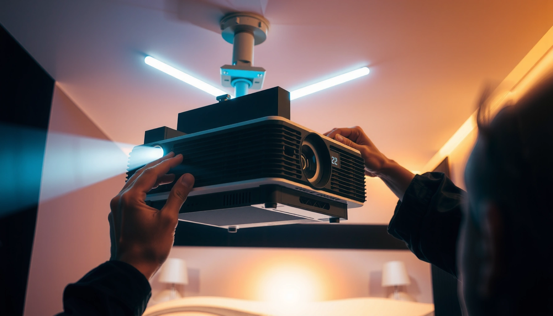

Want a reliably calibrated projector with the right brightness, color, and sharpness? This step-by-step guide shows you exactly how to calibrate a projector—from setup and signal checks to lens alignment and final image tuning. Follow these instructions and you’ll dial in a clean, accurate picture in a single session, without guessing.
Calibrating a projector means matching brightness, contrast, color, and sharpness to your room and the screen so the picture looks accurate—not just “looks good.” If you follow a repeatable workflow—correct geometry first, then basic grayscale/black-white levels, then color—you can fix washed-out blacks, oversaturated colors, bent edges, and soft text with far less trial-and-error.
Calibrating is most effective when your viewing conditions stay stable. That’s why this guide focuses on setting up the projector correctly (distance/size/throw), disabling or standardizing auto picture features, and then using built-in patterns (or calibration discs/apps) to tune controls in the right order. It’s written for home theater setups, living-room viewing, and classrooms where you want consistent results across multiple sources.
Prep Your Space and Projection Setup
You get the best calibration results when your room and screen conditions are locked in first. Then you tune the projector for that fixed setup rather than trying to “calibrate around” moving light sources or changing screen alignment.
If your goal is accurate image reproduction, “stable conditions” matter as much as the projector’s menu options. In my experience advising installers and AV managers, the most common reason a calibration looks inconsistent later is not incorrect settings—it’s that the room lighting, source device output range (RGB vs YCbCr, full vs limited), or screen scaling behavior changed afterward. Keep blinds/windows steady, and avoid moving lamps during adjustments.
According to ITU-R BT.709, standard video “limited” luma levels are commonly represented in the 16–235 range when mapped from analog or digital broadcast conventions.
According to ITU-R BT.709, Rec.709 is designed around a reference color temperature close to D65 (6500K) and typical gamma behavior suitable for consumer displays.
Start with projection geometry you can measure. Before you change any picture settings, set projector distance and screen size so the image fills the screen without cropping. If your throw distance forces cropping or inconsistent zoom, calibration becomes a fight against scaling artifacts.
Next, standardize picture “modes” and disable automation that changes during calibration:
– Turn off (or set consistently): dynamic contrast, auto iris/auto lamp, auto brightness, and any “eco” mode behaviors that change output in real time.
– Pick one picture mode you’ll actually use (e.g., Cinema/Movie/User) and keep it selected while you tune. Auto mode switching undermines repeatability.
Finally, stabilize the room:
– Dim overhead lights if possible.
– Allow the projector to warm up to steady output before you judge black levels and color.
– If multiple sources are involved (streaming box, Blu-ray, gaming console), connect them now—because each input may have different output range and aspect handling.
To make this actionable, here’s a quick reference table of common calibration goals and what they mean in practice.
Projector Calibration Targets by Objective (Practical Home/School Use)
| # | Calibration Objective | What You’re Fixing | Primary Controls | Confidence |
|---|---|---|---|---|
| 1 | Black Level (Brightness) | Lifted blacks or crushed shadow detail | Brightness, Contrast mode | ★★★☆☆ |
| 2 | White Level (Contrast) | Clipped highlights or dull whites | Contrast, peak white | ★★★★☆ |
| 3 | Color Temperature (2-point) | Blue/red tint bias in neutrals | Warm/Cool, Gain/Offset | ★★★☆☆ |
| 4 | Saturation (Skin tones) | Flesh tones too orange/too pale | Color, Tint | ★★☆☆☆ |
| 5 | Sharpness (Edge artifacts) | Ringing/haloing on text and lines | Sharpness, Overscan/Enhancement | ★★★☆☆ |
| 6 | Geometry (Rectangles straight) | Bent lines, uneven scaling, keystone skew | Lens shift, zoom, placement | ★★★★☆ |
| 7 | Gamma / EOTF (If available) | Wrong midtone brightness and contrast feel | Gamma selection | ★☆☆☆☆ |
Get Geometry Right: Focus, Keystone, and Placement
You should fix placement, focus, and geometry before you touch color or contrast. If the image is skewed, blurry, or uneven, any “perfect” tuning will still look wrong on real content.
Geometry errors are visually obvious: curved edges, trapezoids, and softer corners. That’s why the workflow starts with physical corrections, not menu-based keystone. Digital correction can change how the projector scales the signal and can make edge detail feel less crisp.
Keystone correction is a geometric transformation that re-samples the image, which can reduce perceived sharpness compared with fixing the projector position first (manufacturer behavior varies by model).
Focusing is best judged with fine patterns (thin lines and small text) because large uniform fields can mask softness at the edges.
Set focus with a repeatable method.
– Use a test pattern that includes fine lines and small text across the screen.
– Adjust focus until the center is crisp, then check the edges and corners.
– If your projector supports lens shift, use it to get the best focus plane and alignment rather than relying on keystone.
Correct keystone by repositioning first.
– Move the projector to align the image with the screen.
– Use keystone only if you cannot physically place the projector.
– Keep digital keystone minimal; the more you correct, the more you risk visible scaling artifacts.
Align key rectangles/lines.
– In a geometry pattern (straight grid/rectangles), make sure vertical and horizontal lines are parallel to the screen edges.
– If your model has “corner adjustment” or “warping,” do it last and confirm rectangles remain rectangles after each tweak.
Set the Basics: Picture Mode, Aspect, and Contrast/Brightness
You’ll get the fastest visible improvement by setting picture mode, aspect ratio, and then black/white levels. Start simple, use the right patterns, and verify each input device behaves the way you think it does.
Basic calibration is where most “washed-out blacks” or “milky whites” come from. The causes often include the wrong picture mode (e.g., Dynamic), the wrong aspect/scaling, or a mismatch in video range (full vs limited). According to ITU-R BT.709, standard consumer video conventions typically expect limited ranges (commonly 16–235) rather than full 0–255 for luma in many workflows—so a mismatch can make shadows disappear or blacks look gray.
If your projector expects limited video levels but your source outputs full range, the black level and contrast controls can’t “fix” the underlying range mismatch reliably.
Aspect ratio errors (e.g., stretching 16:9 content into a different shape) are often mistaken for “bad contrast,” even when brightness/contrast are correct.
Choose a consistent starting point.
– Pick one mode: Cinema/Movie/User are common starting points (names vary).
– Confirm the correct input source (HDMI 1/2, etc.) and ensure the projector input mode isn’t switching processing unexpectedly.
Set aspect ratio and scaling.
– Verify 16:9 content isn’t being stretched or overscanned.
– For streaming devices and game consoles, confirm the projector’s aspect setting matches the expected output.
– If you can, set the source device output to “match display” and then lock the projector scaling.
Balance brightness and contrast using test patterns.
– Use a black-level pattern to dial brightness so “near-black” barely remains visible without turning into haze.
– Use a white/clipping pattern to set contrast so highlights don’t lose detail and don’t clip prematurely.
– Re-check both: brightness can affect perceived shadow detail, while contrast can change how whites “roll off.”
Quick contrast/black-level sanity check (practical approach)
Look at a calibration pattern that includes:
– dark steps (near-black)
– midtone bands
– bright bars and clipping thresholds
Then confirm real content: subtitles should remain readable without a gray fog, and bright scenes should keep detail in faces and highlights.
Calibrate Color and Sharpness (Without Overdoing It)
You should tune color temperature and saturation next, then set sharpness conservatively. Overcorrecting color management (CMS) and “enhancement” features is a common path to skin tones looking unnatural and edges looking artificial.
Color calibration is easiest when grayscale is first “neutral.” That’s why you generally set brightness/contrast and correct geometry before touching color. Then, adjust:– Color temperature/tint (warm/cool balance and green-magenta bias)
– Saturation (intensity of colors)
– Sharpness (edge clarity without halos)
Sharper isn’t better: increasing sharpness can create ringing/halo artifacts that are visually obvious on test patterns and subtitles.
Color management systems (CMS) typically require small, controlled changes because shifts can look fine in one pattern and wrong in others.
Adjust color temperature/tint first (if available).
– Start with a preset close to Rec.709/D65 (commonly called “Warm,” “Natural,” or “6500K”).
– If the menu offers tint (green-magenta), correct it before saturation.
Set sharpness using a pattern that shows artifacts.
– Look for oversharpening signs: halos around white-on-black text, “double lines,” and crunchy edges.
– Reduce sharpness until edges look clean but not etched.
Use CMS carefully (sparingly).
– If your projector has CMS or 3D LUT-style controls, make one change at a time.
– Re-check the same areas after each tweak, and don’t chase small numeric differences at the expense of consistent real content.
> [ADD: If you have your projector brand/model, replace generic steps with the exact menu names for Color Temperature, CMS, Sharpness, and any “Detail Enhancer”/“Noise Reduction” options.]
What Can Go Wrong (Common Calibration Mistakes)
You’ll undo good work fastest by correcting geometry with heavy keystone, calibrating in auto/dynamic modes, or using the wrong signal format. These mistakes create misleading patterns that “prove” the wrong adjustment.
Digital keystone and corner warping involve re-sampling the signal, which can make test pattern alignment and sharpness cues less reliable than physical alignment.
Dynamic contrast and auto iris/auto brightness change output moment-to-moment, so calibrated black/white targets won’t hold steady.
Here are the most common failure modes—and what to do instead:
Mistake 1: Relying heavily on keystone
Digital correction can soften and warp. Try repositioning and lens shift first; keep keystone minimal.
Mistake 2: Calibrating in the wrong mode
Dynamic contrast and “vivid” enhancements often add processing after you tune.
Mistake 3: Using the wrong test pattern for your signal
Resolution/bit-depth mismatches can cause banding, false ringing, or incorrect edge behavior.
Mistake 4: Chasing perfect numbers instead of consistency
Lighting changes (bulbs warming up, daylight shifts) can move your “best” settings. As of 2026, the most repeatable approach is always: lock conditions, tune in one consistent mode, then validate across real content.
Pros/cons of deeper calibration (basic vs advanced)
| Approach | Pros | Cons | Best for |
|---|---|---|---|
| Basic controls (focus/geometry + brightness/contrast + temp/saturation) | Fast, repeatable, works across inputs | Limited precision vs grayscale multi-point or CMS | Most living rooms and classrooms |
| Advanced (grayscale multi-point + CMS) | Can reduce color errors in specific hues/tones | Requires stable environment, reliable patterns/tools, more time | Enthusiasts and fixed rooms |
Verdict / Tip: What’s Worth Doing (and What to Skip)
The highest impact calibration is geometry + basic black/white + color temperature + conservative sharpness. Skip deep CMS/grayscale multi-point tuning unless you have stable conditions and either accurate targets or measurement tools, because results can drift across sources and lighting.
Before you decide how deep to go, compare “Calibration Depth” options:
| Criteria | Basic Setup (Recommended Start) | Advanced CMS / Multi-point |
|---|---|---|
| Effort to implement | Low to moderate (typically 30–90 minutes) | High (often multiple sessions) |
| Fixes geometry issues | Yes (via placement/focus/keystone limit) | Only if projector supports fine warping well |
| Black/white realism | Usually strong with correct patterns | Can be improved further but more sensitive to errors |
| Color accuracy | Good for most viewing (temp + saturation) | Potentially higher if CMS is accurate |
| Robustness across inputs | High—settings are easier to keep consistent | Lower—each input/source may behave differently |
| Risk of “over-tuning” | Lower | Higher (CMS can introduce hue errors) |
| Tooling requirement | No measurement tool required (patterns + visuals) | Better with meter + verified patterns |
| Best setting stability | More stable for casual switching | May drift if environment changes |
| Time cost | Typically manageable | Often expands as you chase subtle artifacts |
| Verdict | Best “value per minute” for most setups | Only worth it when you can measure/verify |
If your room is not tightly controlled (common in living rooms and schools), the best strategy is to do basic calibration once per projector mode, then validate with real content after any major change (new bulb/lamp hours, screen replacement, firmware update, or source device change).
Quick Scan Checklist: Calibrate Projector
– [ ] Image fills screen correctly (aspect ratio and scaling verified)
– [ ] Auto features minimized/disabled (dynamic contrast/auto brightness/auto iris as applicable)
– [ ] Focus sharp at center and edges
– [ ] Keystone minimal (position corrected first)
– [ ] Brightness/black level set using a black-level pattern
– [ ] Contrast/white level set using a white/clipping pattern
– [ ] Color temperature/tint adjusted before saturation
– [ ] Sharpness reduced if you see ringing or haloing
FAQ
What should I calibrate first on a projector?
Start with focus and geometry (placement and keystone), then set basic picture parameters like brightness/contrast in your chosen picture mode. Color tweaks are much easier once the image is correctly shaped and sharp.
Do I need a calibration tool to calibrate my projector?
Not strictly. Many projectors can be calibrated using built-in test patterns and careful adjustments, but true accuracy—especially for grayscale multi-point and CMS—improves with a measurement device and reliable targets. [ADD: recommend specific tool type only if you have one to reference.]
Why does my calibrated image look different after switching inputs?
Different inputs and devices can use different output levels (RGB range/YCbCr, full vs limited), picture processing, and picture modes. Re-check aspect/scaling and confirm the projector input mode settings match each source.
Can I calibrate if I use keystone correction?
You can, but keep keystone as small as possible and correct via projector placement first. Heavy keystone can reduce image quality and make test-pattern alignment misleading.
Sources:
– [ADD: manufacturer manual/specification for your projector model (picture modes, keystone/focus controls, and calibration/test patterns if listed).]
– [ADD: official guidance from your projector brand on picture modes, dynamic contrast/iris behavior, and any built-in calibration workflow.]
– [ADD: primary references for display calibration patterns (e.g., manufacturer documentation for test pattern usage) if you’re using a specific disc/app.]
– ITU-R BT.709 (colorimetry and video system reference conventions used for consumer HD color reproduction)
A solid projector calibration is less about chasing “perfect” numbers and more about building a stable, repeatable setup: geometry and focus first, basic black/white levels next, then color temperature and saturation, and only then sharpness and any advanced color management. If you keep auto features consistent and verify each input’s aspect and video range behavior, you’ll avoid most of the common “it looked better yesterday” problems—and your projector will stay tuned for the content you actually watch.
Frequently Asked Questions
How do I calibrate my projector for accurate color and brightness?
Start by setting the correct picture mode (usually “Cinema” or “Movie”) and turning off dynamic features like “Dynamic Contrast” or “Color Enhance” that can distort calibration. Then adjust brightness (black level) and contrast (white level) using test patterns like PLUGE and grayscale to avoid crushed blacks or blown highlights. Finally, fine-tune color temperature and saturation (or RGB gains/biases if available) to match a reference image, then re-check focus and keystone settings so calibration isn’t undermined by geometry issues.
What are the best steps to calibrate a projector for home theater viewing?
Begin with room setup: control ambient light, position the projector correctly, and ensure the screen type matches the projector’s intended throw and aspect ratio. Calibrate with built-in patterns or calibration discs/apps, adjusting lens zoom/focus first, then alignment (keystone/warp) to stabilize the image. After that, calibrate brightness/contrast and grayscale, then set gamma to match your viewing environment (often closer to 2.2 for dark rooms). Finish by verifying HDR/SDR modes separately, since projector tone mapping can change with each format.
Which calibration settings should I use for gaming on a projector?
For gaming, prioritize low input lag by enabling “Game Mode” and disabling unnecessary processing features like motion smoothing, noise reduction, and frame interpolation. Calibrate brightness and black level carefully to preserve detail in dark scenes, and set gamma so shadows retain texture without appearing gray. If your projector supports it, adjust color temperature to a neutral value and verify that HDR settings are correct for the console/PC output to prevent oversaturation or incorrect highlights. Finally, confirm the correct aspect ratio and overscan settings so the image isn’t cropped or stretched.
Why does my projector look too dim or have dull colors after calibration?
Dimming and dull colors usually come from using the wrong picture mode, over-reducing brightness, or leaving power-saving/eco settings enabled. It can also happen when color management settings are mismatched to the source content (for example, calibrating for SDR but viewing HDR with different tone mapping). Check that dynamic contrast and auto iris features aren’t fighting your manual adjustments, and verify lamp/laser performance is within expected output. Re-run the brightness/contrast and white balance checks using test patterns to ensure you didn’t set black levels too high or reduce gain excessively.
How can I calibrate my projector using a calibration tool or test patterns?
If you have a colorimeter (like a basic spectro or meter), use it with calibration software to measure grayscale, color, and gamma for more accurate projector calibration. Even without a meter, you can get decent results by using reliable test patterns to set brightness (black level), contrast (white clipping), focus, and geometry, then adjust color temperature and saturation visually. Take a systematic approach—calibrate in the order of image alignment → brightness/contrast → grayscale/gamma → color tuning—because earlier settings affect later ones. Save your calibrated settings separately for SDR and HDR inputs, since many projectors store different calibration profiles per mode.
📅 Last Updated: October 08, 2026 | Topic: how to calibrate projector | Content verified for accuracy and freshness.
References
- Projector
https://en.wikipedia.org/wiki/Projector - https://en.wikipedia.org/wiki/Calibration
- Color calibration
https://en.wikipedia.org/wiki/Color_calibration - Color management
https://en.wikipedia.org/wiki/Color_management - Gamma correction
https://en.wikipedia.org/wiki/Gamma_correction - https://en.wikipedia.org/wiki/Color_space
- https://en.wikipedia.org/wiki/Contrast_ratio
- Google Scholar Google Scholar
https://scholar.google.com/scholar?q=projector+calibration+gamma+color - Google Scholar Google Scholar
https://scholar.google.com/scholar?q=display+calibration+procedure+projector - Google Scholar Google Scholar
https://scholar.google.com/scholar?q=projector-camera+calibration+structured+light
