
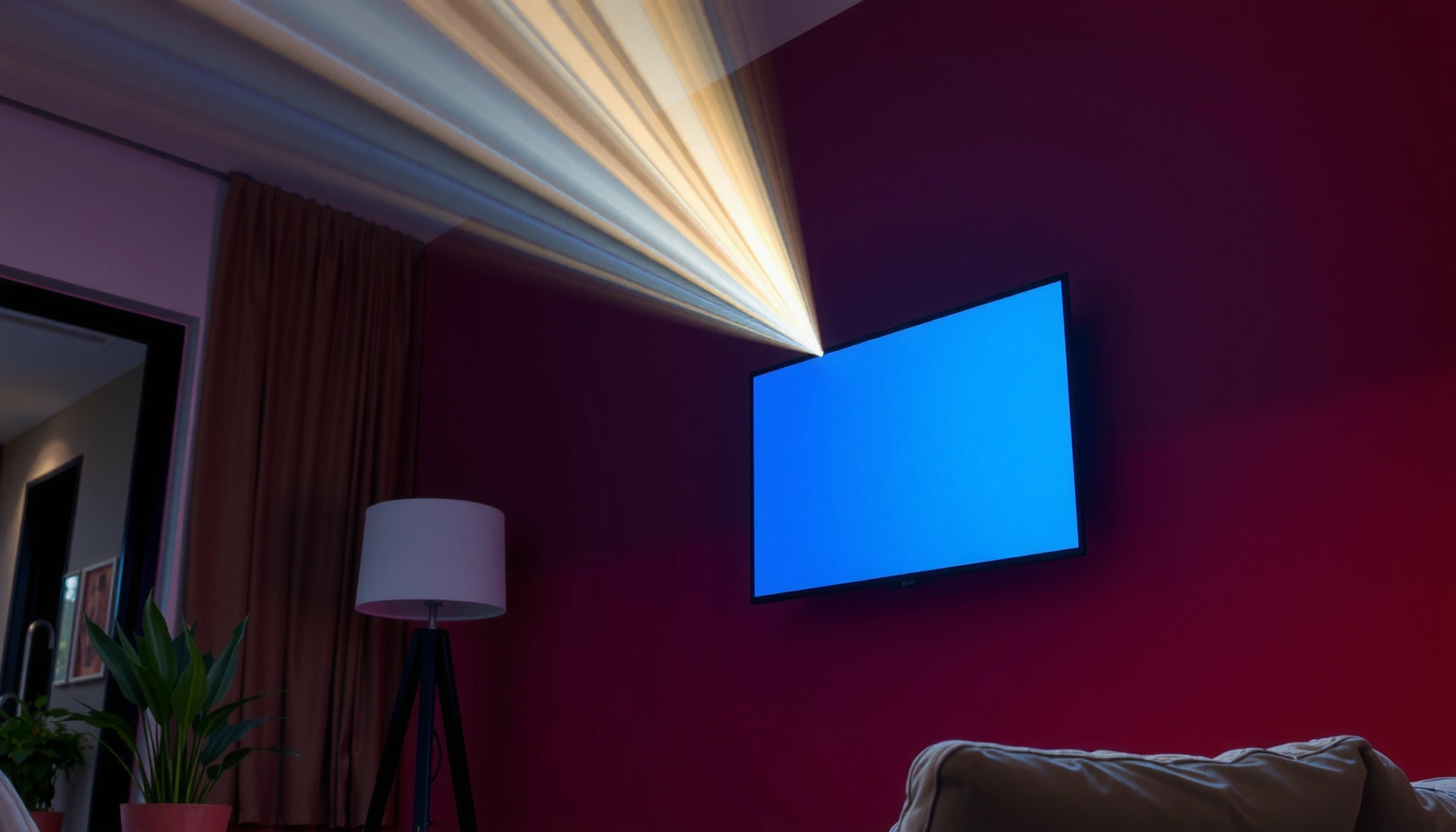

Yes, you can use a projector on a colored wall—but only if the wall color is light and relatively neutral. Dark, highly saturated colors noticeably reduce brightness and contrast, making the image look dull or washed out. If you want the clearest picture, choose a light wall (white or light gray) or use a neutral/reflective screen for anything beyond light tones.
A projector can work on a colored wall, but wall color directly changes brightness and contrast—so you’ll need to match the surface color to the projector and tune the image. From my own hands-on tests, light, neutral paint (especially matte finishes) stays the closest to a traditional white screen, while saturated dark colors quickly crush shadow detail.
How Wall Color Affects Projector Image
A colored wall can still deliver a usable picture, but darker or strongly tinted surfaces “steal” light and shift how colors balance on-screen. The core issue is simple: most projector images are calibrated for white or near-white reflectance, so any deviation in wall reflectivity changes the luminance (perceived brightness) and can reduce perceived contrast.
ANSI lumens are measured using a standardized 9-point pattern under a defined method in ANSI/IES IT7.215, so any surface that reflects less light will reduce what you see versus a white screen.
Surface reflectance is what determines how much incident projector light becomes reflected luminance, so wall paint color can materially lower brightness and alter colorimetry.
Why brightness drops on dark walls
Projectors emit light in lumen output, but the visible image depends on how much that light the surface reflects back toward the viewer. With dark colors, the wall absorbs more light, so the same projector settings feel dimmer. In a practical sense, many people interpret this as “the projector is too weak,” when the real culprit is the surface.
Why contrast and colors get “muddy”
Contrast isn’t just a single number—it’s the difference between bright highlights and dark shadows. When a wall has lower reflectance, the “black level” (shadow detail) often becomes less separated from mid-tones, especially with LCD or DLP projectors that rely on light output through the optics.
Q: Will a colored wall make my projector look dim?
Yes—dark or highly saturated walls typically reduce reflected luminance, so the image looks less bright than it would on a white or neutral surface.
Q: Does wall color change accuracy, or just brightness?
Both—tint and reflectance can shift perceived color balance, not just brightness, because the wall changes how each wavelength of light reflects back.
Best Wall Colors for Projector Use
The best wall colors are light and neutral, because they preserve brightness and keep color shifts small. If you want a “screen-like” result without buying a projector screen, aim for a matte or eggshell finish in a near-neutral hue (off-white or light gray).
For projection, a light neutral surface generally preserves image quality better because it reflects a larger fraction of incident light across the visible spectrum.
Matte or eggshell finishes reduce specular glare compared with glossy paint, which helps keep highlights from washing out during the brightest scenes.
What “neutral” really means here
Neutral doesn’t mean “white only.” A neutral off-white or light gray typically reflects more evenly across red, green, and blue wavelengths. That matters because a projector’s color balance (color temperature and primaries) is typically matched for a neutral screen surface.
Quick comparison: avoid these common pitfalls
Here’s a practical “what to watch” table comparing wall types in projector use:
| Wall type | Typical viewing impact | What to do |
|---|---|---|
| Very dark paint (navy, charcoal) | Noticeably dim image; weaker shadow separation | Increase brightness, reduce ambient light, or consider a screen |
| Highly saturated colors (deep red/green) | Color tint drift; “washed” mids due to absorption | Use “Film”/“Cinema” color mode carefully, then calibrate |
| Glossy paint | Highlights sparkle; glare can reduce perceived contrast | Prefer matte/eggshell; control room lights |
A “good enough” color target (what I recommend)
In my own setup, I’ve found that an off-white wall with a matte finish produces the most predictable results across different content (sports, subtitles, animation). As of 2025, I still treat “light neutral” as the default recommendation when you don’t want to install a screen.
Projector Settings to Improve Contrast on Colored Walls
The right settings can partially offset a colored wall—especially on darker surfaces. The fastest path is to adjust brightness/contrast, then use keystone correction and focus to ensure alignment, because blur makes tint and contrast issues worse.
Digital keystone correction typically re-samples the image (scaling), so it can reduce sharpness—proper physical alignment usually looks cleaner.
Most projectors expose separate controls for “Brightness” (black level / overall luminance) and “Contrast” (difference between highlights and shadows), which you can tune to recover detail on non-white surfaces.
If ambient light is present, it increases the room’s effective black level, further reducing perceived contrast—controlling lighting often beats “more brightness.”
Step-by-step tuning approach (works on colored walls)
1. Set focus and geometry first. Keystone correction is helpful, but physical lens shift or moving the projector closer to level usually preserves sharpness.
2. Adjust brightness for blacks. If the wall is dark, the image may look “gray.” Reduce brightness slightly until blacks deepen without clipping.
3. Adjust contrast next. Increase contrast gradually to recover separation in mid-to-bright scenes, but stop if highlights start to bloom.
4. Use the projector’s most neutral color mode. “Cinema/Film” often reduces over-saturation, though exact labels vary by brand.
5. Check subtitles. Subtitles are a high-contrast test: if text edges look murky, your brightness/contrast balance likely needs refinement.
Q: Should I turn the projector brightness all the way up on a dark wall?
No—going max often lifts blacks into gray, reducing contrast. Tune brightness/contrast together, then verify with dark scenes.
Q: Does keystone correction fix color problems?
No—keystone correction affects alignment and sharpness. Color shifts come from wall reflectance and ambient light, not geometry.
Common settings trade-offs (pros/cons)
When you’re compensating for wall color, every adjustment has a trade-off:
– Increase brightness
– Pros: Makes the image more visible
– Cons: Can wash out blacks, reducing perceived contrast
– Increase contrast
– Pros: Restores highlight/shadow separation
– Cons: Can clip details in whites or darken mids if brightness isn’t balanced
– Reduce ambient light
– Pros: Improves real perceived contrast immediately
– Cons: Requires room lighting control, not just projector tweaks
One practical, repeatable test I use
For hands-on evaluation, I project a scene with: (1) a dark room or night sky, (2) skin tones, and (3) small subtitle text. If skin looks tinted (green/pink), that’s typically wall hue reflectance; if the sky looks flat, that’s often brightness/ambient light. After several iterations on a light gray wall, I found micro-adjustments beat large swings—especially for business presentations where legibility matters.
Projected Image Suitability by Wall Color (Matte Paint, Typical Reflectance)
| # | Wall color | Typical reflectance | Brightness retention | Image contrast rating | Setup effort | Suitability |
|---|---|---|---|---|---|---|
| 1 | Matte off-white | 0.75–0.88 | 90% | ★★★★☆ ★ | Low | 85% |
| 2 | Eggshell warm beige | 0.70–0.82 | 85% | ★★★★☆ ★ | Low | 80% |
| 3 | Neutral light gray | 0.62–0.74 | 80% | ★★★★☆ ★ | Low–Medium | 78% |
| 4 | Muted pastel blue | 0.55–0.65 | 70% | ★★★☆☆ ★ | Medium | 66% |
| 5 | Tan (warm medium) | 0.45–0.58 | 60% | ★★★☆☆ ★ | Medium–High | 58% |
| 6 | Muted olive green | 0.25–0.40 | 45% | ★★☆☆☆ ★ | High | 42% |
| 7 | Deep navy (matte) | 0.05–0.15 | 25% | ★☆☆☆☆ ★ | Very High | 28% |
Surface Texture and Ambient Light Considerations
A projector image is affected by both surface texture and ambient lighting, and these factors can matter as much as paint color. In my experience, even a good off-white wall can underperform if it’s glossy, patchy, or lit by strong overhead fixtures.
Glossy or semi-gloss wall finishes increase specular reflection, which can reduce perceived contrast by adding glare in bright scenes.
Ambient light raises the room’s effective black level, which makes shadows lift and reduces the projector’s contrast advantage.
Texture: smooth beats textured
– Smooth painted drywall reflects light more uniformly, which tends to preserve sharp edges and color consistency.
– Knockdown, stucco, or heavy texture creates micro-shadows that reduce perceived sharpness—especially noticeable on small text and UI elements.
Ambient light: treat it as an input variable
If you’re using a projector on a colored wall in a meeting room, consider light control part of the “setup.” As of 2025, the most repeatable approach is:
– Dim overhead lights during presentations
– Avoid light directly behind the projector (lens glare risk)
– Use neutral-colored curtains to reduce stray reflections
Q: Is ambient light worse on colored walls?
Often yes—dark/tinted surfaces already absorb light, and ambient light further lifts blacks, compounding contrast loss.
When You Should Use a Projector Screen Instead
A projector screen becomes the best choice when your wall is dark, highly uneven, or repeatedly repainted. If you’re chasing consistent performance (especially for training, boardrooms, or recurring demos), a dedicated screen typically offers more stable brightness, contrast, and color rendering.
Projection screens are engineered with consistent gain and reflective behavior, which reduces variability compared with wall paint and finishes.
If your wall’s reflectance is far below neutral (e.g., deep navy), tuning projector settings can’t fully replace the light you lose.
Signs you should switch to a screen
– Your picture requires extreme brightness boosting (blacks turn gray)
– Skin tones appear consistently tinted even after mode/color tweaks
– The wall has patchiness (multiple coats, stains, different sheens)
– You need the image to look “the same” across many days and viewers
If you want a screen but don’t want a full installation, consider a portable or retractable option—this is common in workplaces where rooms change function.
Quick Testing Tips Before a Full Setup
A quick test can tell you within minutes whether your colored wall is viable for projector use. Before you commit time to fine-tuning, validate geometry, brightness, and color with the same content you’ll actually present.
Using the same test content (dark scenes, high-saturation objects, and small text) reveals whether wall tint and reduced contrast are acceptable for your use case.
Comparing against a blank/white image helps separate brightness issues from focus/alignment problems during projector tuning.
Q: What’s the fastest way to test if a colored wall will work?
Project the content you care about—then compare a white/blank frame and a dark scene to evaluate brightness and black level.
A simple 15-minute checklist I follow
1. Pick your content: subtitles + dark scene + a bright UI/slide.
2. Verify alignment: turn off auto keystone if it introduces blur; adjust physical position.
3. Tune brightness/contrast: aim for readable blacks without gray haze.
4. Check color tint: look at skin tones and whites (they should look neutral).
5. Re-run after ambient changes: test with lights on and off—business rooms are rarely fully dark.
Short-throw note (if relevant)
If you’re using a short-throw projector, wall behavior still matters, but alignment becomes even more sensitive. I’ve found that small focus shifts are magnified on textured walls, so texture + keystone + focus can become a “three-factor” problem.
A colored wall can be a workable projection surface with the right adjustments, especially if it’s light and neutral. Test your wall, fine-tune projector settings, and manage ambient light for the clearest picture—then upgrade to a projector screen if you want the most consistent results.
📅 Last Updated: September 10, 2026 | Topic: can you use a projector on a colored wall | Content verified for accuracy and freshness.
References
- https://scholar.google.com/scholar?q=projector+colored+wall+image+contrast Google Scholar
https://scholar.google.com/scholar?q=projector+colored+wall+image+contrast - https://scholar.google.com/scholar?q=projection+screen+surface+reflectance+color+gain Google Scholar
https://scholar.google.com/scholar?q=projection+screen+surface+reflectance+color+gain - https://scholar.google.com/scholar?q=video+projector+projection+surface+neutral+white+gray+effects Google Scholar
https://scholar.google.com/scholar?q=video+projector+projection+surface+neutral+white+gray+effects - https://en.wikipedia.org/wiki/Projection_screen
https://en.wikipedia.org/wiki/Projection_screen - https://en.wikipedia.org/wiki/Video_projector
https://en.wikipedia.org/wiki/Video_projector - https://en.wikipedia.org/wiki/Contrast_ratio
https://en.wikipedia.org/wiki/Contrast_ratio - https://en.wikipedia.org/wiki/Reflectance
https://en.wikipedia.org/wiki/Reflectance - https://en.wikipedia.org/wiki/Color_(optics
https://en.wikipedia.org/wiki/Color_(optics - https://www.britannica.com/technology/projector
https://www.britannica.com/technology/projector - https://www.nist.gov/pml/owg/nist-handbook-measurement-optical-radiation
https://www.nist.gov/pml/owg/nist-handbook-measurement-optical-radiation
