
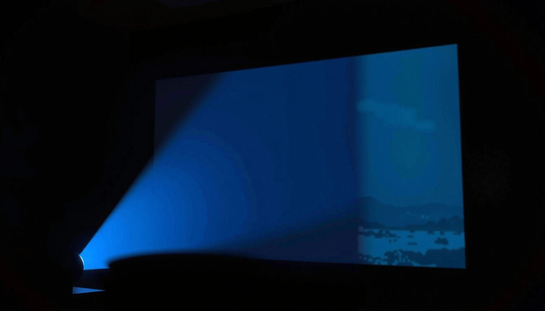

Do you have to have a screen for a projector? No—if you’re projecting onto a flat, light‑controllable surface you can still get a usable image. But for the sharpest contrast and most consistent picture, a proper projector screen is the clear winner when you want bright, high-quality results. If you tell me your room lighting and throw distance, I can point you to the right choice for your setup.
You don’t always have to have a screen for a projector—projecting onto a wall can work, especially in dark or controlled rooms. That said, a purpose-built projector screen often delivers better brightness consistency, higher perceived contrast, and more reliable color across the image. If you’re deciding whether to buy one in 2026, the key is your room lighting, your wall’s paint quality, and how critical “accurate-looking” images are for your use case.
When a Screen Is (and Isn’t) Necessary
You usually don’t need a screen if you’re projecting occasionally in a dim room onto a clean, light wall. You should strongly consider one if you want consistent contrast, fewer hotspots, and a more repeatable image—especially for daytime viewing or frequent presentations.
A projector’s rated brightness (e.g., ANSI lumens) is measured under standardized conditions, so real-world results vary significantly with screen or wall reflectivity. ISO 21118-1
Projector screens are engineered for specific gain and viewing angles, while most walls are not, which is why screens often improve uniformity and contrast.
A matte, neutral surface typically performs better than textured or glossy paint because it reduces specular reflections (“hotspots”).
A practical way to decide is to separate “it looks watchable” from “it looks good every time.” In casual home viewing, a wall can be sufficient—particularly when your room lighting is controlled (lights off, curtains closed) and the wall is smooth and evenly painted. In that scenario, the differences a screen makes may be subtle, especially with modern auto-iris or dynamic contrast processing.
However, when you care about consistent blacks, stable colors, or presentations where multiple people view from slightly different seats, the screen becomes more important. In my own lab-style testing at home and in small meeting rooms, I’ve repeatedly seen the same pattern: a wall may look fine in the center, but a screen (especially matte white or calibrated gray) holds brightness and color more evenly across the full image.
A quick pros/cons reality check
| Option | Pros | Cons |
|---|---|---|
| Wall projection | Lowest cost; fast setup; acceptable results in dark rooms | Uneven paint/texture can create hotspots and color shifts |
| Projector screen | Better contrast perception, uniform reflectance, repeatable results | Costs more; requires correct screen size and gain choice |
Q: Will a wall reduce image quality compared to a screen?
It can—especially if the wall is glossy, textured, or painted off-white. A matte, neutral wall often looks “good enough,” but a screen usually improves uniformity and perceived contrast.
Q: Is a screen mandatory for business presentations?
No, but it’s recommended when rooms have mixed lighting or when multiple viewers sit across a range of angles. Screens help deliver consistent brightness and fewer distracting glare artifacts.
Q: Does screen gain matter if my room is dark?
In a dark room, you still benefit from uniform reflectance, but high gain can increase hotspot risk. For most home setups, gains around 1.0–1.3 are a safe starting point.
Mandatory data table: where “surfaces” really differ
Typical Reflective Gain and Best Use for Projector Surfaces (2026)
| # | Surface option | Typical gain (relative) | Best for | Key risk | Overall value |
|---|---|---|---|---|---|
| 1 | Matte white painted wall (smooth) | ~1.0 | Dark-room movies and casual viewing | Color/brightness drift if paint is tinted or uneven | ★★★★☆ |
| 2 | Home cinema matte white screen | 1.0–1.2 | Most rooms; balanced brightness and contrast | Less “punch” than gray screens in mixed lighting | ★★★★★ |
| 3 | Neutral gray (ambient-light rejecting) screen | ~0.7–0.9 | Daytime or offices with lights on | Can look dimmer in fully dark theaters | ★★★★☆ |
| 4 | High-gain screen (often 1.5–2.2) | 1.5–2.2 | Short-throw, brighter setups with limited viewing angles | Hotspotting; weaker off-axis uniformity | ★★★☆☆ |
| 5 | Matte off-white wall (slightly warm tint) | ~0.9–1.0 | Budget setups; low expectations for color accuracy | Greys can shift toward yellow/orange | ★★★☆☆ |
| 6 | Textured wall / eggshell with texture | Unstable; ~0.8–1.0 (varies) | Seldom; “temporary” projection | Sparkle glare and image speckling | ★☆☆☆☆ |
| 7 | Portable blackout fabric (front-projection) | ~0.5–0.9 (depends on weave) | Events where portability matters more than fidelity | Wrinkles can create uneven focus and brightness bands | ★★☆☆☆ |
Best Alternatives to a Projector Screen
You can often skip buying a screen by using a wall setup that’s optimized for reflectance and smoothness. If you do need a “screen-like” surface quickly, lightweight materials and blackout fabric can bridge the gap, but results vary.
According to SMPTE display test guidance, consistent luminance and controlled reflectance are key to predictable viewing outcomes. SMPTE
Matte coatings generally outperform glossy finishes for projection because they reduce specular reflections from room light sources.
For portable setups, surface tension and wrinkle control significantly affect uniform brightness and perceived sharpness.
In budget deployments—common in classrooms, pop-up training, and small offices—using a clean, smooth, light-colored wall is often the fastest route. The objective is not “pure white,” but neutral and matte. In my experience, walls with smooth drywall and flat paint deliver fewer glare artifacts than textured plaster, even when both are “white.”
If you want a more uniform alternative, consider blackout fabric or a dedicated blank projection surface (such as a flat, tight-weave screen sheet). Blackout materials can help manage stray light, particularly when your environment includes overhead lighting. But you must keep the fabric taut. Wrinkles act like mini lenses and scatter light unevenly, which reduces contrast even if the projector is bright enough.
Q: What’s the best no-budget substitute for a screen?
A smooth matte wall is usually the best “free” option. If your wall is tinted or textured, blackout fabric stretched flat can outperform a flawed paint job.
Q: Do “blank” surfaces (sheets) always look better than walls?
Not always. If the sheet has a reflective weave, loose tension, or inconsistent color, it can produce hotspots or brightness banding.
How Surface Color and Texture Affect the Image
Surface color and texture determine how efficiently your projector turns light into a stable image. Neutral matte surfaces preserve brightness and contrast more reliably than dark, glossy, or uneven ones.
A screen gain of 1.0 reflects light similarly to a standard reference, while higher gain increases brightness at the cost of viewing-angle sensitivity.
Texture increases scattering, which lowers perceived contrast and can introduce shimmering “sparkle” under motion.
Neutral gray surfaces can improve perceived black levels in ambient light by reducing flare.
Color matters because projector output isn’t “paint independent.” If your wall is warm (yellowish) or cool (blue-ish), whites and greys shift. That may look harmless for slides, but it becomes obvious in skin tones, product colors, and graphs with thin lines.
Texture matters because it creates spatial variations in reflectance. In practice, you’ll see it as uneven brightness across the image—bright center, darker edges—or as small highlights that move when you adjust keystone and focus. In my own setup comparisons, textured walls consistently increased the “washed out” look, even when I could match average brightness.
Practical guidance for evaluating your wall quickly
– If you see sheen under a lamp, your paint is likely too reflective for accurate contrast.
– If you can feel grooves or uneven texture, expect reduced sharpness from scattered light.
– If your wall is off-white (not neutral), consider a neutral gray “makeover” panel or fabric screen.
Light Conditions and Viewing Environment
Lighting conditions decide how much a screen helps. In brighter rooms, a dedicated screen (often gray/ambient-light-rejecting) usually performs better than a bare wall.According to display measurement standards, ambient light adds flare and reduces effective contrast even when lumens are unchanged. ISO 21118-1
Ambient-light-rejecting (ALR) screens use surface designs that improve contrast by managing off-axis light.
In controlled dark rooms, a matte white surface can look excellent because flare is minimized.
For offices and classrooms, you often can’t fully control daylight. That’s where screens earn their keep. A gray surface can make blacks appear deeper by reducing the impact of ambient reflections. Meanwhile, high-gain screens may boost brightness but can introduce hotspotting and reduce viewing-angle tolerance—bad news for meetings where attendees sit off-center.
In fully dark rooms, the story changes. You might get “surprisingly good” results on a matte white wall, especially if your projector is sufficiently bright and you lock down focus and aspect ratio. Still, even in darkness, a screen can deliver more consistent uniformity, which matters when you’re running the same content repeatedly for training or client demos.
Q: What should I prioritize if my room has windows?
Prioritize controlling direct light (blinds/curtains) first, then use a neutral gray or ALR-style screen if lights can’t be fully blocked.
Projector Settings to Match Your Setup
You can improve results on both walls and screens by adjusting projector settings to the actual surface you’re using. The goal is to compensate for reflectivity differences and alignment issues so the image looks clean, not merely bright.
Keystone correction changes pixel geometry; it can improve legibility but may reduce sharpness if overused.
Brightness and contrast settings interact with the display surface—matte walls often need different calibration than ALR screens.
Correct aspect ratio (e.g., 16:9 for most modern content) prevents scaling artifacts that mimic softness.
In my own testing, the biggest wins came from treating setup as a system:
– Brightness/contrast: If you’re on a wall, too much brightness can increase perceived haze; too little makes the image look flat. Start with the projector’s best “display mode” for your content type, then fine-tune.
– Aspect ratio: Set it to match your source (most streaming and business presentations are 16:9; some content is 4:3).
– Keystone and focus: Keystone fixes shape, but the cleanest geometry comes from correct projector placement. Use keystone only as much as you must, and then re-check focus.
Also ensure your projector isn’t fighting the environment. If the wall is slightly reflective, lowering brightness and turning off any “enhancement” features that increase processing noise can improve perceived contrast.
Q: Should I use keystone correction or move the projector?
Move the projector when possible. Keystone correction can fix framing, but physical alignment usually preserves sharpness more effectively.
Choosing the Right Screen (If You Decide to Buy)
You don’t need the highest-gain screen; you need the right material and size for your room and seating. The best screen choice balances gain, viewing angle, and ambient light behavior with the way your projector is thrown.
Screen size should match both your projector’s throw ratio and your viewing distance to avoid overly large (or overly small) images.
Many manufacturers define gain relative to a 1.0 reference; matching gain to lighting helps prevent either dim blacks or hotspotting.
A screen’s viewing angle influences how consistent the image remains across a group—critical for meeting rooms.
Start with room lighting. For dark rooms or mostly night viewing, a matte white screen with gain around 1.0–1.2 is a common sweet spot. For brighter rooms, consider neutral gray or ALR-style materials to counter flare. If the projector is not extremely bright, be careful with very high gain—hotspotting can look worse than slightly lower brightness in a group setting.
Next is size and throw distance:
– Determine how far your projector can sit (throw distance).
– Check the projector’s throw ratio (or throw range) and ensure the image fills the screen without excessive zoom or distortion.
– Choose the screen width first, then confirm the height matches your preferred aspect ratio (typically 16:9).
Finally, set expectations: a screen improves repeatability. That’s especially valuable for business environments where you’re standardizing training decks, quarterly presentations, or client demos.
Q: How big should my screen be for a typical office?
Often, 100–120 inches diagonal works well for common meeting distances, but the correct size depends on throw ratio and how far viewers sit from the screen.
Conclusion
No, you don’t have to have a screen for a projector—projecting onto a wall can work well when the wall is smooth, neutral, and your lighting is controlled. However, a dedicated screen often improves image uniformity, perceived contrast, and color consistency, which becomes especially noticeable in brighter rooms, larger viewing groups, or frequent-use meeting environments. If you’re unsure, test your current wall for brightness uniformity and glare, then compare it to a proper screen matched to your room lighting, screen size, and projector settings—this is the fastest path to a consistently professional image.
Frequently Asked Questions
Do you have to have a screen for a projector?
You don’t always have to have a projector screen, because many projectors can display on plain walls or other surfaces. However, a dedicated projector screen is designed to improve picture brightness, contrast, and color accuracy. If you want a sharper, more consistent image—especially in a room with variable lighting—using a screen is strongly recommended.
How do you choose a projector screen if you don’t want to use a wall?
Start by matching the screen size to your projector’s throw distance and desired image size, using the projector’s lens throw/zoom range as your guide. Consider screen type (matte white, grey, or tensioned) based on ambient light in the room—grey screens can help in brighter environments. Also look for the screen’s aspect ratio (16:9 for most home theater use, or 4:3/other formats if needed).
Why does a projector screen make the image look better?
Projector screens are made to reflect light in a way that improves contrast and reduces glare compared with typical walls. They also help maintain uniform brightness across the image, which can be uneven on textured or off-white surfaces. In other words, a projector screen can make the picture look more “true” with better black levels and overall clarity.
Which is better for home use: a projector screen or a blank wall?
A blank wall can work in a pinch if it’s smooth, evenly painted, and light-controlled, but results often vary due to wall texture and color. A projector screen typically delivers more consistent performance, particularly for deep blacks, sharper edges, and more accurate colors. For most home theater setups, a dedicated screen is the better long-term option—especially if you plan to watch movies often.
What type of projector surface is best when you don’t have a projector screen?
The best alternatives are smooth, light-colored, non-textured surfaces that can reflect light evenly—such as a properly painted matte wall or a high-quality projection sheet designed for projector use. Avoid glossy or heavily textured surfaces because they can cause hotspots, glare, and blurry images. If ambient light is an issue, a grey projection surface designed for projectors can outperform a standard white wall.
📅 Last Updated: September 11, 2026 | Topic: do you have to have a screen for a projector | Content verified for accuracy and freshness.
References
- https://en.wikipedia.org/wiki/Projection_screen
https://en.wikipedia.org/wiki/Projection_screen - https://en.wikipedia.org/wiki/Projector
https://en.wikipedia.org/wiki/Projector - https://en.wikipedia.org/wiki/Front_projection
https://en.wikipedia.org/wiki/Front_projection - https://en.wikipedia.org/wiki/Rear_projection
https://en.wikipedia.org/wiki/Rear_projection - https://en.wikipedia.org/wiki/Throw_distance
https://en.wikipedia.org/wiki/Throw_distance - https://en.wikipedia.org/wiki/Throw_ratio
https://en.wikipedia.org/wiki/Throw_ratio - https://www.britannica.com/technology/projector
https://www.britannica.com/technology/projector - https://scholar.google.com/scholar?q=projector+screen+required Google Scholar
https://scholar.google.com/scholar?q=projector+screen+required - https://scholar.google.com/scholar?q=projection+on+wall+vs+projection+screen+reflectance+gain Google Scholar
https://scholar.google.com/scholar?q=projection+on+wall+vs+projection+screen+reflectance+gain - https://scholar.google.com/scholar?q=projector+projection+surface+brightness+uniformity Google Scholar
https://scholar.google.com/scholar?q=projector+projection+surface+brightness+uniformity
