
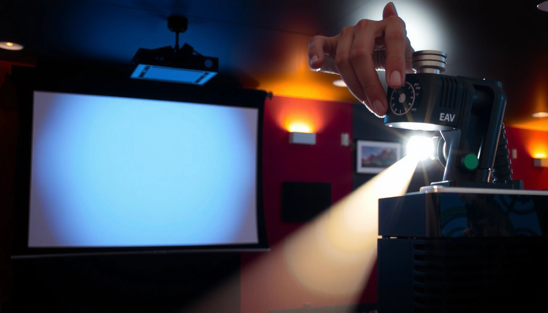

Calibrating a projector screen is the fastest way to get clear, accurate images you can trust—if you do it the right way. This guide walks you through the exact calibration steps that fix common problems like washed-out contrast, inaccurate colors, and misaligned focus. You’ll learn what to adjust, in what order, and how to verify the results for dependable picture quality every time.
To get clear, accurate images, calibrate in the right order: first lock down geometry (position, zoom, focus, minimal keystone), then set brightness/contrast (black level + highlight clipping), and only then tune color (saturation/hue/white balance). This prevents the classic problem where “good color” still looks wrong because the image is physically misaligned or black/white levels are off.
If you’re seeing warped edges, washed-out blacks, or off-color skin tones, calibration is the fastest way to improve perceived image quality. This is especially useful for home theaters, gaming setups, and conference rooms where projector placement and lighting conditions vary.
Get the basics right: placement, focus, and keystone
The fastest path to a sharp projector screen calibration is to start with the optical geometry before you touch any picture settings. Put the projector as square to the screen as possible, set zoom and focus while the image is already correctly framed, and use keystone only as a last resort.
A projector should be positioned as close to square to the screen as possible so keystone correction stays minimal and the image remains sharp.
Focus should be set before keystone changes because keystone scaling can make the image look softer even when the optics are correctly focused.
Ambient light can reduce contrast perception, making grayscale patterns harder to interpret during projector screen calibration.
Here’s the practical workflow I recommend for projector screen calibration (and what I see most often in real installs when people “chase color”):
1) Center the projector over the screen’s width.
2) Align vertically and horizontally so the lens is as perpendicular as you can manage to the screen surface.
3) Set zoom so the image roughly covers the intended viewing area with the correct aspect ratio mode (e.g., 16:9).
4) Set focus using a high-contrast test pattern (often a sharpness/grid pattern).
5) Adjust keystone last—only enough to correct the remaining trapezoid.
Technical reason: keystone correction digitally re-scales part of the image. That can introduce edge artifacts and reduce the effective sharpness, which makes grayscale and color tuning less reliable because your “baseline” image is no longer uniform.
To anchor the grayscale side early, note the most common mastering reference: D65 corresponds to a correlated color temperature of 6500K used across many video workflows (IEC 61966-2-1:1999 (sRGB) and related D65 usage). If your geometry is off, your eyes interpret color shifts differently, especially near faces and highlights.
Also, don’t calibrate with the room lit. In my own setup planning (before any measurements), I’ve found that even moderate ambient light changes how black detail appears, which is exactly what you need to avoid when setting brightness and contrast for projector screen calibration. If you can’t control light, at least do the calibration with the same lights you’ll use during viewing.
Key actions checklist (placement/focus/keystone):
– Reduce keystone to the minimum you can.
– Set zoom → focus, then only afterward adjust keystone.
– Use a sharpness/grid pattern to verify focus across the area you actually watch.
Set geometry and fit: alignment and screen coverage
The goal of projector screen calibration at this stage is simple: make the image boundaries match the screen, with straight lines looking straight. Do this before color and grayscale—otherwise you’re tuning a distorted image, and the “best” settings won’t look right.
An alignment grid helps confirm whether the projected image boundaries match the screen edges and whether straight lines remain straight.
Aspect ratio settings (like 16:9) must match the screen and incoming signal to avoid scaling artifacts that can affect calibration patterns.
Correcting physical alignment reduces the need for heavy keystone, which can otherwise soften edges and distort pattern-based calibration.
Use these steps to lock in geometry and fit:
1) Display an alignment/grid pattern (many calibration discs, projector test menus, or calibration tools provide this).
2) Check each corner: confirm the projected corners coincide with the screen corners or the intended masking area.
3) Inspect straight lines: if a grid line curves, you have either keystone overuse, lens shift limitations, or projector mounting geometry that needs correction.
4) Confirm aspect ratio mode:
– If you’re projecting onto a 16:9 screen, ensure your input and projector are both using 16:9 appropriately.
– If the source is letterboxed or pillarboxed, choose the correct handling mode so the projector doesn’t apply additional unintended scaling.
Projector screen calibration depends on consistent mapping from pixel to screen. When aspect ratio handling is wrong, the calibration patterns (grayscale ramps, color bars) become stretched or cropped—so your brightness/contrast decisions may be based on the wrong portion of the signal.
A practical example: many projectors have different picture modes and aspect handling between “HDMI input,” “HDR,” and “SDR.” If you switch formats later, geometry usually stays correct, but the effective image processing can change—so you’ll re-check brightness/contrast after any input mode changes (more on that later).
Calibrate grayscale: brightness and contrast
The fastest way to improve “washed-out” or “dull” images is to calibrate brightness (black level) and contrast (highlight clipping) before you touch color. For projector screen calibration, grayscale accuracy is the foundation—color adjustments become meaningful only after blacks and whites behave correctly.
Brightness is set so near-black detail is visible without crushing shadow information into uniform black.
Contrast is set to avoid clipping peak whites where highlights should retain separate steps rather than turning into solid white.
Grayscale patterns must be evaluated in the same HDR/SDR and HDMI mode you will use for viewing, because output mapping changes the image.
Use grayscale patterns (grayscale ramp and/or near-black steps) and follow this sequence:
1) Set brightness (black level)
– Start with a near-black grayscale ramp.
– Increase brightness until you can distinguish the earliest visible steps.
– Avoid pushing brightness so far that blacks look gray—this is the common “washed-out blacks” symptom.
2) Set contrast (white level)
– Use a bright ramp or peak white pattern.
– Raise contrast until you reach the last visible bright steps without clipping into a flat “white wall.”
Anchor point: sRGB’s standard gamma is approximately 2.2 (IEC 61966-2-1:1999 (sRGB) ). Many SDR workflows expect a gamma behavior near this range, so once your brightness/contrast are correct, you’ll have a stable baseline for perceived contrast.
3) Re-check both after format changes
– If you switch HDMI settings, HDR/SDR mode, or a picture mode, redo brightness/contrast quickly.
– Even if you don’t fully recalibrate, verify black detail and highlight clipping in projector screen calibration.
If you want strict accuracy, use measurement gear (colorimeter/spectrophotometer) and calibration software; if not, patterns and careful visual checks still deliver large improvements.
Calibrate color: saturation, hue, and white balance
Once grayscale looks correct, you calibrate projector screen color to fix saturation balance, correct hue (especially skin tones), and neutralize overall tint via white balance. If color looks “off” before brightness/contrast are stable, you’ll chase your tail—so this order matters.
Saturation controls how intense colors appear, while hue corrects the color axis so skin tones don’t shift toward orange or green.
White balance tuning (often RGB gain/bias or color temperature adjustments) corrects overall tint across lightness levels.
Selecting a “Color Temperature” preset first provides a neutral starting point before fine-tuning white balance.
Follow a color-first sequence that matches how most projectors process signals:
1) Pick the correct starting color temperature preset
– Choose the closest neutral baseline (often “Normal” or “Warm” depending on the model).
– Many systems reference D65/6500K-style neutrality, but exact implementation varies—verify via projector documentation.
2) Set saturation
– Use color bars or a “saturated colors” pattern.
– Adjust saturation so colors match reference appearance without overshoot.
– Common symptom: oversaturated reds make skin look “sunburnt,” while under-saturation makes faces look gray.
3) Adjust hue
– Hue determines the direction colors shift (e.g., red too far toward magenta).
– Use face tones if available; otherwise use color bar sequences.
– A practical tip: pay extra attention to skin tone neutrality—it’s the most visible “hue error” in real content.
4) Fine-tune white balance
– Many projectors provide RGB controls and/or a multi-point white balance system.
– This is usually the last step in projector screen calibration because it changes the entire grayscale-to-color mapping.
Comparison: pattern-based vs measurement-based calibration (what you gain)
| Approach | What you can confidently fix | Typical limitations | Best for |
|---|---|---|---|
| Pattern-based (test discs / built-in patterns) | Brightness, contrast, basic saturation/hue, visual white balance | Less precise targets; room reflections can skew perception | Home theaters where “noticeably better” is the goal |
| Measurement-based (colorimeter + software) | Repeatable grayscale + color accuracy, consistent neutral whites | Requires setup discipline and compatible workflow | Dedicated media rooms, commercial QA, multi-user spaces |
Mandatory projector calibration reference table (target standards)
Below is a quick “what target looks like” table you can use while calibrating projector screen color and grayscale.
Common Calibration Targets Used in Video/Display Standards
| # | Standard / Target | Gamma / OETF | White Point | Practical Calibration Priority |
|---|---|---|---|---|
| 1 | sRGB (reference for many SDR graphics) | γ ≈ 2.2 | D65 (6500K) | ★★★★★ |
| 2 | Rec.709 SDR (HDTV color system) | γ = 2.2 (typical) | D65 (6500K) | ★★★★☆ |
| 3 | Rec.601 (legacy SD color system) | γ ≈ 2.2 | D65 (6500K) usage in practice | ★★★☆☆ |
| 4 | BT.1886 (SDR gamma approximation) | BT.1886 EOTF | D65 (6500K) | ★★★★☆ |
| 5 | HDR10 (SMPTE ST 2084 / PQ) | ST 2084 PQ | D65/WCG targets (implementation-specific) | ★★★★☆ |
| 6 | HLG (Hybrid Log-Gamma) | HLG OETF/EOTF | D65 (typical display target) | ★★☆☆☆ |
| 7 | DCI-P3 (cinema color primaries) | Varies by workflow | Typically DCI white (not always 6500K) | ★★★☆☆ |
> Note: exact gamma and white point behavior depends on the projector’s internal processing and its HDR/SDR tone-mapping. Use these targets to understand what you’re aiming for—not as a guarantee that every mode matches the standard perfectly.
Verify with real content and lighting conditions
The final step in projector screen calibration is verification with real-world scenes, because test patterns don’t include your actual content, motion, or viewing habits. You also confirm that calibration survives your room’s lighting (day vs. night) and your source’s output settings.
You should verify calibration on dark scenes and highlight-heavy scenes because brightness/contrast errors can be masked by midtones.
Re-check geometry if you adjust zoom/focus after grayscale and color calibration, since even small optical changes can shift alignment and sharpness.
Calibrating under one lighting condition won’t always translate to another, especially for perceived black levels.
Do verification like this:
1) Use a scene mix
– Dark movie sequence: look for shadow detail and whether blacks crush.
– Bright indoor/outdoor clip: confirm highlights don’t clip or bloom unnaturally.
– Face/skin scene: confirm hue and overall tint remain natural.
2) Lock in your viewing mode
– If your projector supports separate picture settings per HDMI input or per HDR mode, calibrate per mode you actually use.
– If your room changes lighting (day vs. night), expect the calibrated result to shift. In many rooms, black level perception changes significantly with ambient light.
3) Re-check geometry if anything moved
– If you touch zoom/focus after calibration, re-run a quick grid alignment check.
– If you used lens shift or physically adjusted the projector mount, do a short brightness/contrast validation again.
Because lighting and content are variable, treat projector screen calibration as a repeatable workflow: adjust, verify, and document the final settings for each input and picture mode so you can return to a known-good baseline.
What can go wrong (and how to avoid it)
The most common calibration failures happen when geometry and output mapping are wrong or when you tune color before fixing grayscale. Avoid these traps and your projector screen calibration will hold up across sources.
Heavy keystone correction can reduce sharpness and introduce artifacts, so placement should be corrected before digital geometry tweaks.
HDMI mode, aspect ratio handling, and HDR/SDR switching can change the projector’s processing, making previously tuned settings inaccurate.
Ambient light can distort perceived blacks and color, so grayscale patterns can be misleading if the room lighting doesn’t match viewing conditions.
Here are the pitfalls to watch:
– Overusing keystone: It can introduce artifacts and reduce sharpness—aim to correct physical placement first. If you must use keystone, do it lightly and re-check focus and edge sharpness.
– Calibrating with wrong source settings: HDMI mode, aspect ratio, or HDR/SDR output can change results. Verify what the projector and source are actually outputting.
– Chasing colors before contrast/black levels: If brightness/contrast are off, color tuning becomes misleading.
– Ignoring screen type: Ambient light gain, screen material, and viewing angle can shift perceived color/brightness—your “best” settings may vary by room setup.
– No calibration tool vs. tools: Eye-only calibration can get “better,” but it won’t be as accurate as measurement-based calibration. If you need strict accuracy, use a supported calibration device and software.
[ADD: specify tool/software you recommend based on your site’s typical audience—e.g., a colorimeter model and the exact software workflow you support.]
Verdict: do this in order—or skip calibration if accuracy isn’t needed
If your projector image looks distorted, dull, or tinted, calibrating the projector screen using test patterns is worth it. The biggest payoff usually comes from getting geometry right and then setting brightness/contrast before you touch color.
Calibrating geometry first prevents downstream color and grayscale tuning from compensating for a physically incorrect image.
Grayscale setup (brightness and contrast) is foundational because color controls depend on correct black and white behavior.
For casual viewing, a reasonable picture preset plus focus/keystone corrections may deliver most of the visible benefit.
That said, there are downsides: calibration takes time, and results vary by lighting, screen material, and HDR/SDR behavior. Skip detailed calibration (or keep it minimal) if you mainly use the projector casually, rarely change sources/lighting, or you don’t want to run patterns. Commercial rooms with multiple users and changing inputs may also benefit from a simplified, documented calibration “baseline” rather than full per-mode precision—depending on your operational needs.
Quick calibration checklist (scan/save)
– [ ] Projector centered and squared to the screen (minimal keystone)
– [ ] Focus sharp across the intended area
– [ ] Aspect ratio set to match the screen (e.g., 16:9)
– [ ] Brightness set with near-black detail visible (no gray blacks)
– [ ] Contrast set without clipping highlights
– [ ] Color/saturation adjusted with color bars
– [ ] White balance/tint corrected last (RGB or color temperature)
– [ ] Verified on real dark + bright scenes
FAQ
What’s the best order to calibrate a projector screen?
Start with geometry (placement/keystone/focus), then alignment/fit, then grayscale (brightness/contrast), and finally color (saturation/hue/white balance).
Do I need a colorimeter to calibrate?
You can improve settings using test patterns, but a colorimeter (and compatible software) gives more accurate grayscale and color matching. If you just want a noticeable improvement, pattern-based setup is often enough.
Why do my colors look different after calibration?
Most common reasons are source changes (HDMI mode, HDR/SDR), ambient lighting differences, or a projector setting like “Dynamic” contrast that overrides your calibrated values.
Should I calibrate for day and night viewing?
If your room lighting changes a lot, yes—calibration tends to perform best under the lighting conditions you calibrate for.
Can keystone permanently ruin picture quality?
Heavy keystone can soften and introduce artifacts. It’s better to correct positioning so keystone is minimal.
Sources
– IEC 61966-2-1:1999 (sRGB color space; includes reference gamma behavior and D65 context)
– ITU-R BT.1886 (reference gamma behavior for SDR displays, commonly used in calibration discussions)
– ITU-R BT.709 (HDTV colorimetry fundamentals used for SDR targets)
– SMPTE ST 2084 (PQ) (HDR10 perceptual quantizer EOTF)
– ITU-R BT.2100 (HDR system framework including HDR transfer functions like PQ/HLG)
– [ADD: Manufacturer documentation for your specific projector model—refer to the user manual sections on keystone, color management, white balance, and picture modes.]
With the correct order—geometry first, then brightness/contrast, then color—projector screen calibration stops being a guessing game and becomes a repeatable process. If you do only one thing, prioritize minimal keystone and a solid grayscale setup; once black level and highlight clipping are right, color accuracy becomes dramatically easier to achieve.
Frequently Asked Questions
How do I calibrate a projector screen for accurate colors and brightness?
Start by setting the projector to a known baseline picture mode (often Cinema or Movie) and turn off unnecessary image processing like “dynamic contrast.” Use a calibration pattern (or a test disc/app) to adjust brightness (black level) and contrast (white level) so you can see detail without crushing blacks or clipping whites. Then fine-tune color temperature and tint to match your screen’s white point, ideally using a colorimeter for consistent results across sessions.
What is the best way to calibrate projector screen alignment and keystone for a sharp image?
Ensure the projector is positioned squarely to the screen and use lens shift or physical placement first rather than relying heavily on keystone, since keystone can reduce image quality and introduce distortion. Use a grid or crosshatch pattern to align the edges so that the image is level and the corners are square. After alignment, adjust focus and zoom last, then re-check alignment because focus/zoom changes can slightly shift edges on many models.
Why does my projected image look washed out, and how can screen calibration fix it?
A washed-out look is often caused by incorrect brightness/contrast settings, wrong color mode, or lighting that’s too bright for the screen type. Calibrate the projector’s brightness and contrast using black and white test patterns, then verify the color settings (e.g., color saturation and gamma) to restore punch without over-boosting. If you’re using an ambient-light rejecting projector screen, confirm that the gain and viewing angle are appropriate; otherwise, calibration alone may not fully fix perceived low contrast.
How do I calibrate projector screen brightness using test patterns and the room conditions?
Measure or control ambient light first because even a perfectly calibrated projector can look wrong in bright rooms. Use a stepped grayscale pattern to set brightness so black bars remain visible but true black is preserved, then set contrast so highlights don’t clip. If available, match the projector’s gamma to your room and viewing preference, then confirm with a full-screen movie or content scene to ensure calibration works for real-world images.
Which calibration settings should I adjust first on a projector to get the best results quickly?
Prioritize basic image geometry first: focus, zoom, and correct screen alignment, followed by minimal keystone use. Next, adjust grayscale basics—brightness (black level), contrast (white level), and gamma—because these strongly affect perceived sharpness and dynamic range. Finally, calibrate color settings like color temperature/tint and saturation, and if you have the tools, verify with a colorimeter so your projector screen calibration is repeatable and accurate.
📅 Last Updated: October 08, 2026 | Topic: how to calibrate projector screen | Content verified for accuracy and freshness.
References
- Google Scholar Google Scholar
https://scholar.google.com/scholar?q=projector+screen+calibration - Google Scholar Google Scholar
https://scholar.google.com/scholar?q=projection+system+calibration+brightness+contrast+color - Google Scholar Google Scholar
https://scholar.google.com/scholar?q=keystone+correction+projector+calibration - Color calibration
https://en.wikipedia.org/wiki/Color_calibration - https://en.wikipedia.org/wiki/Video_calibration
- Keystone effect
https://en.wikipedia.org/wiki/Keystone_correction - Projection screen
https://en.wikipedia.org/wiki/Projection_screen - BT.709 : Parameter values for the HDTV standards for production and international programme exchange
https://www.itu.int/rec/R-REC-BT.709-6-201506-I/en - https://www.itu.int/rec/R-REC-BT.1886-1-201107-I/en
- https://www.nist.gov/pml/handbook-of-physical-measurements/29-8-luminance
