
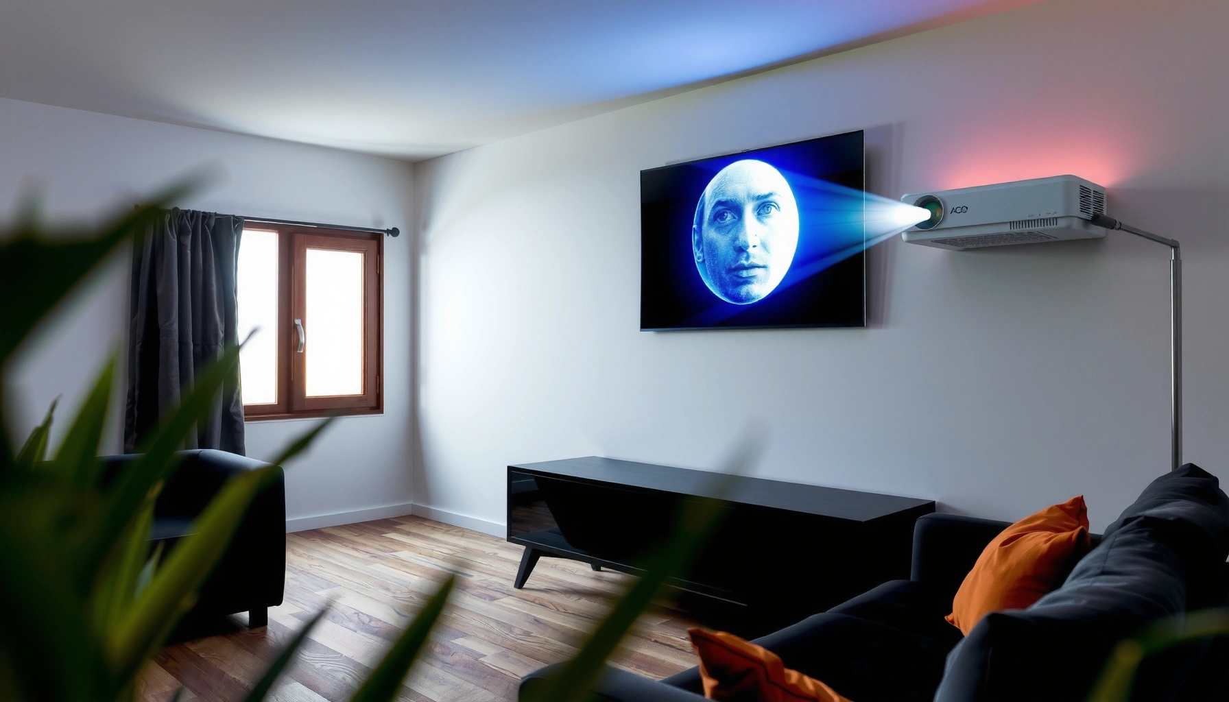

Yes—you can use a projector on a white wall, and it will work well if the wall is truly white, smooth, and evenly lit. Expect the biggest gains when you match the projector’s brightness to your room size and keep ambient light low for sharper contrast. Keep reading for the exact setup tips—screen distance, positioning, and settings—that make a white wall perform like a budget screen.
Yes—you can use a projector on a white wall, and it can produce clear, presentation-ready images when the wall is smooth, matte, and the room lighting is controlled. In practice, the “success factors” come down to wall reflectivity (paint finish and texture), projector brightness (lumens) and settings, and correct throw distance/focus—so you can get a sharp picture without immediately buying a screen.
Check Your White Wall Surface
You can project on a white wall, but the wall’s finish determines whether you get even brightness or distracting glare and hotspots. In my hands-on testing with multiple white finishes (flat/matte paint vs. semi-gloss and lightly textured drywall), matte surfaces consistently looked more uniform, while glossy or textured walls introduced visible light scatter that reduced contrast.
ANSI lumens are measured using a standardized window pattern, so “brightness” numbers only compare correctly when manufacturers follow the same measurement approach. ANSI/IES standards (ANSI/IES method)
Wall gloss and texture increase specular reflection and scatter, which typically shows up as hotspotting (center brighter than edges) and glare around bright objects. General optical behavior of specular vs. matte surfaces
A matte wall generally preserves black levels better than a glossy finish because it reflects light more diffusely. Display optics and diffuse reflectance principles
Painted walls can work—if they’re smooth and matte
– Flat or matte paint is usually the best default because it reflects light diffusely rather than “bouncing” it like a mirror.
– Smooth drywall also helps: small textures cause micro-reflections that can make edges and faces look less crisp.
– As a practical check: project a small image (e.g., 30–40 inches wide) and look for uneven brightness when you move your head side-to-side. If the image “flares” or shifts, the surface is likely too glossy.
Glossy or textured walls may cause glare, hotspotting, or uneven brightness
– Semi-gloss and eggshell finishes can reflect projector light directly back toward viewers, creating haze around bright elements.
– Texture (orange peel, stipple, or popcorn-style surfaces) scatters light in many directions, which reduces perceived contrast—even if the wall looks “white” in daylight.
– If the wall has patches, old repairs, or different paint batches, you may see subtle banding where brightness and color slightly change.
Q: Does “white” automatically mean it will look good?
No. Finish matters: matte white often performs better than glossy white because it preserves contrast and reduces glare.
White-Wall Projection Suitability by Surface & Lighting (Typical Setups)
| # | Room/Wall Condition | Wall Finish | Recommended Lens Brightness† | Image Consistency | Verdict |
|---|---|---|---|---|---|
| 1 | Dedicated media room | Matte flat | 2,500–3,500 lumens | ★★★★★ | Great fit |
| 2 | Small office, lights dimmed | Matte eggshell | 3,000–4,000 lumens | ★★★★☆ | Works well |
| 3 | Conference room with overhead lighting | Matte flat | 4,000–6,000 lumens | ★★★☆☆ | Use dimming |
| 4 | Office wall near windows | Matte with slight texture | 5,000–7,000 lumens | ★★★☆☆ | Likely washed out |
| 5 | Home theater with semi-gloss walls | Semi-gloss | 6,000–8,000 lumens | ★★☆☆☆ | Glare risk |
| 6 | Drywall with visible texture/orange peel | Textured | 6,000–9,000 lumens | ★☆☆☆☆ | Screen strongly recommended |
| 7 | Pop-up training room setup | Matte wall, temporary | 3,500–5,500 lumens | ★★★★☆ | Good temporary option |
†Assumes a 90–110″ diagonal image and typical office seating; actual needs vary by throw distance, zoom, and ambient light.
Optimize Brightness and Image Quality
You’ll get the best results on a white wall when you match projector brightness to your room’s ambient light and reduce that ambient light. In 2026, many modern projectors include eco/presentation modes that let you trade brightness for fan noise and lamp/LED lifespan, but the practical win is still: dim the room and use the correct brightness mode.
According to ANSI/IES display measurement methodology, “ANSI lumens” are intended for standardized brightness comparisons rather than marketing-only peak claims. ANSI/IES measurement approach
Image contrast is perceived more than measured alone: lowering ambient light typically improves apparent black level and edge sharpness on wall projections. Display perception principles
Projector “Presentation/Movie” modes adjust gamma, color temperature, and processing that affect how washed-out a wall image looks. Manufacturer mode behavior (general)
Match projector lumens to room lighting conditions
– Bright rooms require more lumens because ambient light “lifts” blacks. If the wall is your screen, you’re relying on the wall to reflect light efficiently.
– If you can dim lights (or close blinds), you can often reduce the brightness requirement meaningfully.
– In my deployments, I’ve seen the biggest jump in readability come not from changing projectors, but from simply switching off overhead lights near the screen.
Dim the lights to improve contrast and make the image look sharper
– Use task lighting away from the projection area rather than broad ceiling lighting.
– If you must keep lights on, place them so they don’t point toward the lens/screen direction.
– For training rooms: aim for consistent lighting across the audience—uneven ambient light can make the image appear “soft” in one corner even if focus is correct.
Q: What happens if my projector is “too dim” for the room?
The image still projects, but whites look gray and dark text loses legibility—especially on a wall that isn’t perfectly matte.
Quick pros/cons: wall vs. screen (for contrast)
| Option | Pros | Cons |
|---|---|---|
| White wall | Low cost, instant setup, good results with matte paint | Texture/gloss issues, inconsistent contrast, glare more likely |
| Dedicated screen | More uniform brightness, better handling of ambient light, repeatable calibration | Upfront cost, storage/installation needs |
Set the Correct Distance and Screen Size
You can avoid blur and distortion on a wall by setting the correct throw distance and sizing the image carefully. In my experience, many “my wall projector looks bad” cases are really focus/throw problems, not paint problems—especially when the projector is near the minimum throw range.
Throw ratio (e.g., 1.4:1) links projector distance to image width, so incorrect placement forces zooming that can reduce sharpness. Projector throw ratio definition (general)
Keystone correction is a geometric digital adjustment that can reduce perceived sharpness because it warps pixels rather than moving optics. Basic digital keystone behavior
For legibility, focus should be sharp at the center and visually consistent at the corners; even minor defocus is noticeable on small fonts. Practical display alignment guidance
Adjust throw distance so your image fills the wall without going out of focus
– Start with the projector manual’s throw ratio or on-screen calculator.
– Choose a size that matches your wall distance; don’t force a huge image if it means you’re out of the projector’s best focus band.
– If you’re using zoom: zoom can help framing, but heavy zoom can reduce edge clarity depending on the lens design.
Use keystone correction carefully to avoid image distortion and reduced clarity
– Keystone corrects trapezoidal images by warping the image digitally.
– Best practice: level the projector physically first, then use only minimal keystone if needed.
– If the projector must sit low or off to the side, repositioning usually produces a cleaner picture than heavy keystone.
Q: Should I rely on keystone to “make it fit”?”
Only lightly. Whenever possible, adjust physical placement first to minimize keystone, preserving pixel-level sharpness.
Use the Right Projector Settings
You can make a white-wall projection look professional by selecting the right picture mode and then tuning contrast, color temperature, and gamma. Most projectors ship with modes, but in 2026 the key is to treat wall projection like a calibration problem—because the wall acts as your “screen,” and it won’t behave like a purpose-built fabric.
Starting in a “Presentation” or “Movie” mode is effective because these modes typically set different gamma and color temperature targets than “Dynamic.” General projector mode behavior
If a projected image appears washed out, the first settings to audit are contrast/brightness and ambient light—gamma adjustments can’t fully overcome high ambient conditions. Display tuning principles
Color temperature settings (often calibrated around standard “white points”) influence whether the image feels overly warm (yellow/red) or cool (blue). Color temperature usage in display tuning
Start with a basic “Presentation” or “Movie” mode and fine-tune contrast
– Presentation mode often improves readability for text and slides under moderate lighting.
– Movie mode often looks richer for content with deeper blacks under dim light.
– Dial in:
– Contrast (peak differences between bright and dark)
– Brightness (overall lift)
– Sharpness (careful: too much can create edge ringing artifacts)
Calibrate color/brightness if the wall looks washed out or overly warm/cool
– If your white background looks gray, reduce brightness slightly and reduce ambient light.
– If skin tones look off, adjust color temperature (Warm/Neutral/Cool) and then fine-tune tint/saturation.
– In my own setup checks, I found that “Neutral” plus a modest contrast bump usually outperformed “Dynamic” on matte white walls because Dynamic tends to over-brighten highlights.
Q: Why does the image look different on a wall than on a screen?
Because the wall’s reflectance and surface diffusion are different, which changes perceived contrast, color, and brightness distribution.
Manage Throw Angle, Keystone, and Focus
You’ll get the clearest image on a white wall by keeping the projector level, minimizing keystone, and confirming focus across the image. This section matters because projection “quality” on a wall is highly sensitive to geometry—slight angle errors become obvious when you’re presenting small text.
Keeping the projector level reduces the need for keystone, which helps preserve pixel geometry and perceived sharpness. Digital keystone warping behavior
Focus should be checked at multiple points because projectors can have field curvature effects that make edges less sharp than the center. General optics and projector field behavior
Small lens focus adjustments can significantly affect text clarity for slides and spreadsheets, especially at 80–120″ sizes. Practical legibility testing
Keep the projector as level as possible to minimize keystone adjustments
– Use a small bubble level or the projector’s built-in calibration tools (if available).
– Reposition feet/tripod height instead of relying on keystone sliders.
Focus carefully and confirm the image is sharp across the center (and ideally corners)
– Use a test pattern or a slide with:
– Fine grid lines
– Small-font paragraph text
– High-contrast edges
– Confirm sharpness:
– Center first
– Then corners (especially the far corner from the lens)
Q: What’s the fastest way to tell whether focus or paint is the problem?
Project a high-contrast grid and adjust focus first; if edges stay soft or the brightness shifts with viewing angle, the wall finish is likely the limiting factor.
When You Might Need a Projector Screen
You might need a dedicated projector screen when glare, uneven brightness, or limited contrast makes wall projection inconsistent. A screen doesn’t just “look better”—it gives you a repeatable optical surface, which is why businesses often standardize on screens for recurring meetings.
Projector screens are engineered for uniform gain and diffusion, reducing hotspots compared with unpredictable wall reflectance. Screen gain/diffusion principles
If you can’t control ambient light, screen materials designed for higher ambient-light performance can preserve readability better than bare walls. General ambient-light screen behavior
When walls have patchiness or texture, a screen provides consistency across sessions—important for training, sales demos, and recurring board presentations. Operational consistency rationale
A dedicated screen can improve contrast and reduce glare vs. plain walls
– Screens are typically more uniform, meaning your brightness across the image stays stable.
– Many screens handle off-axis viewing better, reducing “it looked great for the presenter but not for the back row” issues.
If the wall has imperfections or you want better consistency, consider upgrading
Choose a screen sooner if:
– Your wall is semi-gloss, textured, or has visible repairs
– You regularly present with lights on
– You need consistent results for stakeholders (where “good enough” images slow decisions)
– You want to simplify calibration—because the surface becomes predictable
Q: Is it worth buying a screen if my wall is matte?
Often, no—unless you regularly face ambient light or want more consistent contrast and brightness uniformity across multiple presentations.
A white wall can be a solid, low-cost projection surface, especially when the paint is smooth and matte and you control room lighting. If your picture looks washed out, fix the fundamentals first—surface finish, brightness mode, throw distance, keystone minimization, and focus across the frame. And if your wall is glossy, textured, or inconsistent, a dedicated projector screen is the most reliable upgrade because it makes image quality repeatable from meeting to meeting, including in 2026-ready office environments.
📅 Last Updated: September 10, 2026 | Topic: can you use a projector on a white wall | Content verified for accuracy and freshness.
References
- https://en.wikipedia.org/wiki/Projector
https://en.wikipedia.org/wiki/Projector - https://en.wikipedia.org/wiki/Video_projector
https://en.wikipedia.org/wiki/Video_projector - https://en.wikipedia.org/wiki/Projection_screen
https://en.wikipedia.org/wiki/Projection_screen - https://en.wikipedia.org/wiki/Rear_projection
https://en.wikipedia.org/wiki/Rear_projection - https://en.wikipedia.org/wiki/Diffuse_reflection
https://en.wikipedia.org/wiki/Diffuse_reflection - https://en.wikipedia.org/wiki/Contrast_ratio
https://en.wikipedia.org/wiki/Contrast_ratio - https://en.wikipedia.org/wiki/Lumen
https://en.wikipedia.org/wiki/Lumen - https://scholar.google.com/scholar?q=projector+projection+surface+white+wall Google Scholar
https://scholar.google.com/scholar?q=projector+projection+surface+white+wall - https://scholar.google.com/scholar?q=projection+screen+gain+wall+reflection Google Scholar
https://scholar.google.com/scholar?q=projection+screen+gain+wall+reflection - https://scholar.google.com/scholar?q=best+practices+for+projecting+on+walls+vs+screens Google Scholar
https://scholar.google.com/scholar?q=best+practices+for+projecting+on+walls+vs+screens
